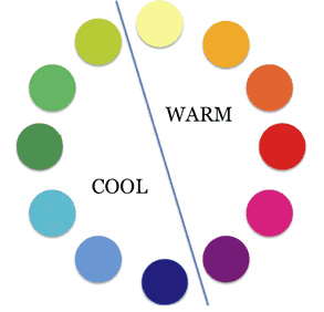
The color-scheme or color-palette of a website helps clarify and emphasize the content by visually framing the product.
It eases visual perception, creating a better structured "Gestalt" (whole) and it helps branding the website, because color creates a psychological mood for the product being presented.
| Color link chart | |
| http://www.colormatters.com/colortheory.html | Classic color theory (primary/secondary/complementary colors). Basic color harmony. |
| http://www.ideabook.com/tutorials/web_design/color_strategy.html#more | The use of color in design |
| http://newark1.com/color/000055.html | Color psychology oriented towards Web! |
| http://www.mountevansdesigns.com/articles_colors.html | More on web color consideration |
| http://www.sibagraphics.com/colour.php | Very interesting multicultural considerations on color (horrible interface design). |
| http://desktoppub.about.com/cs/color/a/symbolism.htm | |
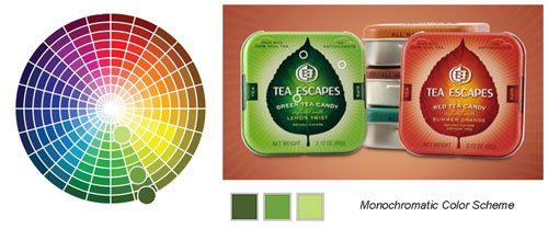
Some color-relationships referring to the color-wheel. This part of color-theory should orient you and confirm your intuition. Don't get obsessed with the theory, please.
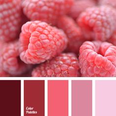
Monochromatic Color Schemes: Notice how you will work around the same color, changing levels of white and black. |
 |
||||||||||
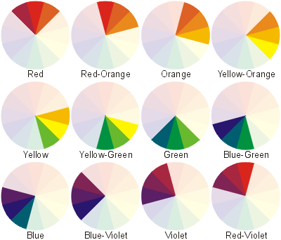
Working with Analogous colors Colors will be close to each other in the spectrum and related in their frequency. Example: "yellow, darker yellow and orange".
|
 |
||||||||||
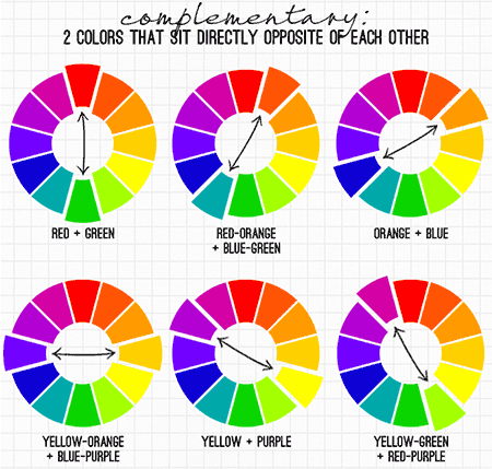
Complementary Colors: This combination will be more harmonious if one of the colors is used in a very dark or light form (to desaturated it). e.g. A dark red wine color and a light pastel sage green. The rest of the colors in the palette can be intermediate versions of one of the main complementary shades (this is how you get to the Triad, Tetrad palettes below).
Complementary colors form powerful combinations, that have been used for painting since the end of the 19th century (remember the Impressionists, Fauves, German expressionists?) |
 |
||||||||||
|
|||||||||||
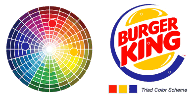
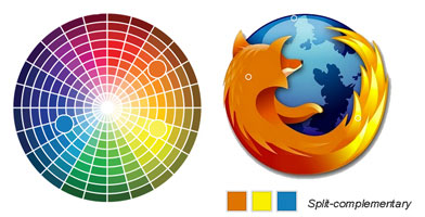
Split, Triad, and Tetrad Color Schemes:
|
 |
||||||||||
Triadic combinations typically choose three colors that are equal distances apart around the wheel (e.g. warm red, mustard and ultramarine blue in the Burger King logo).
|
Tetrad or double complementary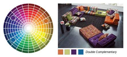 |
||||||||||
| Color palette applications | |
| http://colorschemedesigner.com |
web color palette online application. very intuitive. Notice that you can define the basic palette to use and then the "Chroma" (Complementary color, analogous, tetrad...) Click on the "light and dark pages" |
| http://kuler.adobe.com |
Color palette online application. You have sign in with your Adobe ID. The same application can be used inside all Adobe Graphic software (Photoshop, Illustrator, After Effects...) |
