The color-scheme or color-palette of a website helps clarify and emphasize the content by visually framing the product.
When defining a color-palette for the web you need to list all the colors used in the Design of that website: background colors: for the HTML pages, for the header, for the menus or blocks within the pages (if added colors are used as a background of menus or blocks). Also the colors used in the fonts: in headers, paragraphs, captions, section names...). This means that White and black might be part of your palette, since you are using them in the page/s.
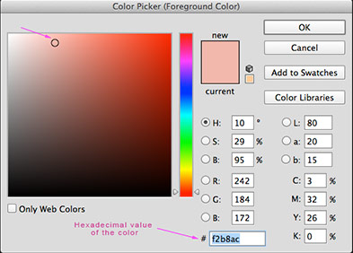
You need to provide the hexadecimal number for each color because you will have to give that list to the HTML/CSS coder, or keep it in a safe place for yourself later.
Notice that since websites are based on a clear template, pages tend to be very similar in structure, only a few sites using more than one template for the whole site.
Your job here is to create different looks (out of different combinations) out of the same family of colors.
 |
 |
 |
||
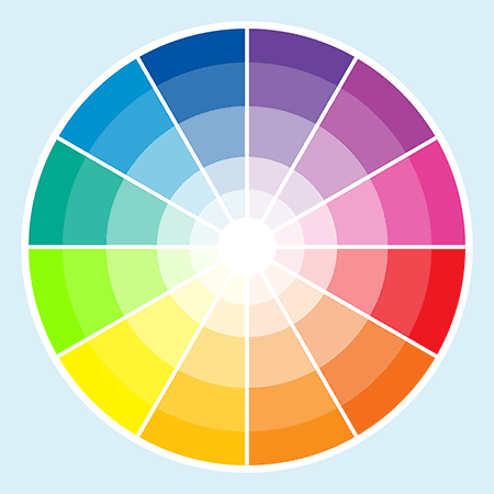
Each of those colors is a good color but they have no relation to each other so they will not work good against each other as background or on top of each other as background and text. Notice that if you are planning to use those colors as blocks, maintaining a white background, White should be included. Same thing if you are planning to include black text in the page. Even if we add White and Black to this palette, the family of colors does not make sense and does not communicate any mood or psychological character. |
These color palettes have a stronger relationship between the shades included. There are also different levels of saturation and different levels of light and darkness (tone). This stronger difference within the shades will increase readability (light on dark or vice-versa).  |
There is something remarkable about using a pic (a bitmap image) to choose shades for a color-palette. You still need a certain sensibility to choose shades from a bitmap, but the job becomes way easier and the results improve. |
|||||||||||||||||
|
|||||||||||||||||
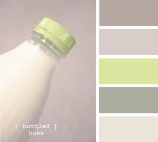
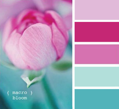
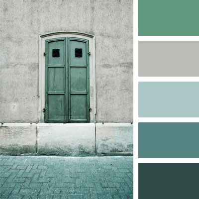
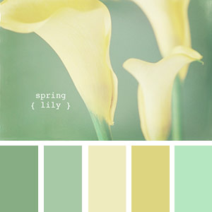
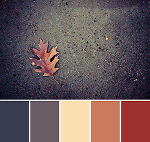
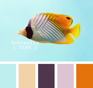
How to Choose shades from a pic If you want to choose your colors from a pic, find a pic that defines the mood of your project (not literally, through content, but a sensorial intuitive environment). _Once you have the palette defined work out the 3 different color tests, which are very simple layouts of a page. |
 |
- There shouldn't be more than 4 or 5 colors on a site color-palette, and you should count the background color of the page as one of them.
- You begin by finding a group of colors that satisfy you, then you need to test which color/s will be used as background for the page or as background blocks.
- You also need to check how text will look against your different background colors, and you need to check what font family and font size needs to be used to get the optimal effect (remember: the text color is also part of the color-palette).
- On a web-site, you need to differentiate between section names, headings and block text. You might want to use different colors for different types of text.
- To create a color-harmony with your pictures you might want to retouch your images and change the values towards your color palette
(specially images on the home page or images that are not going to be changed often). Duo-tone images usually work very good for this.
- You can also operate backwards, and build a color-scheme for a website based on the colors of an image.
This is an excellent way of getting harmonic colors if you don't know much about color-theory (see examples above)
See student work for this assignment
Student-work including color palette with color-blocks and hexadecimal number for each one, plus 2-3 different tests, that should include a text for section-names, heading text and paragraph.
See student work.
You might want to see how the images on your home-page, logo and other mandatory graphic material will work with the color-scheme.