INTRO TO MULTIMEDIA. MAT 103

Alejandra Jarabo

Multimedia Arts & Technologies. Santa Barbara City College
Student work

Examples of color-schemes for websites done by students through a number of semesters.
The assignment requirements have slightly changed through time. Old assignments tend to use a color bar under the section names and don't include a bulk text test within each page's mock up.


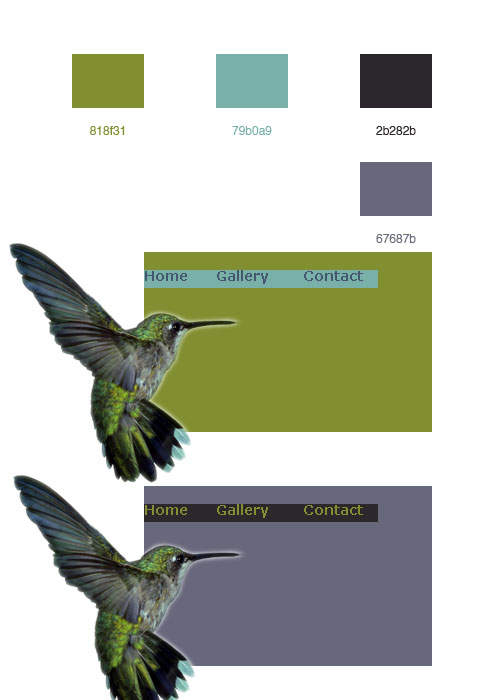
Alec Tyre. Web Color palette based on a pic (Humming bird) with 2 layouts.
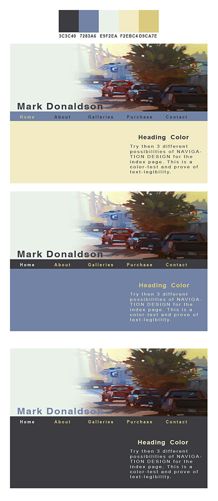
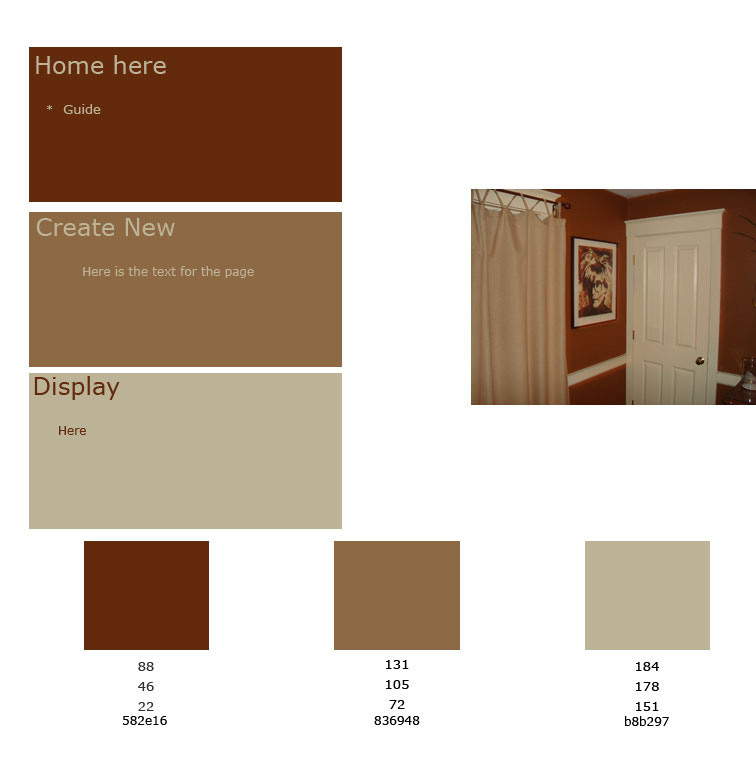
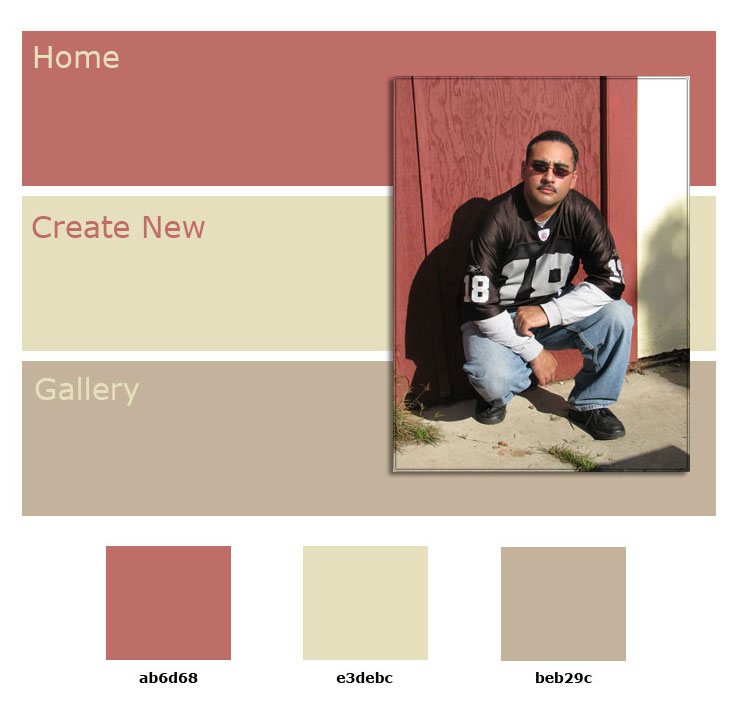
He is missing some bulk text for the page, besides the section names. That would have helped with the composition and color variety within the page.
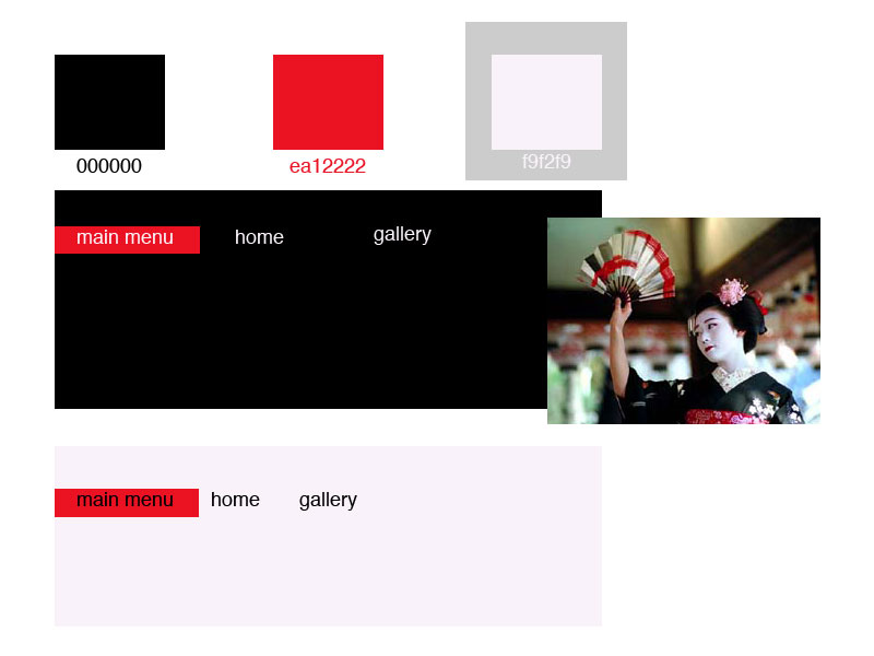
Creating a different color-bar for the main menu bar is one way or emphasizing the navigation content but there are different options that you should explore like font color, design and size, or positioning the menu items under a header-image or Illustration portraying the site's theme (all accross the page), or using a decorative graphic element to frame the section-names.


Satsuki. Web Color palette based on pic with 2 layouts.
It would be actually easier to appreciate the page look if the "image motief" is integrated in the page (as content of the page) and a generic text box was placed on the page (Lorem ipsum... or other) to get a feel of the negative space on the page.
Each page mock-up should be slightly bigger or in a proportional relation with the web page's design.


  Mark Stekete. Web Color palette based on design idea.
Interesting heading structure and nice color palette. He only submitted one mock up for color distribution.


Karina deSantiago.
Great layout. Very close to what the real page would look like. Simple design with good hierarchy of text (font, size and color). That produces a very well organized page. The 3 pages have good readability and abalanced scene of color.

Mark Donaldson.
Great header that organizes the whole page. Good hierearchy of text (in the heading, for sections and in the body. Notice how the image in the heading fades into one of the colors in the palette/scheme.


Jack Linehan. Color palette based on a pic.

The layouts are not complete (you should have all the menu items on each version).
A text box (with several lines of text) helps mock up the page's text that just a word or a line
The rectangular color samples could be smaller and the page's mock ups should be bigger. .


Student Linda Lopez. Web color palette based on a pic.

The layouts are not complete (you should have all the menu items on each version).
The way the pic is visually integrated in the 3 pages is an original solution that makes this document attractive.
Making any material that you present to your client attractive helps their decission making and trust in your capability to sucessfully design their site.