HTML5 and CSS3 in Dreamweaver – Part 3: Using CSS media queries to target different screen resolutions
Requirements
Sample files
Creating a site-wide media queries file in Dreamweaver CS5.5
With index.html open in the Document window, open the Media Queries dialog box using one of the following methods:
- Select Modify > Media Queries.
- Click the down arrow on the right of the Multiscreen button, and select Media Queries.
- In the Multiscreen panel, click the Media Queries button.
- In the Write media queries to section at the top of the Media Queries dialog box, click Specify.
- In the Specify Site-wide Media Query File dialog box, select Create new file from the CSS File pop-up menu, and click the folder icon to the right of the text input field. This opens the Save File As dialog box.
- Navigate to the css folder, type citrus_mq.css in the File name field, and click Save.
- The location of the new file should now be listed in Specify Site-wide Media Query File dialog box (see Figure 4).
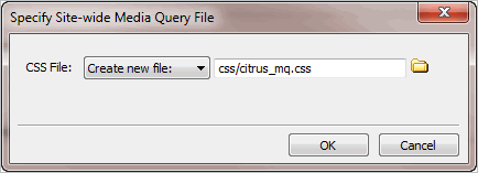
- Click OK. The new file is now listed in the Media Queries dialog box as the Site-wide media queries file. Select the radio button alongside to confirm that you want to use it (see Figure 5).
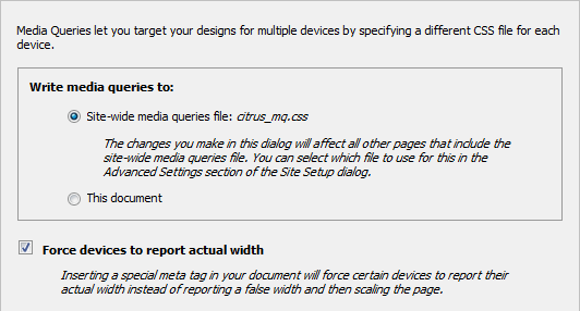
- Verify that the "Force devices to report actual width" check box is selected.
- In the bottom half of the Media Queries dialog box, click the Default Presets button. This creates a list of three suggested settings for style sheets to be served using media queries (see Figure 6).
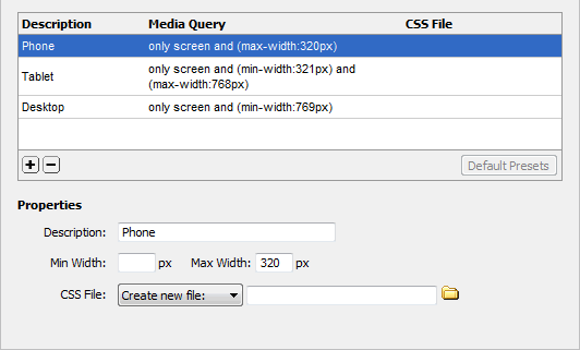
- You now need to specify the names of the style sheets for each setting. With Phone selected, make sure the CSS File pop-up menu is set to "Create new file," and click the folder icon to the right of the input field.
Navigate to the css folder, and type phone.css in the File name field, and click Save.
Note: Don't worry that citrus_mq.css isn’t listed in the css folder. Dreamweaver doesn't create the new style sheets until you close the Media Queries dialog box.
- Select Tablet, and create a new style sheet called tablet.css in the same way as you did for Phone.
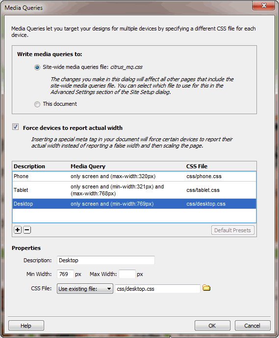
- Select Desktop. The style sheet already exists, so set the CSS File pop-up menu to "Use existing file" before clicking the folder icon, and selecting desktop.css.
- Verify that the settings in the Media Queries dialog box look like Figure 7 before clicking OK.
Inspect the
<head>of index.html in Code view. Dreamweaver has inserted a <meta> tag and linked the site-wide media queries file, citrus_mq.css (see Figure 8).The viewport
<meta>tag instructs mobile devices to use the actual width of the screen (device-width) when applying media queries. Without this tag, most modern mobile devices ignore media queries and scale the desktop version to fit within the screen, making text difficult to read without rescaling.

- The desktop style sheet is included in the site-wide media queries file, so you need to remove it from the
<head>of index.html. Delete the desktop.css<link>tag (shown on line 7 in Figure 8). - Select File > Save All Related Files. Don't worry if index.html becomes unstyled. It probably means that Design view is less than 769 pixels wide. The media queries are now being applied to Design view, and there are no style rules in phone.css or tablet.css.
- Select citrus_mq.css in the Related Files toolbar to inspect the code (see Figure 9).
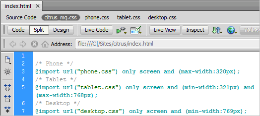
- The styles in desktop.css need to apply to all browsers, even those that don’t understand media queries. Also, the rules in phone.css and tablet.css need to override the basic rules in desktop.css. So, you need to move the @import rule for desktop.css to the top of the page and remove the media query (see Figure 10).

- Save citrus_mq.css. When you click in Design view, the page should be styled again.
- Move the Multiscreen Preview panel to your secondary monitor or minimize the panel by clicking the double arrows at the top right.
- Select tablet.css in the Related Files toolbar, and add the following style rule to it:
#container {
    width:700px;
}
This overrides the rule the determines the width of the page content.
In Dreamweaver CS5.5, open the Window Sizes menu by selecting View > Window Sizes or using one of the other methods described in Part 1 of this tutorial series, and select 768 X 1024 Tablet to resize the Document window viewport.
The images folder contains a medium size version of the logo. Create a new style rule in tablet.css to use the smaller image, and adjust the height of the logo as shown in the following snippet.
#logo {
   background-image:url(../images/med_logo.jpg);
   height:100px;
}
- Press F5 to refresh Design view. The logo is now more compact, but you need to move the menu higher to compensate.
Change the top padding on the
<nav>element to 110px:
nav {
    padding-top:110px;
}
- To get a more accurate view of the changes you're making to the layout, activate Live view.
The menu items need to be reduced in width to fit the 700px container, but they also need to harmonize with the background image for the mission statement, which is 669px wide.
The current styles add 10px of padding to each side, plus a 1px border. Reducing the width of the links in the menu to 114px produces an overall width for the menu of 680px. The font size needs to be slightly smaller, too. Add the following rules:
nav ul {
    font-size:18px;
}
nav ul a {
    width:114px;
}
- Press F5 to refresh Live view. The top of the page should now look like Figure 14.

- The
maincontent <div>needs to be the same width as the container. You can also remove the top and bottom padding to make it more compact, but you need a small left margin to balance the content with the menu, which is slightly wider than the mission statement and pods below. The revised rule looks like this:
#maincontent {
    padding: 0;
    margin-left:5px;
    width: 700px;
}
- Next, fix the mission statement. The background image is smaller
(669 x 242), so the width, height, and right padding need to be changed.
The font also needs to be smaller. The revised style block looks like
this:
#vision {
    background-image:url(../images/med_hero.jpg);
    width: 289px;
    height:217px;
    padding-top:45px;
    padding-right:350px;
    font-size:26px;
}
- The two pods with images can now be expanded to display the full width of each image (302px). To balance the layout, the "Events" pod needs an extra margin on the left. Give the "Events" <section> an ID, and add the following definitions to tablet.css:
.pod {
    width: 305px;
}
.podContent {
    width: 302px;
    height:180px;
}
#events {
    margin-left:7px;
}
- The "News" pod is still the same width as the other two, but pushed down below. You need to make it the same width as the other two combined, and add some space between them. The style definition looks like this:
#news {
    width:650px;
    margin-top:20px;
}
- Finally, add a small left margin to the footer paragraphs to move them in from the edge:
footer p {
    margin-left:5px;
}
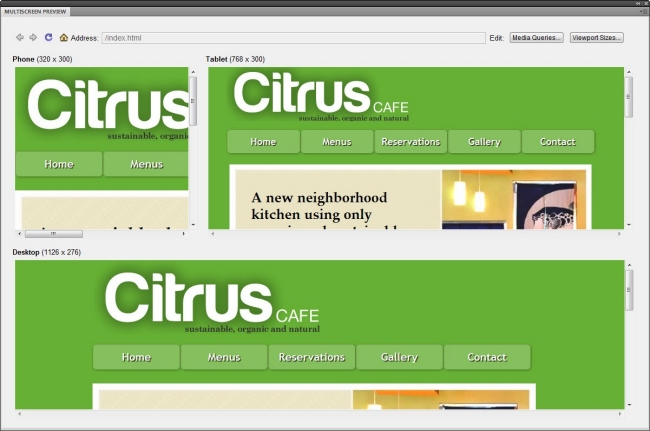
- Save tablet.css, and compare the two layouts in the Multiscreen Preview panel (see Figure 15).
- Select phone.css in the Related Files toolbar.
- The images folder contains a smaller version of the logo. Because
the styles in phone.css will be served only to devices with a maximum
width of 320px, the width of the container needs to be set to 100%, and the logo centered in case it's viewed on an even smaller screen.
Add the following style rules to phone.css:
#container {
    width: 100%;
}
#logo {
    height:auto;
    width:270px;
    background-image: url(../../images/sml_logo.png);
    margin-left:auto;
    margin-right:auto;
}
- In Dreamweaver CS5.5, open the Window Sizes menu, and select 320 x
480 Smart Phone. In Dreamweaver CS5 (11.0.3), resize Design view
manually until it's about 320 pixels wide.
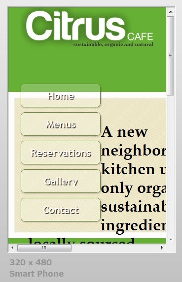
- Activate Live view, if necessary, and press F5 to refresh the layout. The page looks a terrible jumble (see Figure 16).
- The menu buttons are the wrong size and too far down. Add the following style definitions:
nav {
    padding-top:100px;
}
nav ul {
    font-size:24px;
}
nav ul a {
    padding-right: 0;
    width:97%;
}
nav ul li {
    float:none;
}
nav ul li:hover {
    margin-top:0;
}
- Because the height of the logo
has been set to auto and the menu items are no longer floated, you need to remove the top margin from the maincontent<div>. At the same time, remove the padding to give the content more space. The mission statement's background image also needs to go, and the text needs to be much smaller. The revised rules look like this:
#maincontent {
    margin-top: 0;
    padding: 0;
}

#vision {
    background-image:none;
    width: 280px;
    height:auto;
    font-size:16px;
    line-height:normal;
    padding-top:0px;
}
- The remaining style rules set the pods to full width, and nudge the footer items away from the edges.
.pod {
    width: 305px;
}
.podContent {
    width: 302px;
    height:180px;
}
footer p {
    margin-left: 5px;
}
#facebookTwitter {
    margin-right:5px;
}
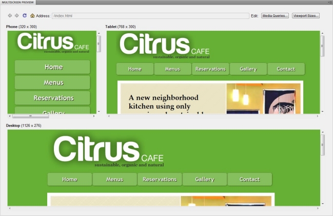
- Save phone.css, and compare the three layouts in the Multiscreen Preview panel (see Figure 17).
- If you don't want to display the images in the pods for the mobile phone layout, amend the last section of styles like this:
.pod {
    width: 305px;
    padding-bottom:0;
}
.pod h1 {
    margin-bottom:0;
}
.podContent {
    width: 302px;
    height:180px;
    display:none;
}
#news .podContent {
    display:block;
}
Figure 18 shows the result.
