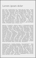
Justified text. The relatively primitive text justification available today on the web creates word-space problems that result in "rivers" of white space that seem to run down the page.

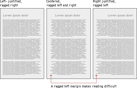
Centered and right-justified text blocks are difficult to read. We read from left to right, anchoring our tracking across the page at the vertical line of the left margin. The ragged left margins produced by centering or right-justifying text make that scanning much harder, because your eye needs to search for the beginning of each new line.
Left-justified text is the most legible option for Web pages because the left margin is even and predictable and the right margin is irregular. Unlike justified text, left justification requires no adjustment to word spacing; the inequities in spacing fall at the end of the lines. The resulting "ragged" right margin adds variety and interest to the page without interfering with legibility.

Line length
Magazine and book columns are narrow for physiological reasons: at normal reading distances the eye's span of acute focus is only about three inches wide, so designers try to keep dense passages of text in columns not much wider than that comfortable eye span. Wider lines of text require readers to move their heads slightly or strain their eye muscles to track over the long lines of text. Readability suffers because on the long trip back to the left margin the reader may lose track of the next line.
Restrict the text line length to about fifty to seventy characters per line.
Indenting paragraphsLegibility on screen
Some typefaces are more legible than others on the screen. A traditional typeface such as Times Roman is considered to be one of the most legible on paper, but at screen resolution its size is too small and its shapes look irregular.
Adapted traditional typefaces
Times New Roman is a good example of a traditional typeface that has been adapted for use on computer screens. A serif typeface like Times New Roman (the default text face in most Web browsers) is about average in legibility on the computer screen.
Designed for the screen
Typefaces such as Georgia and Verdana were designed specifically for legibility on the computer screen; they have exaggerated x-heights and are very large compared to more traditional typefaces in the same point size. These fonts offer excellent legibility for webpages and are designed to be read directly from the screen. However, the exaggerated x-heights and heavy letterforms of these fonts look massive and clumsy when transferred to the high-resolution medium of paper.
We read primarily by recognizing the overall shape of words, not by reading each letter and then assembling a recognizable word:
![]()
Words formed with capital letters are monotonous rectangles that offer few distinctive shapes to catch the eye:

I recommend downstyle typing (capitalize only the first word and any proper nouns) for your headlines, subheads, and text. Downstyle is more legible because as we read we primarily scan the tops of words:
![]()
Notice how much harder it is to read the bottom half of the same sentence:
![]()
If you use initial capital letters in your headlines, you disrupt the reader's scanning of the word forms:
![]()
Italics
Italicized text attracts the eye because it contrasts in shape from body text. Use italics for convention, when listing book or periodical titles, for example, or within text for stressed or foreign words or phrases. Avoid setting large blocks of text in italics because the readability of italicized text, particularly at screen resolutions, is much lower than in comparably sized roman text.
Bold
Boldface text gives emphasis because it contrasts in color from the body text. Section subheads work well set in bold. Boldface text is readable on-screen, though large blocks of text set in bold lack contrast and therefore lose their effectiveness.
Underlined
Underlined text is a carryover from the days of the typewriter, when such options as italics and boldface were unavailable. In addition to its aesthetic shortcomings (too heavy, interferes with letter shapes), underlining has a special functional meaning in Web documents. Most readers have their browser preferences set to underline links. This default browser setting ensures that people with monochromatic monitors or people who are color-blind can identify links within text blocks. If you include underlined text on your Web page it will certainly be confused with a hypertext link.
Colored text
Although the use of color is another option for differentiating type, colored text, like underlining, has a special functional meaning in Web documents. You should avoid putting colored text within text blocks because readers will assume that the colored text is a hypertext link and click on it. Colored text does work well as a subtle means to distinguish section heads, however. Choose dark shades of color that contrast with the page background, and avoid using colors close to the default Web link colors of blue and violet.
Capital letters
Capitalized text is one of the most common and least effective methods for adding typographical emphasis. We recognize words in two ways, by parsing letter groups and by recognizing word shapes. Words or headlines set in all capital letters form rectangles with no distinctive shape. To read a block of text set in all capital letters we must read the text letter by letter which is uncomfortable and significantly slows reading. As you read the following paragraph, notice how tiring the process is:
THE DESIGN OF THE SITE WILL DETERMINE THE ORGANIZATIONAL FRAMEWORK OF YOUR WEB SITE. AT THIS STAGE YOU WILL MAKE THE ESSENTIAL DECISIONS ABOUT WHAT YOUR AUDIENCE WANTS FROM YOU, WHAT YOU WISH TO SAY, AND HOW TO ARRANGE THE CONTENT TO BEST MEET YOUR AUDIENCE'S NEEDS. ALTHOUGH PEOPLE WILL INSTANTLY NOTICE THE GRAPHIC DESIGN OF YOUR WEB PAGES, THE ORGANIZATION OF THE SITE WILL HAVE THE GREATEST IMPACT ON THEIR EXPERIENCE.