|
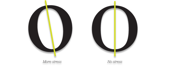
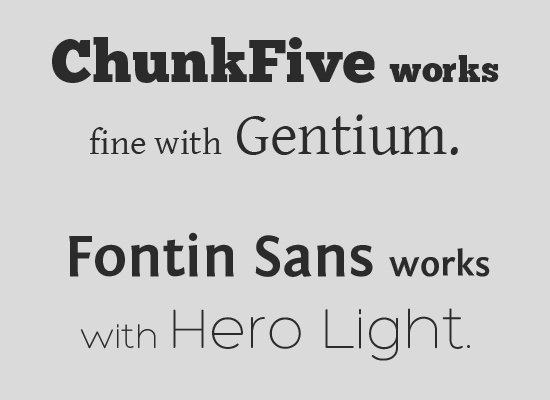
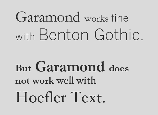
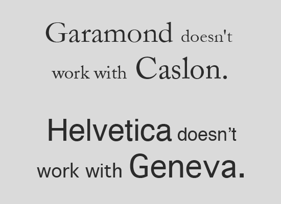
Carl Dair, Canadian typographer. Book: "Design with type", 1967. Carl Dair's definition of "typographer": someone who designs with type, not just a fancy typesetter, but someone who uses type, in all its variations, as the principle element of design. One of the basic goals of Design is creating visual Harmony. See how to create that visual contrast on the right. From Creative Pro, Seven principles of Typographic Contrast,
|
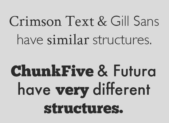
Contrast of Scale: using different font sizes. Contrast of font Weight : A Thin or a Light font used with a Bold or a Black. Contrast of Form: with different Typefaces (see below) Contrast of Texture: Considering the masses and negative spaces that blocks of text create. Contrast of Color. Contrast of Rhythm: by changing direction, letter spacing... |
Noupe.com Principles for combining typefaces, HERE Typecast.com Contrast through scale, Slides how on typographic contrast, Typographic Contrast and Flow on the web, |
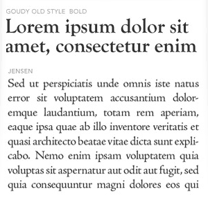
Below you can see a simple type test with always the same font as a heading and different choices for the body of text. You should look and compare the boxes with your eyes slightly slanted so you can appreciate the effect of the font on the negative space of the white page.
 |
 |
 |
 |
|||
First test with the same typeface in both, heading and body of text.
|
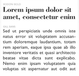
Serif for the heading, sans serif for body of text. Bodoni is an Unbracketed serif (look at the straight serif terminations of the strokes) with a lot of Contrast (difference in thickness between different strokes in a letter). It makes the heading stand out. |
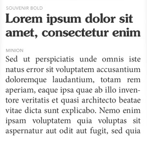
Both, Heading and body in serif fonts. Notice how dense is Souvenir bold compared to all the other bold fonts in this row.
|
Again both, Heading and Body in serif fonts. Notice how different is the negative of this test compared to the window on the left. |
|||
 |
 |
 |
 |
|||
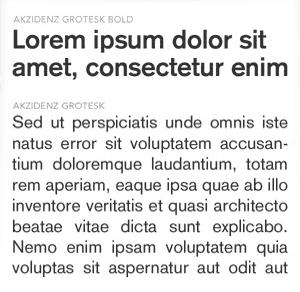
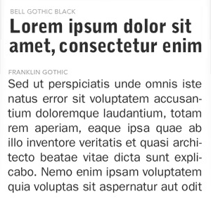
Sans serif for both, the heading and the body of text. Bell Gothic is an Oblong font that reinforces verticality. Franklin Gothic is also slightly oblong, what gives the page a nice slightly geometric touch. |
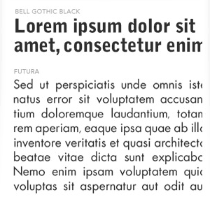
Futura is one of the roundest sans serif available. |
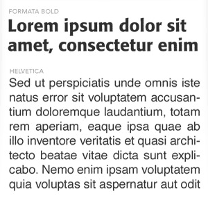
Helvetica is another classic sans serif. Notice how the letter spacing is tighter than Futura. It is also a very round type face. |
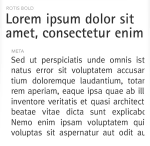
Rotis Bold is less dense that amy of the other heading typefonts on this row. It is also very geometric in nature (observe the "c"). |
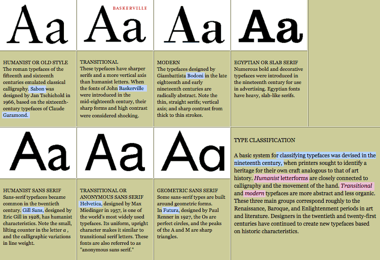
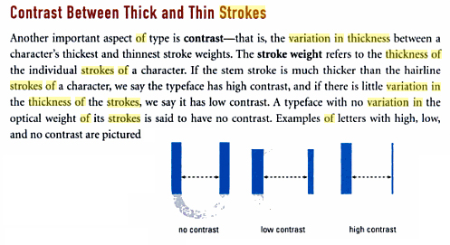
Typographic Contrast
Is the difference in thickness between the strokes of a letter.
Typefaces might have "no contrast" , when the width of the stroke is always uniform, like in Sans Serif fonts.
We talk about "low contrast" when there is s small variation in thickness ( like Minion or Jensen, up the page).
A typeface has been designed with "high contrast" when the stem stroke looks much thicker that the other strokes on each letter, being the last ones designed with almost a hairline thickness (look at "Bernard Modern" in the previous page)
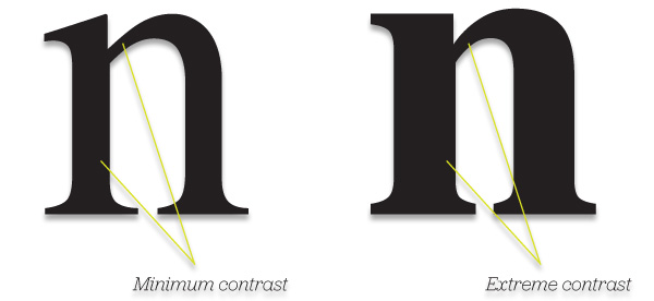
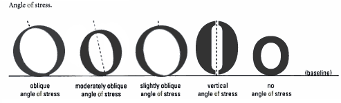
Typographic Stress
The angle of stress describes the main strokes of a typeface aim in relation to the baseline.
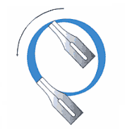
The concept is based on classic calligraphic writing, where a pen would make a different mark depending at the angle at which is held.
 |
 |
 |
 |
|||