This is work students of this class has done considering the Gestalt concept of Negative space applied to web page design.
Students chose web pages with special distribution of space and commented on all the possible Gestalt principles applied to the design.
Student: Eriko Ito
Comment:
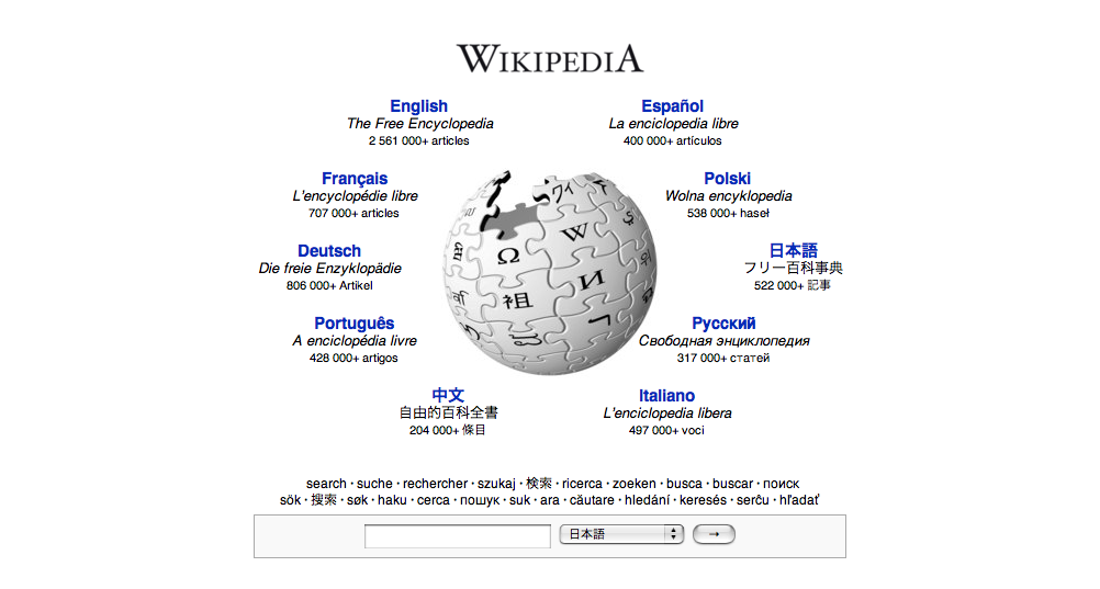
I choose the top page of Wikipedia. There is a wikipedia logo mark, which is a circle thing in a white background. Around the circle, there are links with dark blue font color.
It is really well organized because whole design is in the middle of this page, as one big design.
Also the links are along the outside circle, so it looks like everything is group in the center, giving the illusion of leveling and grouping that give the page the symmetry that avoid the tension on the page.
Alejandra Jarabo comment:
The application of the principle of Leveling by reinforcing the centrality of the page was a good comment.
Surroundness could also be mentioned, since the whole navigation is reinforcing the circle.
We could have added Closure, since the globe is not technically complete (one puzzle piece is missing).
This trick breaks the otherwise boring negative space, so Figure& Background also applies.
Grouping is used to build the navigation items, by creating a repetitive structure (every item has a blue heading and a black-smaller text block).
Student: Anthony Hampton
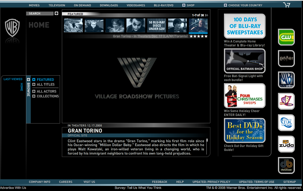
I chose the Warner Bros. studios home page. I browsed the homepages of the four biggest movie studios, and WB's seems to be the most appealing to the eye. It's lay out is pretty simple and feels organic.
At the top of the page, there are a series of movie trailers available. Due to their proximity and similarity in size (all thumbnail sized), they are easy on the eyes and quickly identified as "associated".
The dominant figures of the page stand out well due to the simple, unobtrusive, black background, which does not compete with figure. The movie menu bar is in a bit of an odd placement, halfway down the middle, left side...but is simple and clean and in enclosed within a simple rectangle (closure) that draws the eye in.
The main menu is on top, simple, horizontal, in close proximity. The homepage has a menu of WB subsidiaries on the right side.
Some principles in use here are PROXIMITY (of the icons in the page), CLOSURE (of the icons within unfinished line-boxes), and GROUPING of the icons together, among others.
The layout of this page is very clean, simple yet engaging. I think the black background is the biggest factor here. It really enhances one's ability to identify figure over background, quickly, and focus in on the important aspects of the page without tedious distraction from an overzealous background.
Student: Gavin Woods
Principles of Visual Perception
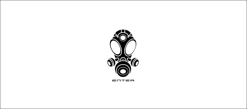
I chose the website of artist Naoto Hattori. I've liked this site for years because of the artist's surrealistic style.
His work definitely distorts our normal perceptions of reality as well as different principles of visual perception.
The site is classic - www.wwwcomcom.com
The screen-shot I took is of the "Enter" page of his site.
The image is made of individual black objects organized in such a way that our eye sees it as one object, a gas mask. All of these objects, grouped as they are, create one image that is relaxing to the brain.
I think the main principles used here are Grouping and Proximity as well as others to a lesser degree.
Alejandra Jarabo comment:
I would also say that, because of the wood-cut style of the graphic (all the tones reduced to planes of flat black or white) Closure also applies. Most of the white ellipses are technically unfinished and we reconstruct them with our imagination. Since all those "white rings" are surrounding central ellipses and perspective is used the Third dimension effect is also reinforced.