
The content of this site is placed inside a central BOX (called container in CSS) with white background.
That main CONTAINER is centered in the window browser with CSS.
This way, the total content
will be centerd on the browser, independently of the window size.
The extra space on the sides will be displayed in blue. You can also set it to a repeating pattern.
Link to the current site:

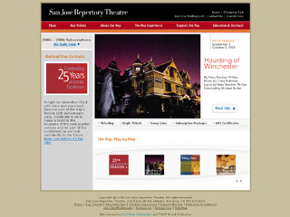
You can see the main BOX centered with white background.
The main bar, placed at the top with black background and the closely red bar with the Section buttons do a nice job aliviating the feeling of a big rectangular block. The right bare with a light gray background also help on that direction.
Link to the current site:
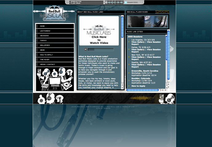
Notice how the design on the current site has completely changed.
In my opinion it has got much worse. It could be due to how the site is now organized from the back end, since it looks like they are using a "web content management system" that forces them to have standard sized blocks for content.
Here you see the background of the main Container set to a repeating pattern.
You do this by creating a small graphic (gif preferably) that acts as a tile that is repeated as needed to fill out any background space. In this case the background image has been set to a long -thin rectangle.
Link to the current site: