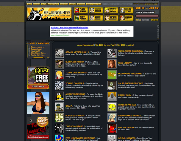
The user's avatars organize this page full of content and links.
Notice how the text is organized with 2 colors and different fonts to differenciate the name of the nimation from the description. at a first glympe, the pattern makes the page interesting (an the add too, I know, I saw it).
The main sections contain icon-drawings and the site-logo has a dominant space on the header. The page, although it hosts a lot of information, is image driven.
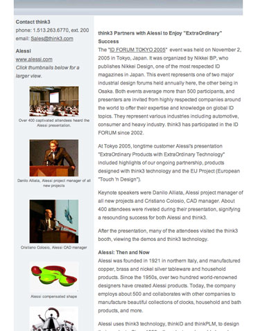
This is a broing, corporate page. There is very little negative space and it is not working towards any visally appealing efect.
I personally want to focus on the colums with images. The captions under each image are helping visually because they create a change of pace (a rythm or pattern of image/caption/space).
Introducing images with no background (4rth up tp down) can help changing the shape of the visual space.

Colorful navigation using color-coding.
Images form clusters to better work on negative space.
Shot pieces of text, well organized and letting the images and design elements rule the page.
Good work with typography, headers are organized visually (see the site's logo and the sign "the perfect touch".