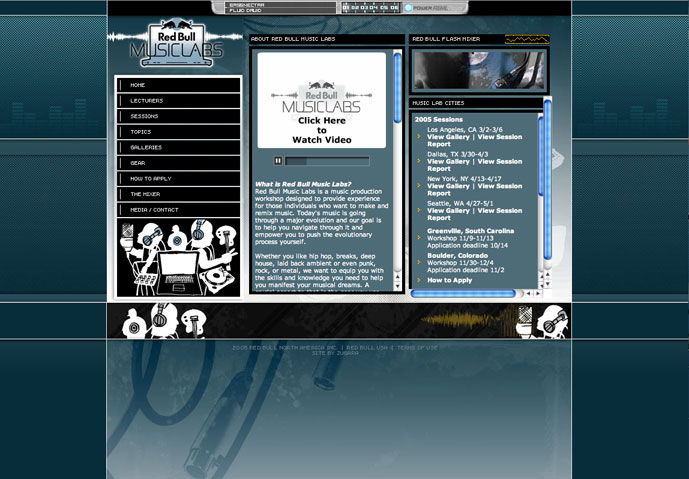
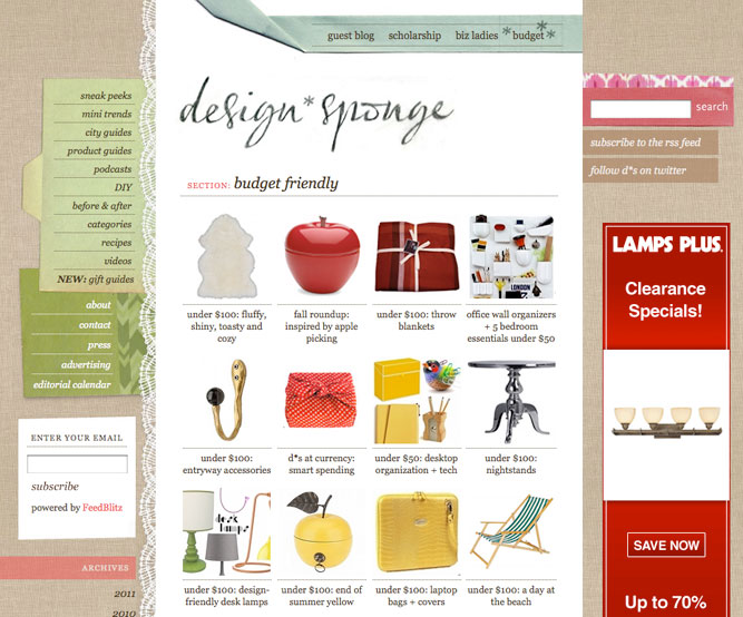
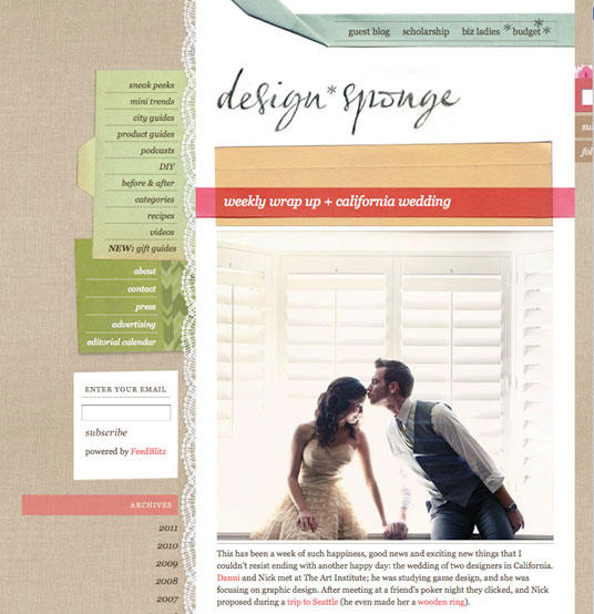
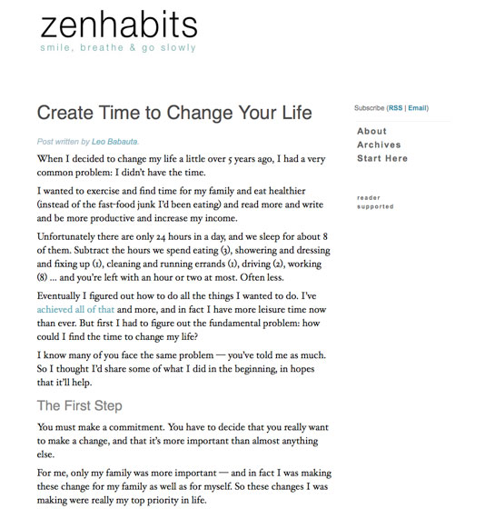
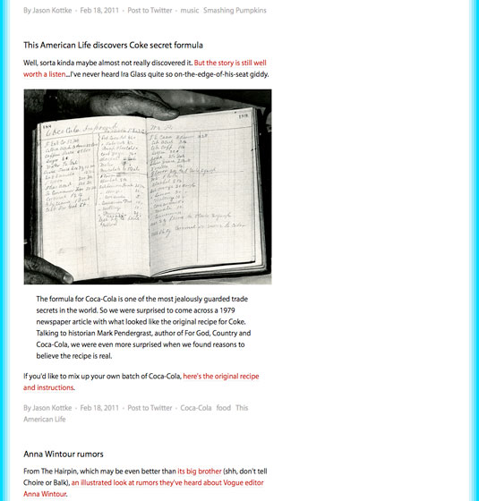
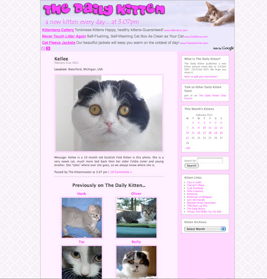
Fitting content on a page, respecting a negative space is difficult task that requires a sense of composition in a reticulated space.
Hiding the visual rectangular structure requires as much care as taking advantage of that type of structure in your layout.
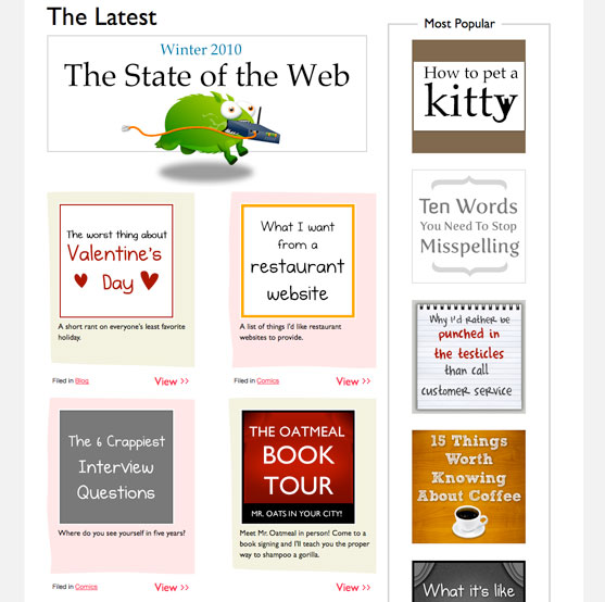
Pages with very little content can invest a lot of space in design elements. It is important to pay attention to pages with a lot of content: A navigation menu with plenty of items, a product catalog,
multiple content boxes... look how those busy sites solve their real state dilemas.
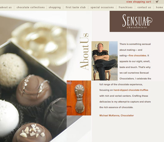
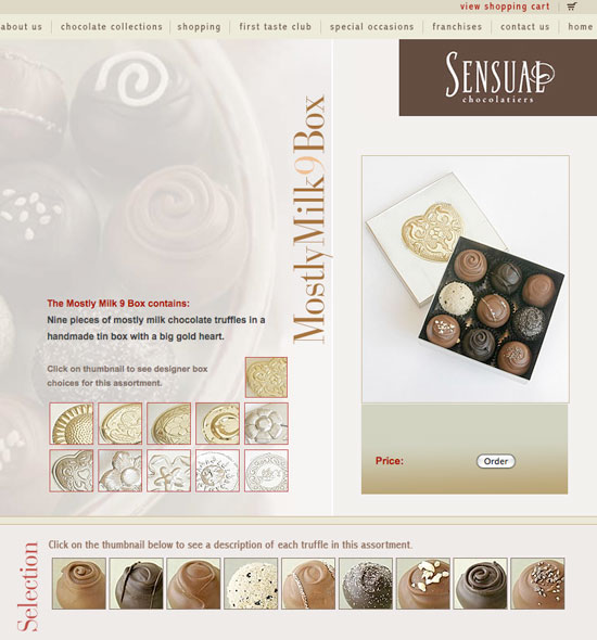
http://newark1.com/chocolate/chocolate.htm
Look at this very retricted design, from the first days of the web. Consider the page structure, maintained on every page of the mini-site.
http://newark1.com/cigarbox/about.htm

