WEB AUTHORING. MAT 108 | Alejandra Jarabo |
Web design. Negative Space on the Web |
TO NEXT PAGE |
NEGATIVE SPACE |
|||||
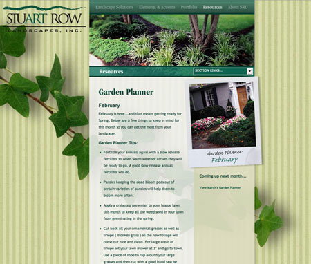
Distracting from a tightly reticulated space is the first goal of visual design in current web pages. Because of technical structure, html needs content to be constructed through boxes but the visual result of that basic system is poor and the psychological reaction is stressfu. Crowdness effect because of the abscence of an interesting negative space. The main challenge od a web page design is to organize content in a visual context (a right brain way of organizing experience) using a logical-left brain tool. Good negative space relaxes, helps focus on content and memorize the basic structure of the page, what greately supports branding. See how diferent visual solutions solve this design challenge. |
|||||
http://www.stuartrow.com | http://www.think3.com | ||||
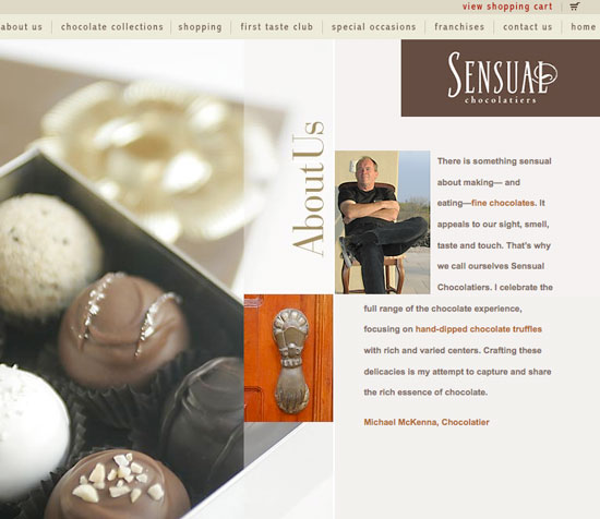
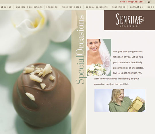
http://newark1.com/chocolate/chocolate.htm Look at the small variations to the same composition. | |||||
Here you see how to modify looks using the same template or use different page templates with the same design elements. | |||||
Pages with high visual impact, and great negative space attract and inspire the user, more conventional pages can be then used to maximy content. In the editorial world, good color images imply a high cost in printing and paper. On the web, images or text imply the exact same cost. |
|||||
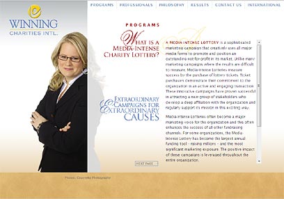
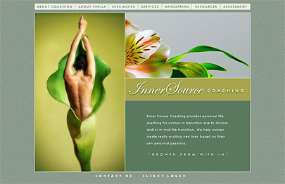
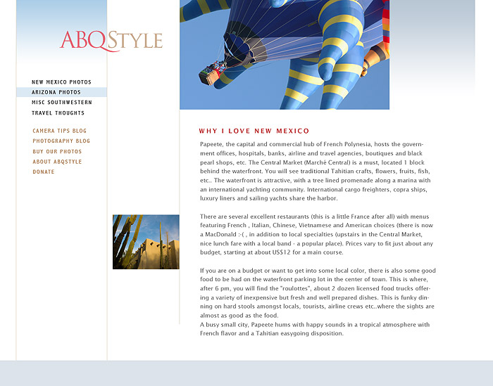
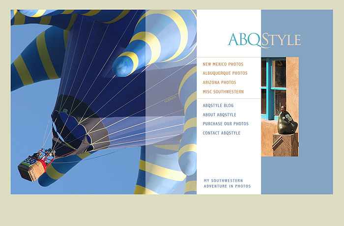
This approach is very similar to high quality magazine design. Observe the design of the home page with a high visual content. Notice the interesting asymetrical placement of the navigation. On the right a content page. Pay attention to the branding (Logo presence and branding image). There is still space for a content image, a great menu with plenty of negative space and good presented text. |
|||||
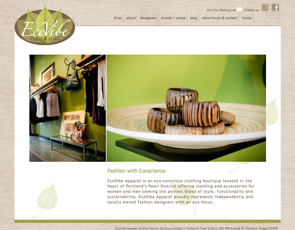
Look at the same page structure with great visuals using a flash photogallery. http://www.ecovibeapparel.com |
|||||
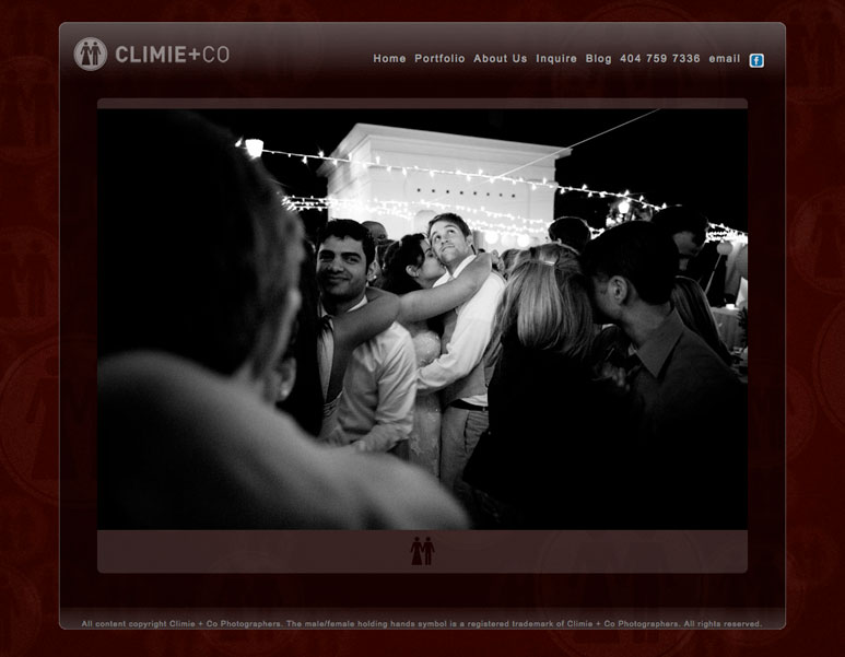
http://climie.com/portfolio.php | |||||
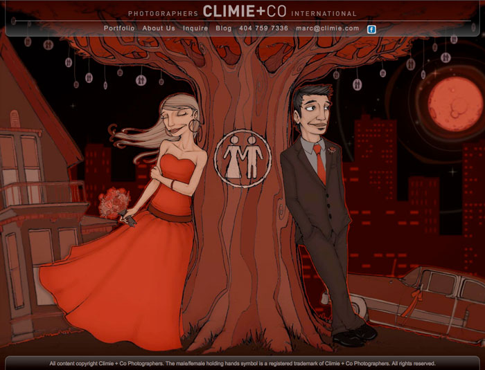
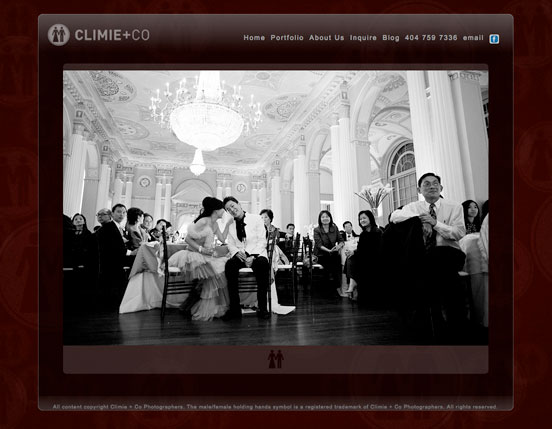
Look at this original approach to a wedding site. You don't want to leave the site and it makes you dream. I think it is a great reaction to the traditional wedding site... | |||||
Web news at: Smashing magazine, HERE |
|||||