Recognize the negative space in an image and its effect on your reading process of that image.
Negative space is directly related to the figure/subject in the image but is delimited by the outer frame. The image's proportions are very important for negative space, since it defines its shape and internal tensions.
The shape, extension and subdivisions (if the object touches the outer frame) of the negative space configures the image's composition.
by Betty Edwards. link to Amazon

Landscapes are very interesting oportunities
to redefine the importance and use of negative space.
This tiny figure, in comparison to the importance of the background makes us visually relax and wonder in the
inmensity of the space.
It feels almost silly that we consider "negative space"
as what is not important in the image.

Where is the negative space in this image?
There is none. Each façade is an object or subject
and they overlap one another.
It is important to see how the psychological impact
of the image is completely different: the eyes constantly wander with no rest.
We try to anchor the eyes in the window shapes,
the only well deifned-closed shapes in the image.

Where is the figure in this image?
Lanscapes are exceptional types of images were you can appreciate a very wide space without the need of a figure.
When the brain is not trying to identify a figure or object it pays attention to other possible forms of organization, usually in the form of patterns.
Each one of those irregular rock shapes could work as an object or figure but there is not enough contrast to identify them against a possible background (the snow also appears cut in very similar type of shapes).
Because of those characteristics landscapes and abstract patterns are perfect kind of backgrounds for web pages. They will avoid visual tension with any other subject.
Remember that the key to avoid visual tension is to soften the image contrast (very dark against very light tones) and to avoid closed shapes.
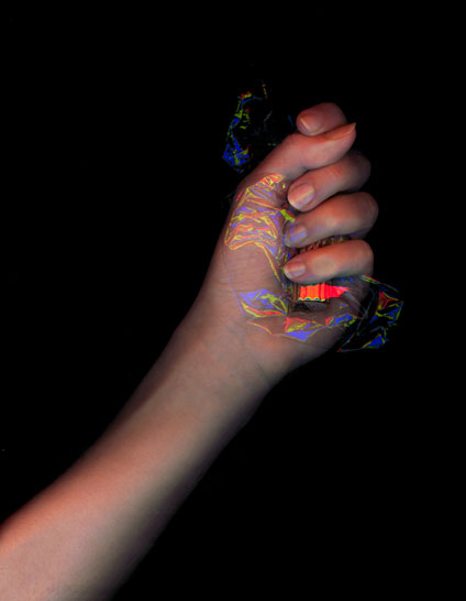 |
The nuances of the images catch your attention and your brain considers |
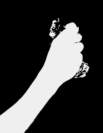
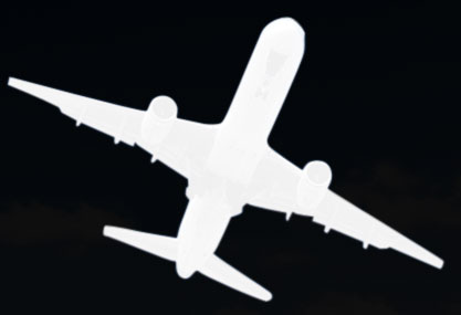
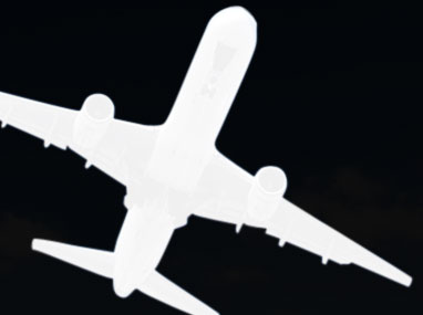
An image with no detail helps you understand the structure of figure&background contained in the picture. The object in this image is aligned with a major diagonal, so the negative space extends through two almost symetrical areas. |
 |
 |
||
 |
||
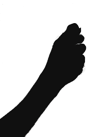
Because negative space always refers to the most outer frame you have to keep an eye on visual references.
If you looks at both arm negative-images at the same time and keep the reference of the boxes below, you will see a face, withe the images acting as eyes.

Picture of a stool and its negative space.
This is a rational image that lacks any kind of emotional suggestion.
The negative space is completely even and supports the clear description of the parts.
 |
 |
|||
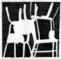
An artistic image describing the negative space between a group of chairs.
The negative space is highly unequal, and becomes divided in an interesting amount of parts.
The forces presented by the masses of the Negative space are putting together a composition: a balance of tensions between the shapes.
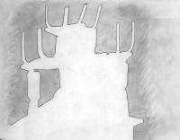
Notice that negative space not only refers to the proportion of figure&background within the image: sometimes different graphics on a page can relate to eachother with powerful structures, like the repetition of a same inage with a central element.
Those graphics were shown up on the page and seen in group could resemble the structure of a face.

 |
 |
 |
||
 |
 |
 |
Negative space in video frames.
Negative space is as important in video as it is in still images since it gives as very important information on the subject and it dramatically changes composition.
It is specially important when you need to extract a frame from a video to display it as a still graphic.
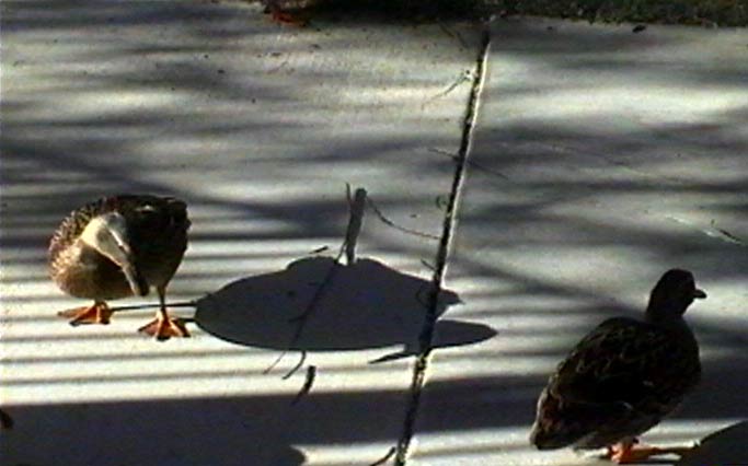
In this frame of the video we can see the figure (the duck) and the background, the floor including the shadow, fine
We are going to be considering the duck AND the shadow as our figure or motif for the still graphic.
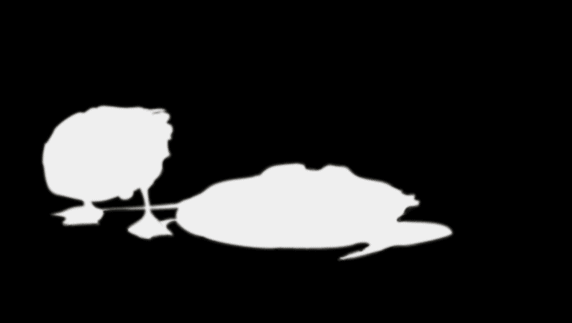
When we look at the isolated negative space we realize that we cannot clearly see the shape of the duck in the figure, although we can recognize the shape through the form of the shadow.
Selecting this frame, then, will bring the connotations of the structure of the negative space and symbology interpretations with it.
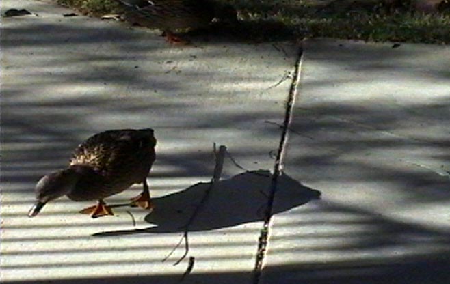
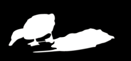
When we look at the isolated negative space we realize that the duck's shape can be easily recognized but the shadow looks greatly deformed.
Selecting this frame will bring the connotations of the structure of the negative space and symbology interpretations with it.
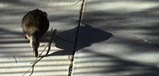
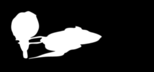
When we look at the isolated negative space we see that the position the the legs in the shadow make up a confusing image, but it is also a poetic one, with more formal implications that the previous ones.
Selecting this frame will bring the connotations of the structure of the negative space and symbology interpretations with it.