Vector graphics are very clean and crisp; sometimes that look is problematic because it doesn't suggest warmth or coziness.
If you want to "warm up" a vector based Illustration,
 you can introduce a bitmap visual texture to it. you can introduce a bitmap visual texture to it.
This will mean working with Photoshop on a photograph with a good visual texture to work out a uniform texture the size of your Illustrator artwork. Then importing that photoshop bitmap-based image into Illustrator.
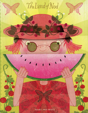
The covers of the "Land of Nod catalog" are always very textured but as you see the texture doesn't interfere with the reading of the image, it just makes it richer in visual detail and gives a warmer feeling to it.
See also how Blending modes are working to accentuate aspects of the artwork: the hat's band, the raspberry motifs, the glasses and the central butterfly are set to Multiply, providing beautiful darker tones to the image.
Some lines look somehow irregular (like the frame of the glasses or the lines of the hands) but the line work of the Illustration is so consistent that it just makes the image look more like an art piece with a touch of hand made work.
|