|
|||||||
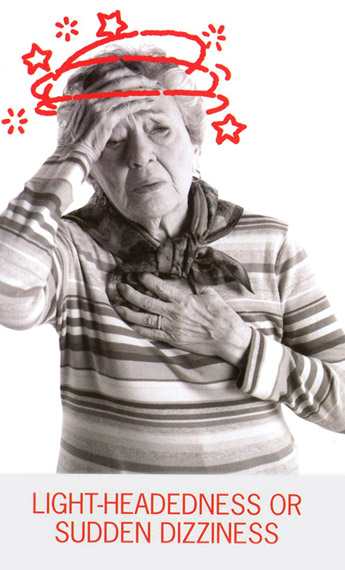
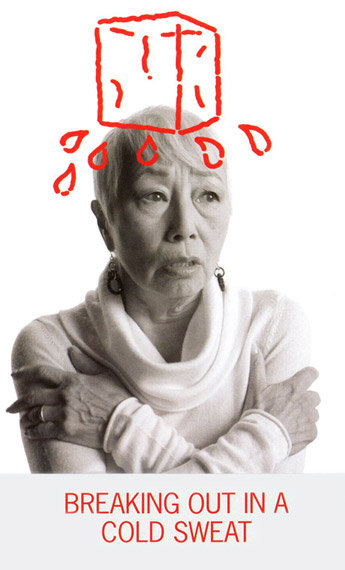
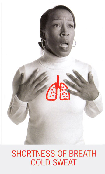
Those images are from a graphic campaigh to warn about women's particular symptoms of a heart attack. Notice the beaufiful detail in the image on the right of the little finger resting on top of the Illustration. To make an illustration and a photograph blend you will have to use composition, tone (light-darkness) and chroma (color) to your advantage, to blend or make stand out. In this case, the saturated red on a grayscale theme stands out literally (as a color) and metaphorically (a heart that still pumps). You see 3 images here but a total of 7 images were used in the poster to describe the main range of possibilities. Click here to see the whole poster.
|
|||||||
Designing the header of a blog is an important graphic campaign that defines the spirit and style of a blog and hopefully frames the type of content we will find, making it, of course, as attractive as possible. I have chosen this one becauseI like it as a design. I think it woyu;ld have worked much better if the sillouette had included the details of the photo from which it was traced: it would feel more personal. |
|||||||
The background is set here to a band of bright red with a think darker band as a background of the header, anda very dark gray for the background of the body. Notice that there is a big logo on the upper right that links to a feed option for the blog, and then another big round tab ( with a rounded square pill in dark red and a yellow star with text) that marks the column for adds and content (further down). The style for the tabs is an option that comes with the blog template but the graphic artist made it work very good with the content.
|
|||||||
|
|||||||
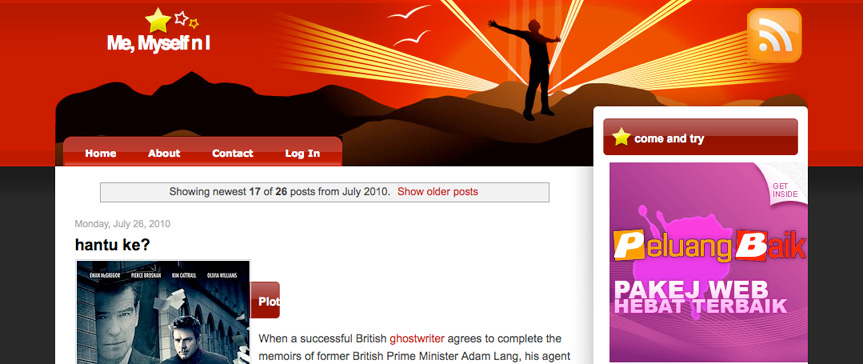 Header fom the Blog " Me, Myself n I"
