Self Portrait Project
   
Liz Wentling

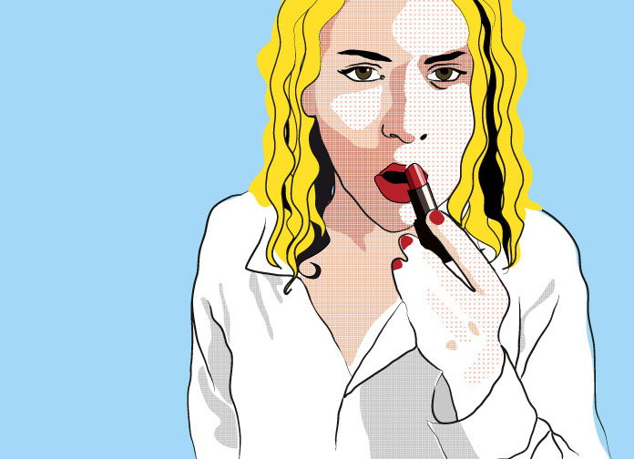
Notice how fills and lines in Liz's artwork don't exactly match.

That gives a nice flow and dynamism to the composition: it makes it look alive, ready to move.

She is also changing the thickness of the lines (using a brush, not the pencil. Brushes "technically" produce fills, not lines, you we'll see that they work with the fill color. More on brushes on Module 8)

The three images on this page are using at a certain point patterns as a fill.

Patterns, in this case will make you work like in a collage. Patterns are a type of a fill and you can learn more about them on module 14.

Liz work reminds me of the work of animators in the movie "Waking life" or "Scanner Darkly". That can be a great source of inspiration for this project.

Liz Wentling, finalist in the Digital imaging category at Showcase 2011
 

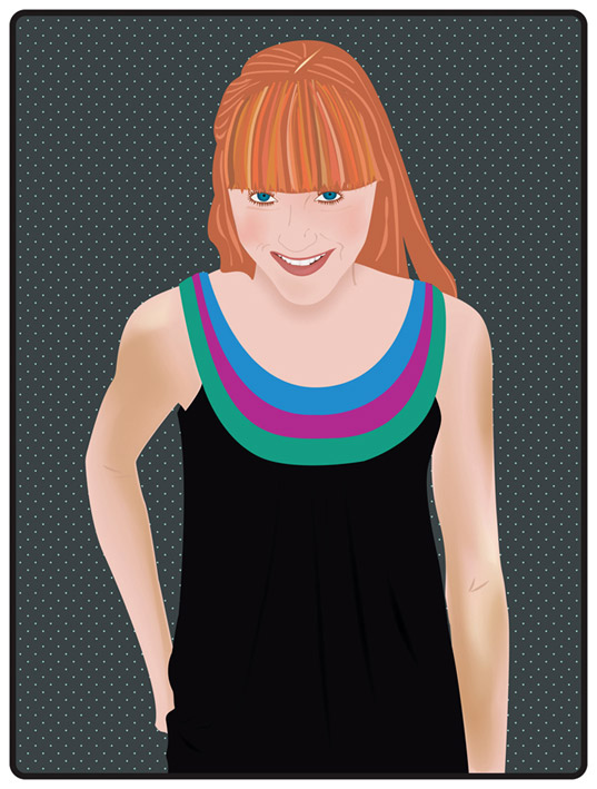
Maryn uses very strong volumes (the black fill of the dress, the 3 color-bands on the dress, the hair...) the contrast is even stronger because it is seen against a pattern.

She has kept the skin very subtle but with great nuances (look at the left shoulder or the shadow on the neck under the chin). Because the gradients change so seamless and subtle I would say it was executed with a mesh (see module 8 for that).


The color palette is very good, obviously built to enhance her features. The strong emphasis on the eyes, with great amount of detail, works great against the dramatic line of the hair-bangs.
I think it was a great idea to emphasize the vertical direction all through that plane with shapes in similar warm tones: it breaks the rhythm of the dot pattern and emphasizes the half moon that the collar builds.

Maryn Howard, MAT_112 student Spring 2011

Merry uses the hair as a way to introduce rhythm to the picture and break the background pattern.

It is very interesting that she keeps some areas of the background pattern on parts of the face. It works great under a semitransparent gradient.

She even uses the same pattern as the fill for the eye color, with a gray-semitransparent gradient on top to create more definition. Notice how the pink-semitransparent gradient works the planes that the glasses create.
This is a very sophisticated work that reflects a good background in studio Arts (drawing, painting, understanding of light effects over volumes...). If you don't have enough experience in classic art, remember that both fields, Digital Arts and Classic Studio-Arts compliment each other, since they work with the same type of Thought and Observation behind.

Merry Young, finalist in the Digital imaging category at
Showcase 09