|
Typeface
Font |
Type family |
Type combination in lay-out |
Letter-spacing or Tracking General horizontal space between characters The amount of letter-spacing in text can affect legibility. 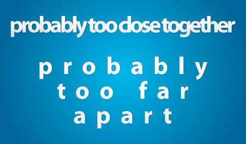 |
KerningSpace between specidic couple of characters In digital typography, kerning is usually applied to letter pairs as a number by which the default character spacing should be increased or decreased. Reducing the default character spacing is widely used to fit capital letters, such as T, V, W, and Y, closer to some other capital letters on either side (especially A), and to some lower case letters on the right side, such as the combination Ro. It is also used to fit a period (full stop) closer to certain letters (T, V, W, F, y, r). Auto kerningSome typographic programs provide an autokerning feature. Autokerning simply takes into account a predefined list of common kerning pairs, and if the outlines of two consecutive glyphs are spaced too far apart, makes a kerning entry. It is rarely a sufficient alternative for manual kerning.
Great page on Kering @ Canva 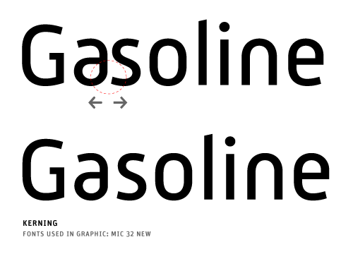 |
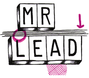
LeadingVertical space between lines The term originated in the days of hand-typesetting, when thin strips of lead were inserted into the forms to increase the vertical distance between lines of type.
|
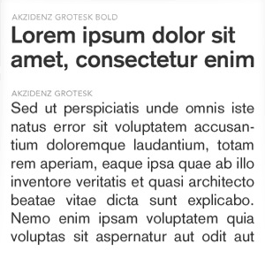
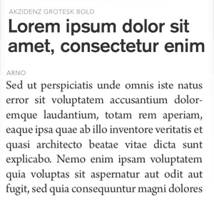
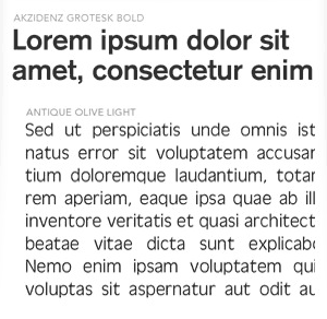
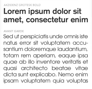
Below you can see a simple type test with always the same font as a heading and different choices for the body of text. You should look and compare the boxes with your eyes slightly slanted so you can appreciate the effect of the font on the negative space of the white page.
 |
 |
 |
 |
|||
| Same Typeface for the Heading and the body-text. The use of Full Sans serif results in very clean page. Effect: Coherent and Constant but a bit boring. |
Sans serif for the heading, serif for body of text. This is a strong serif that gives a professional image and a news-paper like look. |
Sans serif for both Heading and body of text. Antique Olive is an Oblong serif (Bowls are elongated) what makes it work a bit strange with Akzidenz, which is a very round serif. The page has very good legibility, though. |
Sans serif for both Heading and body of text. Avant Garde has very round bowls, included a perfectly round "a". In this big block of text and working with this font size the round effect is excessive and compromises legibility. It might work better if we reduced the font 2 points. |
|||
 |
 |
 |
 |
|||
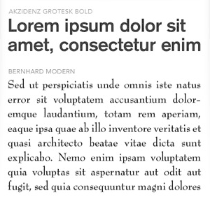
Sans serif for the heading, serif for body of text. Bernard is a serif font with very high contrast in the strokes (extreme contrast of thick and thins, hairline serifs). This makes up for a very characteristic negative space in the area of the body of text. |
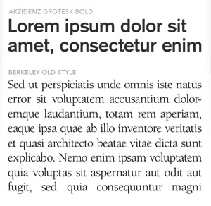
Sans serif for the heading, serif for body of text. Berkeley is a very round serif with short distance between letters (letter spacing) and it creates a very consistent block of text. Legibility in this small size is not optimum. |
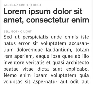
Sans serif for both Heading and body of text. Bell Gothic is the most oblong (elongated) of all the sans serif fonts on this screen. Notice also the wider distance between letters. Good legibility but text longer piece of text. |
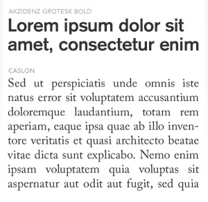
Sans serif for the heading, serif for body of text. Caslon is a classic serif with good balance of roundness and nice space be |
ADOBE: type classifications, HERE
Typographic glossary (with visual graphs), HERE
Another page on Kerning, HERE
Simple page on kerning, leading and tracking, HERE
Great infographics in the classification of Type, HERE
