
DESIGNING FOR MOBILE DEVICES
In the 21at century designing for a variety of platforms is a must including designing for mobile media. Mobile users are very demanding expecting more than ever from features, visual appearance and usability. Many are used to the stunning graphics that have always been an essential part of the package in the world of entertainment and games. The designer's job is to design a polished and attractive visual appearance while keeping in mind the importance of functionality.
The emotional appeal of graphics
As is common in designing for a demanding marketplace, it is very important to consider the emotional appeal created by good design. The design of mobile applications must take into account this importance and not solely depend on the hype around new technological possibilities. The designer needs to work closely with the developer to understand the usability and functionality then translate those features into something that visually captivates the interest of the user. A well-designed visual appearance combined with an application that fulfills the user's needs means that the development team has created a complete package of high quality.
The rules for mobile design
The classic principles and rules of graphic design apply to mobile devices as well. However, there are some additional considerations such as the mobile device capabilities and the context of use. The small size of the device and fact that there can be distractions during use can pose additional challenges such as limited display real estate and increased need for clarity and usability to meet the various different use contexts. Mobile graphic design requires the ability to consider and accept all the limitations and be creative in developing solutions. It is not enough to copy what has been traditionally done for the web.
• Understand the capabilities of the device BEFORE designing.
• Create a polished splash screen or an opening animation to set the user in the right mood right away.
• Avoid too many opening screens.
• Maintain the excitement of the first screen on subsequent screens to hold interest.
• Know the screen size then make every pixel count.
• Make the most out of the small screen dimensions. Consider turning the design for a landscape format.
• Keep in mind other components that are needed when not in full screen mode such as the top of the screen battery and signal indicators.
• Group elements properly.
• Don't try to include too many components or too much information on the same screen.
• Make sure your graphics are not so intensive that they drain battery power.
• Consider physical conditions and use to design a display that is easy to view in varied conditions (i.e bright sunlight, night, poor lighting, etc.)
• Work in phases: the design draft phase, UI specification phase, and the implementation phase. The draft phase is usually used in market testing so should be rough. This allows the users to evaluate the entire product rather than just the details of the graphics.
• Test your work and do it early and through all phases.
Key components
Color - Keep colors simple. Use the color wheel to use the basic rules of color theory. Note that that mobile device displays are usually dominated by blue tones (eg. blue tones make better gradients). Use a single hue and values within it, analogue hues and complimentary colors.
Contrast - Make sure that every element has enough contrast with its background and the surroundings.
Vector and bitmap graphics - Using vector or bitmap graphics depends on size and use. Scaling the vector graphics uses processor capacity, so in a highly resource-intensive application you might be better off with bitmaps. Also, if the application is targeted to several devices with different displays, you may need several versions of the UI graphics. Consult with the programmer to find out if special effects should be replaced with code.
Fonts and text - Because of the small screen size and low resolution readability is essential. Avoid serif fonts at small sizes. Do not use unnecessary formatting, such as italics or underlining. Make sure to separate information into smaller units or blocks to control how the user navigates and proceeds. Try not to embed and hardcode any text in the graphics to make localization work easier in case the application will be used in other languages. Also find out if changing the font size is allowed in the application.
Animation - Although animation gets the user's attention use it cautiously and limit the number of animations to one at a time.
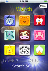
Icons - Icons should symbolize the actual metaphor and provide visual clues as to what they represent. Avoid 3D graphics for small icons. Pay attention to cultural considerations and commonly used icons.