|
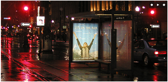
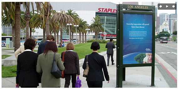
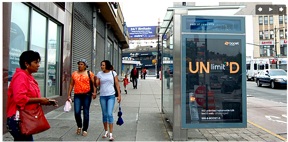
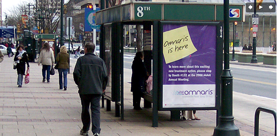
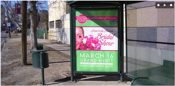
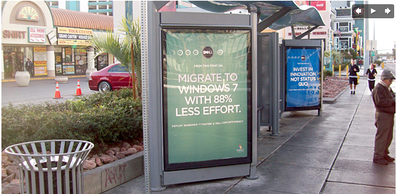
Outdoor Advertising Designing outdoor advertising is visual storytelling. Outdoor advertising is a great way to reach people where they live, work and play. It is media that is everywhere, and when used with creativity, it creates brand new ad spaces where none existed before Many people still think of outdoor as just billboards. Well, the hard-working billboard is still going strong but we are here to tell you that outdoor advertising is more than just billboards. Looking to reach pedestrian and vehicular traffic with your advertising message? Transit Shelter displays — also known as bus shelter ads — may be just the right media for your next ad campaign. In urban areas, transit shelter ads are placed on heavily traveled streets with lots of potential readers on the sidewalks and in cars. The frequency of bus stops in many city areas allows an advertiser to place a message repeatedly along heavily commuted roadways. In more suburban areas, as bus routes branch out towards and past the city limits, bus shelter ads are often one of the few choices that advertisers have for getting their message next to the road and in front of a commuting audience. For areas that do not have billboards as an advertising option, transit shelter advertising will often be an excellent alternative. Also consider gas station ads as an alternative to billboard advertising in these types of areas. Transit shelter advertising uses large interior and exterior display areas that are illuminated at night for excellent visibility. Sizes will vary but a typical ad display will be approximately 4' wide by 6' high. http://www.emcoutdoor.com |
|
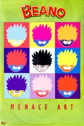
The poster and outdoor advertising have much in common. Typically posters include both text and graphic elements, although a poster may be either entirely graphical or entirely text. Posters are designed to be both eye-catching and convey information. They are a frequent tool of; advertisers (particularly for events, musicians and films), propagandists, protestors and other groups trying to communicate a message. Posters tend to be a smaller size than most outdoor advertising and are designed for indoor use at a closer viewing range. It's important and helpful to study posters as you design for outdoor advertising. Both are trying to attract attention to a specific audience and to convey a message. The following information can be applied to both posters and outdoor ads. 1. Use plenty of white space: Be DRAMATIC 3. Use contrast to draw attention to your design. 4. Avoid gradient fills; they look great on your monitor, but on paper they can be disappointing. 6. Review, spell check, review, spell check: The version you print to the color printer should be your final draft, so do everything you can to make sure your design is error-free and just as you want it. |
• 20 Insane and Grunge Type Poster Designs
|
|
Digital Outdoor advertising Digital outdoor advertising is turning old media into new media and a sluggish outdoor advertising industry into a growth industry. With digital signage becoming a growth area for traditional outdoor advertisers such as Clear Channel Outdoor and Lamar Advertising, even Google is set to get in on the action. The outdoor advertising industry, until now dominated by large roadside billboards, is experiencing a paradigm shift as static ad displays are being converted to digital - and in the process becoming much more lucrative for advertising companies. In a bygone era, billboard advertisements stayed up for one to twelve months before being manually changed. Now, converting the old vinyl displays to digital ones allows outdoor advertisers to rotate images from several different advertisers throughout the day, called "day-parting" in industry parlance. Remember you’re dealing with signage, and while it’s got sound and motion, it’s not quite the same as television. Match up your text and visuals, and treat each slide like it's a stand-alone poster. Use visual transitions to link related slides within a larger piece of content. Think carefully about repurposing existing content. You’ve got 15 seconds to make your point. The good news is you’ve got a captive audience. Place your most important messages at the beginning and the end of your ad. Introduce the first item on the list at a slower speed, and leave enough time at the end for people to remember the last item. Choose your two best messages and get rid of the rest. Group key phrases or concepts together -- batches of three usually work nicely. Repeat important words and phrases 2-3 times in a row for reinforcement. Consider using alliteration and rhyme, since people are trained to respond well to these patterns. Keep your text simple and clear. When writing your call-to-action, start it with a verb, keep the verb and subject close together, and either leave the call-to-action on screen the whole time, or show it several times per spot. Use sans-serif fonts and large font sizes so that viewers can read your message at-a-glance. Don't use too many fonts in a single piece of content, and don't go overboard with colored text. Avoid writing in all caps. Choosing one color over another rarely has any impact on the success of your content. So, pick colors that meet your business and stylistic goals, e.g. those that match the color schemes of your venues or advertisers. Do avoid content that is too dark. More contrast between foreground and background is a good thing. A minor change like increasing the contrast by 10% can make the content easier to read, and recognizable to a much larger audience. Make it POP! Use motion selectively: you don't want to interfere with readability or comprehension. Give people enough time to read the text, and don't move your text around abruptly. When you're animating an element, try to pick something that has a strong and easily-identifiable silhouette. Consider keeping your logo and other important features on the screen at all times, without excess motion. Info from: Pumpflix has tools to help you build content and compelling digital signage. |
|

