logo

Advertisements

Poorly designed ads
- get attention
-don't usually sell product

Poor organization:
- too many focal points
- no integration of text and graphics (unity)
- missing information

Small Ads
- need to standout to be noticed
- placement on page
- test out different placement
- strength of ad when surrounded by other ads
- 1/2 page ad
- 1/4 page ad
- 1/16th page ad


Newspaper ads are sold by a column inch.

Santa Barbara Newspress: Advertising rates

Independent: Advertising rates

Newspaper Advertising site

Grids
- flexible grid

Borders/rules
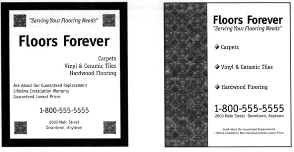
- isolates your ad and helps it to stand out

White space
- give ad breathing room
- allows it to stand out when surrounded by other ads

Headlines
- prioitize information
- draw attention
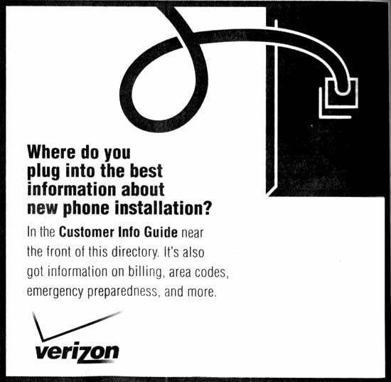
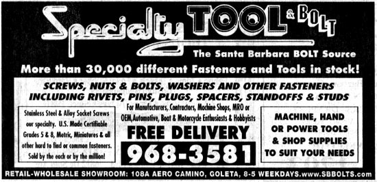
- use reversals
- rotate heads

Screens
- add "color" to ad
- use a variety

Size of Type
- keep prices proportional to graphics

Logos and Contact info
- logos should be prominent but not over powering
- contact info should be easisly visible


Full page ads
- more expensive
- no control over opposite page
- choose appropriate publication for product
- must be well designed (can use effects i. e. bleeds)

Classified Ads
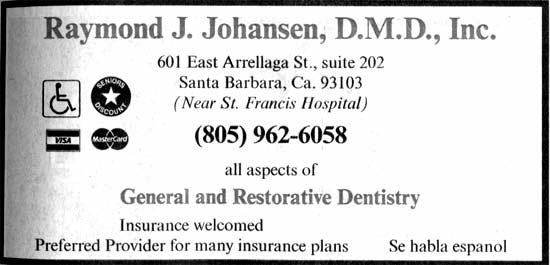
- usually on page with "gray" areas
- use white space
- use borders
- use high contrast

Camera-Ready art
- digital file for magazines


Checklist
- borders/ rules
- white space
- prioritze info with point size
- headline prominent but not distracting
- products, prices are clearly connected
- all correct contact and pricing info included in ad
- logo prominent
- consistent sizes for repeating elements to create unity