DESIGN:
To create order out of chaos.
Design consists of both elements and principles.
Graphic design is visual problem solving using text and/or graphical elements. Your aim is to create something that is pleasing to the eye, and gets the attention of the viewer. But things can't just look cool. They have to work as well.
DESIGN PRINCIPLES:
Guidelines or rules that work with elements of design to accomplish creative objectives.
- Alignment
- Balance
- Contrast
- Emphasis
- Flow/Rhythm
- Unity by:proximity, repetition
Align left keeps all lines even on the left side
and ragged on the right side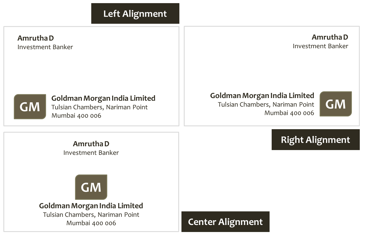
ALIGNMENT
The visual connection between words, graphics, images and rules on a page when their edges line up with each other. The concept of alignment says that everything on a page should be visually connected to something else on the page. Nothing should be placed arbitrarily. When elements are aligned they are connected to each other, even if they are separated on the page. You may have noticed that the alignment of the subheading "Alignment" was centered. As it is said, "Good design is transparent." The lack of alignment between the subhead and the related paragraph made your eye have to travel across the page, and it was probably enough for you to notice.
Example: lining up the top of a photo with the top of a headline. It's one of the principles of design that help us create attractive, readable pages.
Use alignment to: (view all links at bottom of web page)
• create order
• organize page elements
• group items
• create visual connections
Good alignment is invisible. Most readers won't consciously notice that everything is lined up neatly but they will feel it when things are out of alignment.
Align RIGHT keeps
all lines even on the right side
and ragged on the left.
Centered alignment is when all the lines are centered one above the other in every line.
CENTERED alignment should only be used for a headline with two or three lines.
Centered alignment is also used for poems and wedding invitations.
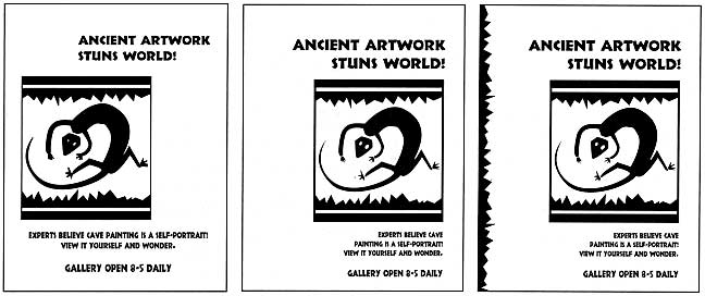
Example Below:
#1. Mixed alignment -doesn't work.
Creates unorganized look.
#2. Align right - Elements "touch" or align to the invisible vertical line on the right.
#3. Align right with vertical bar on left that repeats the jagged bars in the graphic to create unity and to balance the design.
BALANCE in Design:
Order achieved by the relationship of forms to one another and the space around them.
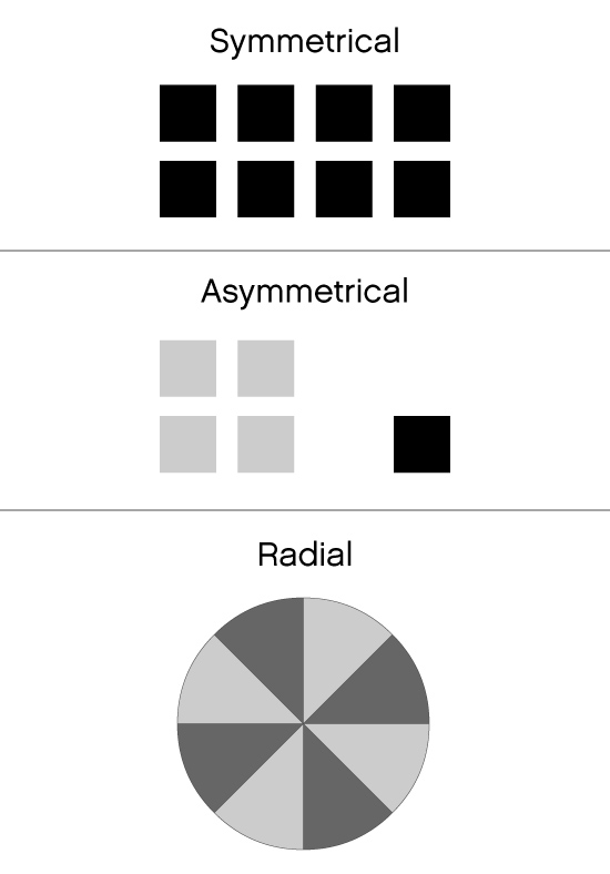
Balance is an equal distribution of weight. Balance in general is seen as equal visual weight. ‘Symmetrical Balance’ would be described as a central axis dividing the composition in the middle, horizontally or vertically, with the same design on both sides, what we would think of as a mirror reflection.
A design that is balanced holds together, looks unified and feels harmonious.
Unbalanced design feels uncomfortable.
Balance involves the following visual factors:
- weight
- position
- arrangement
Visual Weight is creating the illusion of visual weight on a two-dimensional surface.
Size, value, color, shape, and texture of a mark all contributes to visual weight.
Position
Same mark positioned in different places on a page will appear to change in visual weight.
Balance- Balance is one of the important principles of a successful design. Balance in graphic design can be achieved by adjusting the visual weight of each element, both in terms of scale, color, contrast, etc.
Symmetrical and Asymmetrical
Two approaches to arranging elements in a design.
-Symmetrical balance
is achieved by repeating shapes in the same position on either side of a central axis, a mirror image.
Formal / business feel. A vertical axis is required to achieve balance with symmetry. Part of the reason is that we have struggled throughout our lives to perfect our balance in order to stand, walk, ride a bike, etc.. To do this we must have exactly the same weight on both sides of our bodies. Our axis of symmetry is vertical and this makes a good model for symmetry in visual information.
Symmetrical balance is also called formal balance because a form (formula) is used -- a mirror image about a vertical axis. The results look formal, organized and orderly.
There is a strong emphasis on the center axis in symmetry since all of the information is reflected from there. This should be taken into consideration when designing with symmetry. It is easy to over emphasize the center.
Symmetrical balance guarantees left to right balance, which is the most important aspect of balance. But there is more to balance than that. Top to bottom balance is also important. Most images seem more stable if the bottom seems slightly heavier. If the top seems too heavy the composition can look precarious.
Balance between the center and the outsides of the image must also be considered. Fortunately our own sense of balance is usually good enough to feel when the balance in a composition is wrong. Pay attention to your own sense of balance and you will do well. Your sense of balance, like anything else, can be improved with practice and experience.
-DaphnePalomar.edu
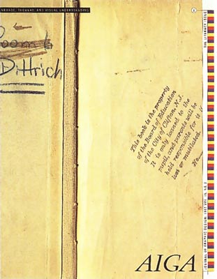

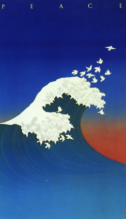
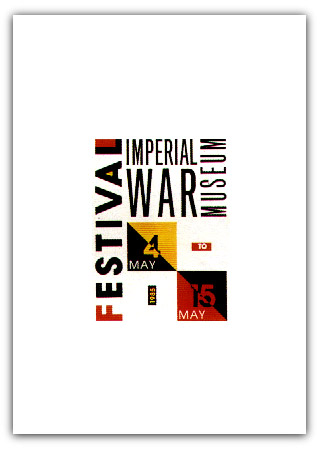
-Asymmetrical balance
is placing elements in unequal and opposing positions within a given space to create an informal / creative feel. Asymmetrically balanced layouts have elements that don’t mirror each other across a centerline. These layouts can be more difficult to design but can be appealing to viewers. To create an asymmetrically balanced layout,experiment placing several small items on one side, and one large item on the other side. Using light and dark elements on different sides can create asymmetry. An asymmetrical balanced design can create tension, drawing the viewer in.
Relation of all the elements in a design to each other is crucial to achieve asymmetrical balance.
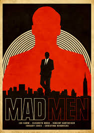
Moving one element can make or break the balance in a design. The uneven vertical spaces create interest, the narrow horizontal bar on left points to the block of copy(text). The angle of the copy points to the AIGA logo. The vertical squares on the right"anchor" all the mentioned elements to the page.
CONTRAST:
The elements on a page should
look distinctly different from each other. It stresses the visual difference
between words, phrases and graphics. For example, it could be different colors between the text and the background color. It could be a heading set in a big, bold, grungy font combined with a sans-serif font for the body text. It could be a difference between a large graphic and a small graphic or it could be a rough texture combined with a smooth texture. Our eyes like contrast. The important thing about contrast is that the elements should be completely different. Not just a little bit different.
Contrast can be achieved by size, weight, color.
Value refers to the darkness or lightness of objects. Black against white has a much stronger contrast than gray against white. To balance these two colors, you would need a larger area of gray to balance the stronger value of black.
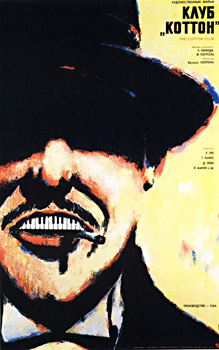
 size and color contrast
EMPHASIS/Focal Point:
What is the first thing I see?
The eye is drawn to the focal/dominant point in a composition. This organization of elements helps keep the viewer involved. The designer determines the most important element or area by the message and by what the designer feels will attract the viewer.
The most important elements on the page should be the most prominent.
The second most important element should be the next dominant.
The third most important element should be the least dominant.
This is referred to as creating a Hierarchy for the information. Divide the page into thirds horizontally. The optical center is the top third area of the page format.
Placing elements in the optical center of a page emphasizes them , creates a visual tension and excitement.
Avoid placing images in the very center of the page layout which is usually very boring to look at.
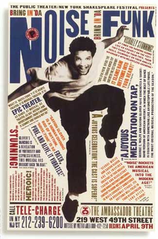
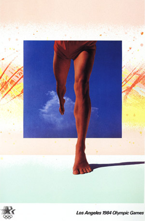
FLOW / Rhythm:
The visual path of movement that a viewer's eye follows through a page design.
Placement of elements in a manner which controls the way a viewer scans the design.
A sense of movement within the layout.
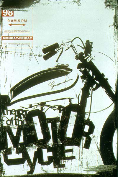
The example to the left has a lot of movement or energy.
The eye starts at the head (and you read the headline) goes down the left(your left) arm, bounces up the right arm to the title, then back to the head and down the vertical leg (to read the info at the bottom) and up the leg and over to the bent leg to the tip of the shoe bouncing off the orange type block up the blue type box on the right to the headline again.
The angled type blocks help create the energy.
Remember that a diagonal line creates movement and energy.
Unity
When all of the elements(line, shapes, graphics, body copy, headlines, photos, color) on a page feel as if they belong together.
The human eye seeks unity; when no unity is evident the viewer looses interest in the design.
A unified design is easier to read and comfortable to look at.
Unity by Repetition
Elements unify the composition by repeating the same or similar shapes, line, color, texture and images/graphics.
Unity by proximity
The close arrangement of objects.
Unity- When each elements has a clear visual relationship to one or more other elements, the composition is unified. Unity gives a sense of oneness to a visual image. The words and the images work together to create meaning. Unity of the elements helps organize a visual layout facilitating interpretation and understanding. When unity is achieved:
•
a composition does not become cluttered or confusing
•
a concept can be communicated more clearly
•
a design evokes a sense of quality and organization
Unity by variety
In creative endeavors, variety creates opposing forces and adds interest to the composition which ultimately attracts and holds the viewers attention.
Variety is accomplished through contrast, size, texture and color.

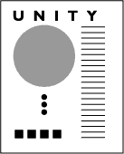
Unity by Proximity- Proximity is another very simple way of creating unity for your design. When you bring certain elements together in close proximity you are establishing a visual unity of those elements. The design to the left uses overlapping of elements to create unity.
Positive and Negative Space
or
Figure Ground Relationship
In a picture, the shapes that the artist has placed are considered the positive shapes.
The spaces around the shapes are the negative spaces or "white space".
It is just as important to consider the negative(white) space in a picture as the positive shapes.
The terms figure and ground explain how we use elements of the scene which are similar in appearance and shape and group them together as a whole.
Similar elements (figure) are contrasted with dissimilar elements (ground) to give the impression of a whole.