
Forget the Words, Enjoy the Shapes
Good typography has to do with shape, balance and color.
Always be aware of the shapes your type makes.
Using the alphabet correctly could be the difference between success and failure of a design.
The alphabet is actually a collection of abstract shapes which, when placed together in various combinations, conveys a message and we are able to communicate with each other.
Type designers over the years have developed many typefaces, with basic characters, which are beautiful forms.
With these wonderful shapes, designers can create more complicated and adventurous imagery in their designs and even use them in fine art statements.
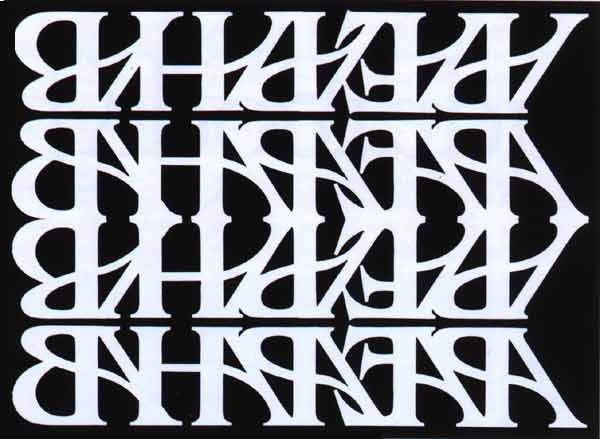
The design below was created by Bob Farber, former art director of the International Typeface Corporations's, U&l;, Upper and lowercase magazine.
Using the basic letter forms of the alphabet, and the simple principles of repeat, mirror and reverse,Farber has created a beautiful abstract image. The font he has used is ITC Benguiat.
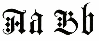
Example of beautiful Black Hand Letterforms
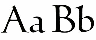
Example of beautiful Black Hand Letterforms
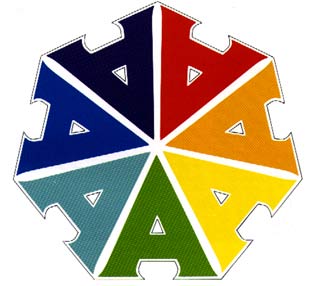
The image to the left is another one of Farber's designs. Repeating the ITC typeface Serif Gothic letter A, he has created this multicolored and intricate design. The forms, color and negative space create a fun and playful image.
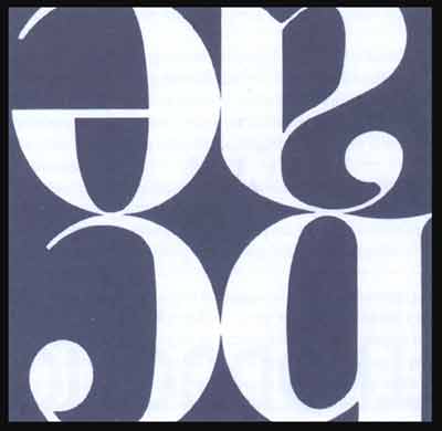
Cropping letterforms to distract from the letter it self but still to show the beauty of each form.
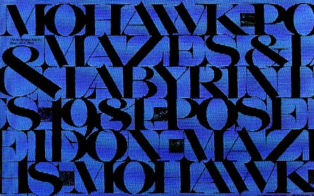
An example of breaking all the rules.
No line spacing, letters touch and a feeling of compactness.
Yet, the beauty of the thick and thin of each stroke is still visible.