
The phaomnneil pweor of the hmuan mnid.
Aoccdrnig to rscheearch at Cmabridge Uinervtisy,
it deosn't mttaer in waht oredr the ltteers in a wrod are,
the olny iprmoetnt tihng is taht the frist and lsat ltteer
be at the rghit pclae. The rset can be a ttoal mses
and you can sitll raed it wouthit porbelm.
Tihs is bcuseae the huamn mnid deos not
raed ervey lteter by istlef, but the wrod as a wlohe.
AMZANIG!
How difficult was it or you to read the paragraph above.
Not very difficult I would bet.
Type Design and Readability
Readability refers to an extended amount of text, as in a book or magazine article, and how easy it is to read.
The most important feature of readable text is that the font itself it is not noticable.
The characteristics of the font become transparent.
Factors affecting types readability include, point size, linespacing,line length, alignment, letterspacing, and word spacing.
Research has found that the typefaces people have grown up with are more comfortable and easier to read. In our culture and in our era, serif letterforms have been more easily recognizable when there is a large amount of text to read.
Classic oldstyle typefaces are the best to use when dealing with a body of text.
Nothing fancy about the type face is noticable. It allows the reader to SEE the information NOT the typeface itself. It does not have swashes or other fancy characters.
The most common oldstyle typefaces are Times, Palatino, Garamond and Bembo.

Below are the factors that make type either more or less readable:
1. Serif type
Long bodies of text are easier to read when set in a serif typestyle.
The serifs allow the eye to flow easily from one letter to the next and to link the letters into words.
The contrast of the thick and thin strokes of the letters, which san serif fonts do not have, break up the space around the letters and they are easier to recognize.
The moderate ratio of the x-height, body of the letters, in relation to the height of the upper case letters creates a more consistent, comfortable or invisible look.
IMPACT is a vert narrow and heavy face. Very difficult to read.
ROCKWELL Condensed is a bit easier to read but the narrowness of the letter forms and the heaviness of the square serifs make this a poor choice for long paragraphs of text.
Palatino and Bodoni are much easier on the eye.
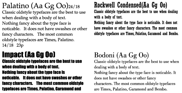
2. San serif letters usually have a larger x-height in relation to the capital letters and it is more difficult for the eye to look at large amounts of text.
If you must use sans serif type, shorten the line length, use a smaller point size and add line spacing.
CAPS/UPPERCASE and lowercase
The brain (eye) looks for chunks of information. We do not read letter by letter but phrase by phrase. The shape of the word is what the eye recognizes.
IF YOU ARE USING ALL CAPS IN A LONG SENTENCE, THE BRAIN (EYE) SEES A RECTANGULAR SHAPE WHICH IS DIFFICULT TO RECOGNIZE.
- use uppercase words for short headlines, less than ten words.
- avoid uppercase words if you need the reader to scan information quickly as in catalog heads, phone book listings
Avoid using bold and extra bold
- if the typeface has an extra large x-height, and use more line spacing.

Letter spacing and word spacing
(tracking / kerning)
The brain/eye looks for consistency.
If the letter/word spacing is uneven, the natural reading pattern is upset and the text is not comfortable to look at.
Justifying the alignment of a short column of copy will result in poor word spacing.
Rivers of white space will appear throughout the column.

Use script faces sparingly.
Be sure to adjust the letter spacing so the letters actually touch but be sure to add word spacing so the words do not touch.
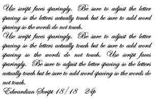
Make manual adjustments by
- deleting spaces between word,
- do a soft return (return/shift) to bring words to the next line
- alter column width
- change point size
- change typeface

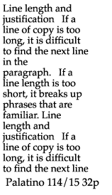
If a line length is too short,
it breaks up phrases that are familiar.
When using non-justified text, shorten the line length but be sure the lines are not too short.
TRUST YOUR EYES.
If the spacing looks too far apart or too close ...it is.
Line length and justification
If a line of copy is too long, it is difficult to find the next line in the paragraph.
- when using a readable oldstyle typeface and you want to justify it, but the spacing is awful at this length.

Lengthen the line by a few picas and add a tiny amount of linespacing.
Figure out the optimum line length and then analyze the typeface:
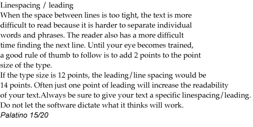
Until your eye becomes trained, a good rule of thumb to follow is to add 2 points to the point size of the type.
If
the type size is 12 points, the leading/line spacing would be 14
points. Often just one point of leading will increase the readability
of your text.
- does the typeface have a very large or very small x-height
- is the typeface san serif
- is the type being reversed out of a background or solid color
-is the typeface decorative, script or odd
- is the type being used on a presentation slide or on a web page
Useing an appropriate line length, word spacing and avoiding all caps will allow you to use a more distinctive typeface in your designs.
Linespacing / leading
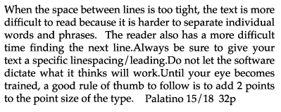
When the space between lines is too tight, the text is more difficult to read because it is harder to separate individual words and phrases. The reader also has a more difficult time finding the next line. Until your eye becomes trained, a good rule of thumb to follow is to add 2 points to the point size of the type.
If the type size is 12 points, the leading/line spacing would be 14 points. Often just one point of leading will increase the readability of your text.
Always be sure to give your text a specific linespacing/leading. Do not let the software dictate what it thinks will work
Increase linespacing if..
- the line length is longer than usual
- the font is sans serif and the x-height is very large
- the type is being reversed out of a background or solid color
- the type has a small x-height and is on an average line length
(a small x-height naturally creates more space between the Lines)

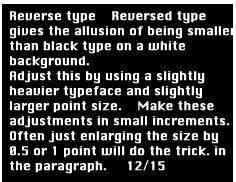
Reverse type
Reversed type gives the allusion of being smaller than black type on a white background. Make these adjustments in small increments. Often just enlarging the size by 0.5 or 1 point will do the trick.

Adjust this by using a slightly heavier typeface and slightly larger point size.
When reversing text, make it a bit larger and bolder and don’t use a “light” typeface with fancy swashes.
Italic and script
These are difficult styles to read. Use them sparingly.
NEVER use them for a paragraph of type.
Use italic type only to draw attention to a word or phrase in a paragraph.
Use italic and extra light for accents.

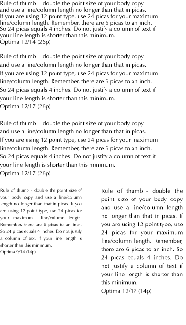
Rule of thumb
- double the point size of your body copy and use a line/column length no longer than that in picas. If you are using 12 point type, use 24 picas for your maximum line/column length.Remember, there are 6 picas to an inch.
So 24 picas equals 4 inches.
- do not justify a column of text if your line length is shorter than this minimum.
Adapted from
“The Non-Designers Type Book’ Robin Williams
"Graphic Design Solutions" Robin Landa