 |
|
Purpose of Grids: • improve communication: make the page more effective in getting the message across to the reader • make the message clearer to the reader • make the page appear more interesting • builds a family resemblance in multi-page publications • create order and continuity • avoids ambiguity • speeds up layout time by giving you a frame work to follow Some grids are best suited: • to deal with text with sidebar illustrations • for layouts where a variety of images are dominant and text is secondary • for a mixture of both type and images
|
GRIDS Think of the grid as a plan -- a plan for your page layout Many of the pages that you see everyday have a grid: You may not see it but it is there, holding up the design, establishing structure, guiding the page elements. A Grid is:
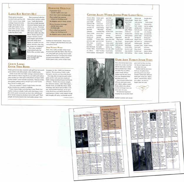
Grids don't appear on the printed piece but their influence may be evident in the They are a series of guidelines that determine the margins of the piece, space between page elements (headlines, body text, photographs, etc.), and let you know where to put things on the blank page. While it is invisible in the final printed piece, you'll need to be able to see it during page construction.
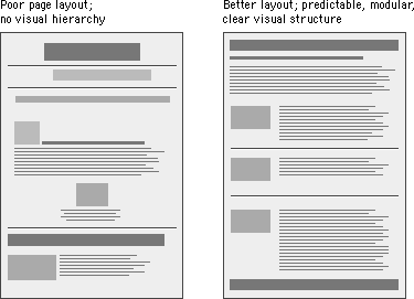
Poor page layout on left below.
|
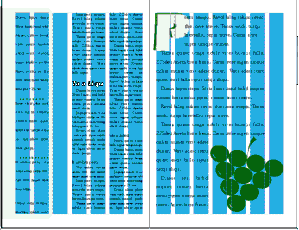
Grid columns are a container to hold the type and images. The type style and point size must be appropriate for the size of the column: Rule of thumb: |
|
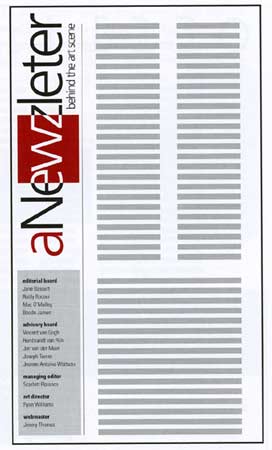 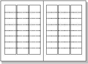 |
Grid Units Grid units are the primary locations on your page where you will place text and images. They determine placement not necessarily size. Grids provide visual organization Grids have different uses and may not be appropriate for all situations or all designers. Publications such as magazines and newsletters almost always require a grid. It provides page to page continuity. |
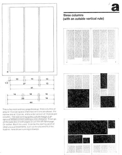 |
Choosing a Grid Choose a grid based on the content and adjust content based on the grid The right grid also enhances organization and makes it easy for the viewer or reader to understand the content. |
