Catagories/Classifications of Type
To most of us, one type face looks like another.
The reality is that each typeface has it's own specific characteristics.
As your eye becomes better trained, you'll recognize the specific typeface by the texture it creates on the page.
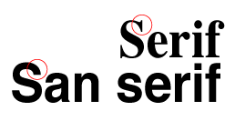
Serif
short strokes that extend from andat an angle to the upper and lower ends of the major strokes of a letterform.
By studying the subtle changes found in type over the centuries, especially between the 15th and 18th centuries where the changes are most obvious, you will begin to see differences.
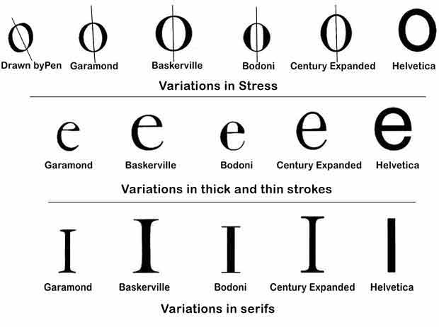
The five catagories and the typefaces which represent them are:
Oldstyle/Serif - Garamond (France)- 1617
Transitional - Baskerville England)- 1757
Modern - Bodoni - (Italy)1788
Egyptian/Slab Serif - Century Expanded - (US)1894
Contemporary/San Serif- Helvetica - (Switzerland)1957
Serif Style
Roman stone masons incised phrases and dedications into stonework for shrines, villas.
Used an iron chisle to laborousily cut letterforms into the stone.
Difficulty to get a neat ending stroke.
To clean up ragged ends they added a short extra stroke at the end of the letterforms called a serif.
Romans first invented Old Style typefaces.
The thick and thins strokes were further developed by the scribes hand lettering using a wedged shape pen .
The first craftsman using a printing press imitated these letterforms.
In the 1400s when moveable type was developed, the letters carved out of metal resembled the original handlettering of the scribes.
The first books to be printed were large books such as the Bible.
The first typefaces were designed with one purpose, to be readable.
OLDSTYLE - 1617
- Garamond
- Caslon
- Sabon
- Bembo
- Galliard
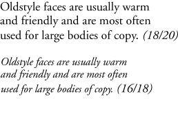
Oldstyle faces are usually warm and friendly and are most often used for large bodies of copy.
These faces are the most invisible. You don't really know they are there. They allow the eye to read the words without shouting at the reader.
The letter forms don't have any design characteristics that interrupt the message.
Oldstyle:
- heavily bracketed serif
- diagonal stress
The lowercase letters slant and have serifs which are attached to the main stroke with a bracket or a curved stroke.
There is little contrast between the thick and thinstrokes .
TRANSITIONAL - 1757
- Baskerville
- Stone Serif
- Times Roman
- Perpetua
The contrast in the thick and thin strokes became more noticable than in Oldstyle type and the serifs became finer and the
stress is almost vertical.
The development of smoother papers, better printing inks and more advanced printing methods allowed for these changes.
MODERN - 1788
- Bodoni
- Didot
- Fenice
Times began to change and the Oldstyle and Transitional styles
became obsolete.
The new styles reflected the changes in the world. A more mechanical look was desired and the type structure no longer resembled hand written letters.
The Modern era was ushered in.
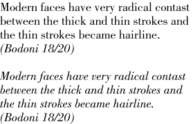
Modern faces have very radical contast between the thick and thin strokes and the thin strokes became hairline.
The serifs are all vertical or horizontal and have little or no bracketing
(curved line connecting to the stroke).
The letterforms have a vertical stress.
The Modern faces tend to have a cold or severe feel to them. Bolder and dramatic than previous styles.
Most Modern faces are not very readable and therefore should not be used for lengthy body text or be used at a small point size.
The thick and thin strokes are hard on the eyes.
EGYPTIAN / SLAB SERIF - 1894
- Century Expanded
- Clarendon
- Rockwell
- Melior
- Bookman
As the Industrial Revolution took off, advertising products to the consumer became important.
Type designers needed to develop a face which was easier to read than the Modern faces.
They created letterforms which still had serifs but the serifs are now thick and horizontal. A more mechanical look was created to express the industrial age.
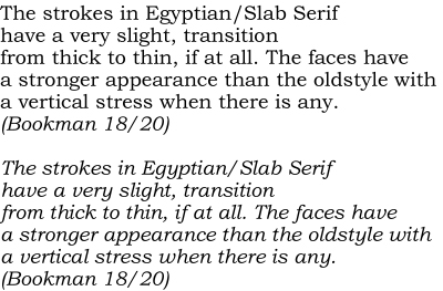
The strokes have a very slight, transition from thick to thin, if at all.
The faces have a stronger appearance than the oldstyle with a vertical stress when there is any.
If the slab serif is not too heavy, it can make a very readable face.
CONTEMPORARY / SAN SERIF - 1957
- Helvetica
- Futura
- Uniivers
- Frutiger
In 1919 when the Bauhaus school of design was formed, the san serif
face became popular.
The Bauhaus motto, "form follows function" caused designers
to strip designs down to the bare essentials, the simpilest, most
functional form.
This new school of design influenced the world.
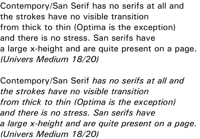
This face has no serifs at all and the strokes have no visible
transition from thick to thin (Optima is the exception) and there
is no stress.
San serifs have a large x-height and are quite present on a page.