Typography in Graphic Design
How to use Type for Layouts
The bulk of what we read is BODY COPY.
It's the novels, magazine articles, newspaper stories,
contracts, and web pages we read day after day. You are
reading body copy now. Body type or a body face is the typeface used
for body copy.
Above most body copy, especially in a magazine or newspaper
articles is the HEADLINE.
Typography in Graphic Design,
is the headline for the following paragraphs of information.
Just below the headline is the SUBHEAD,
How to use Type for Layouts. Subheads are usually smaller in apppearance.Headlines are the largest followed by the subhead and the smallest size would be the body copy.
HEADLINE
Subhead
Paragraphs of type are referred to as body copy. Paragraphs
of
type are referred to as body copy.Paragraphs of type are referred
to as body copy. Paragraphs
of type are referred to as body copy.
Paragraphs
of type are referred to as body copy. Paragraphs of type
are referred
to as body copy.
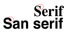
Serif or Sans Serif
The Two Main Kinds of Fonts:Serif or Sans Serif
Serif fonts have that little detail at the end of the letter strokes. They are traditional and can be found as text in books and copy in newspapers.
Sans means "without," so sans serif fonts are those without that extra detail on the ends. Sans serif fonts are more casual and contemporary.
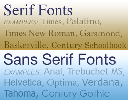
In the U.S. at least, body copy is most often set in serif
faces — for most books and newspapers, especially. Experts seldom
agree on the reasons for the use of serif or sans serif
faces for body copy. Ultimately you will decide based on
the needs and wishes of your audience, your clients, and
your own sense of what is appropriate.
1. Serif faces are the norm for most books and newspapers making them familiar and comfortable to readers.
2. The serifs on some faces aid readability by moving the eye from one letter to the next — connnecting individual shapes to form whole words.
3. Serif faces often have a subdued, formal, or serious look.
4. Sans Serif faces are often crisper, bolder, or more informal.
5. Sans Serif faces are
often more readable than serif faces when set
in very small type (such as for footnotes, captions, and "fine
print")
6. Serif faces printed from 300dpi or lower quality desktop printers or printed on textured paper may lose detail in the thin strokes and delicate serifs.
What follows are guidelines and rules of thumb only.
As with any typographic or design issue, use your own judgment.
Keep in mind that there are many other factors, including line spacing and line length, that will weigh heavily in your final choice of body type for any project.
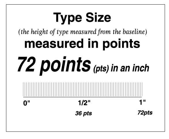
Point Size
A unit of measure in typography which measures the vertical height of
type from highest ascender to lowest descender and includes a small shoulder
of extra space. There are approximately 72 points to the inch and
12 points is equal to one pica.So how do you choose a specific typeface
for body copy, and why?
Body copy is generally set at 12 point or less, with 9-11
point being a good starting point size. Size will depend
on the font, width of the column and the line spacing.
1. In the US at
least, SERIF faces are the norm for most books and newspapers making them
familiar and comfortable as a body text font.
2. A good body face blends in and doesn't distract
the reader with oddly shaped letters, or extremes in x-height, descenders,
or ascenders.
3. In general (with many exceptions) consider SERIF
faces for a subdued, formal, or serious look.
4. In general (with exceptions) consider a SAN SERIF
body text font for a crisper, bolder, or more informal
tone.
5. Avoid SCRIPT or handwriting typefaces as a body text font. Some
exceptions: cards and invitations where the text is set in short lines
with extra line spacing.
6. Save your fancy or unusual typefaces for use in
headlines, logos, and graphics. As a body text font they are almost impossible
to read comfortably, if at all.
Important Tips:
1. Always do a test print. What you see on the monitor is usually larger when it is printed on paper.
2. Fonts suitable for print do not always translate well to the screen for Web use.
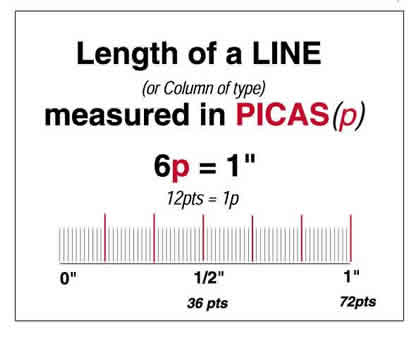
Pica
A unit of measure that is approximately 1/6th of an inch and measures the length of a line of type or a column of type. One pica is equal to 12 points or one inch.
1. Use picas for measuring column width and depth, margins, and other larger distances.
2. Picas and points have a direct relationship to each other. There are 12 points in a pica.
3. There are 6 picas to an inch. A standard US letter size page is 8.5 by 11 inches or 51 by 66 picas. (6 picas are approximately 25 mm)
4. The letter p is used to designate picas as in 22p or 6p. With 12 points to the pica, half a pica would be 6 points written as 0p6. 17 points would be 1p5 (1 pica = 12 pts, plus the leftover 5 pts).
Your software can take away some of the math for you. For instance, with picas as your default measurements in Indesign/Quark, if you type 0p28 (28 points) into the control palette when setting indents or other paragraph settings it will convert it to 2p4 automatically.
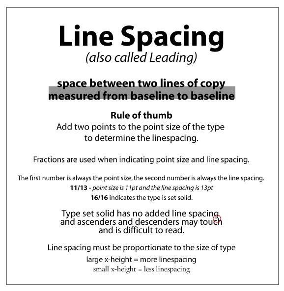
Line Spacing/Leading
Is the space between lines of text. Also called Leading, pronounced ledd-ing, its name comes from the practice of using metal strips (usually lead) of varying widths to separate lines of text in the days of metal type.
Line spacing is measured from baseline to baseline and is measured in points, just like type.
How much line spacing/leading?
One rule of thumb suggests adding about 20% or around 2 points to the point size of your text as a starting point for adjusting line spacing. Less is generally too crowded.
Changing the leading of text affects its appearance and readability.
When starting a new project, experiment with the amount of line spacing/leading to find what works best. Increased line spacing is also another way to combat gray pages and introduce more white space into a page layout.
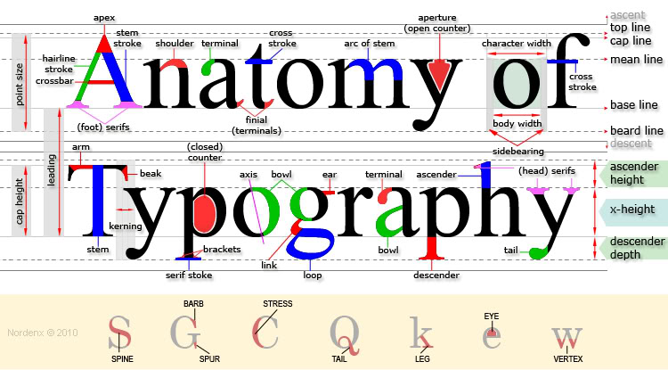
General Type Terminology
Ascender: The part of lowercase letters (such as k, b, and d) that rise above the x-height of the other lowercase letters.
Baseline: The imaginary line on which the majority of the characters in a typeface rest.Descender The part of lowercase letters (such as y, p, and q) that descends below the baseline of the other lowercase letters in a font face. In some typefaces, the uppercase 3 and Q also descend below the baseline.
Counter: The white space enclosed by a letterform, whether wholly enclosed (as in "d" or "o") or partially (as in "c" or "m").
Descender: The part of lowercase letters (such as y, p, and q) that descends below the baseline of the other lowercase letters in a font face. In some typefaces, the uppercase 3 and Q also descend below the baseline.
Sans serif: A type face that is without serifs. The ends of the strokes are usually square as in Helvetica.
Serif: Small decorative strokes that are added to the end of a letter's main strokes.
Stress: in a typeface, the axis around which the strokes are drawn: oblique (negative or positive) or vertical. Not to be confused with the angle of the strokes themselves (for instance, italics are made with slanted strokes, but may not have oblique stress).
X-height: Traditionally, x-height is the height of the lowercase letter x. It is also the height of the body of lowercase letters in a font, excluding the ascenders and descenders. Some lower-case letters that do not have ascenders or descenders still extend a little bit above or below the x-height as part of their design. The x-height can vary greatly from typeface to typeface at the same point size.