Line Art, Continuous tone and Halftone
Line Art
Line art is the term used to describe art that is black or white, with no gradations in between. (It's also called flat art.)

But not all art drawn in line is line art.
In fact, a pencil line is not necessarily line art, because the graphite mark contains shades of tone that graduate from black to gray to white, depending on the degree of pressure applied, the degree of hardness of the pencil point, and the degree of texture in the paper.
Ink lines, on the other hand, create single tone whose opposite is the white drawing surface itself. They can therefore be considered pure line art.
Unlike line or flat art, continuous tone art has values of gray that vary between the extremes of black and white.
Why do images need to be broken into a dot pattern?
The printing press sends out the same amount of ink over a printing plate. It does not know where in a photograph there is a highlight, midtone or shadow.
It is important to understand that in the printing process,
the values of a photograph must be broken into black and white dots in order for it to be printed.
Every photographic image you see on paper is actually an optical illusion, a series of different size dots.
A continuous tone image (photograph) must be broken down into a dot pattern called a halftone before it can be offset printed. Remember that the dots for a vector/line art image
are all equal in size to create the flat color.
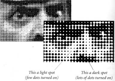
Dots which make up a halftone image are all DIFFERENT sizes.
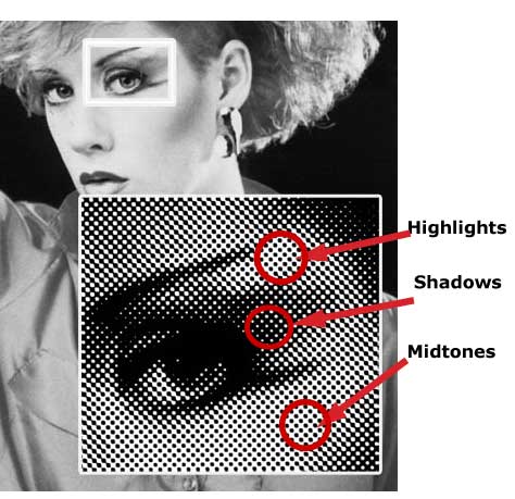
These different sizes create the highlights, midtones and shadow areas in that image.
All raster/pixel (photographic images) based images are altered in Photoshop.
A bit of History
Until the 19th century all art work which was reproduced on a printing press was originally line art; engravings and etchings created by artists.
Engravings and Etchings are works of art made up of tiny, individual hatchmark drawings done in black ink or using tiny lines engraved into copper plate.
In the latter part of the 19th century (photography was developed in 1839), a technique was developed to solve the problem of printing continuous tone photographs.
(The first commercially printed photograph was printed in the Century magazine).

This new method of taking a continuous tone image and breaking it into black and white dots came to be called halftone.
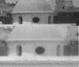
A halftone breaks a continuous tone image into tiny dots that VARY in size. The example on the left shows the photo at the top and the bottom image is an enlargement of the offset printed photograph (continuous tone image) broken into halftone dots.
Keep reading...don't get discouraged!

Converting Continuous tone Art into Halftone art to be Offset Printed
Traditionally, Continuous tone art was "photographed" through a special screen, called a halftone line screen or line screen frequency, inscribed with many fine lines that criss-cross at right angles. This process is now done digitally within the raster image processor or rip software. So the halftone process is now done digitally.
Although a physical line screen is no longer used, the concept is the same. The number of lines per square inch
(referred to as screen count or lpi) varies depending on the press and the quality of paper used for the printed piece. The most common LPIs are 133,150,175. The line screen is doubled to determine the acutal resolution needed for the image
(2xLPI = Resolution)
The higher the number of lines per inch, results in a smaller dot and a greater number of dots which gives more detail and wider range of tones, thus, higher resolution. Fine art reproductions might be reproduced with a 175 line screen or 350 ppi (2x the LPI).
A halftone designed to be reproduced onto a lower grade of paper, such as newsprint, is generally processed using the coarser screen, perhaps 65 lpi (130ppi). When the few lines per inch (i.e. 65) is used the dots will be larger and fewer and more noticeable when the image is printed. A newspaper photo is a good example of a coarse lined screen. The smaller dots created by a finer lpi would tend to fill in with ink, losing detail on a coarse paper.
The screen breaks up the tones into dots, densely or sparsely placed depending on the tones in the continuous tone image.
In the example to the left, the dots in the highlight area are very tiny, the midtone area the dots are larger and in the shadow area they begin to get very large.
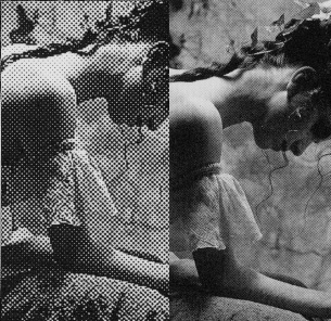
When the printed halftone is seen from a normal viewing distance it gives the illusion of a continuous tone image (photo).The more lines per inch used the smaller the dots will be and the finer the image will appear with more detail.
The example on the far left is the result of using a 50 lpi halftone screen and the image on the right was produced using a 175 lpi halftone screen.

So, are you totally confused!?
Not to worry, the halftone concept is a difficult one to understand and takes quite a while to grasp for some.
The good news is that the printer is your best friend and has all the answers. Once the printer knows what your project is he/she will advise you as to the correct paper choice which will help determine the resolution all your images should be. Most printshops require 300 or 350 ppi (dpi is most commonly used when referring to pixels per inch).
Each printshop might have a different ppi for images which is also determined by the kind of press that shop uses.
Again, just talk to your printer and follow their directions.
The most important rule is to talk to your printer BEFORE you begin choosing and/or manipulating any images.

Tips:
ALWAYS talk to the printer before you begin preparing your photos to determine the correct resolution.
Keep in mind that the image size and the physical dimensions(height and width) of the image determine the overall file size, and the greater the file size, the more space required on disk and the more time it takes to print.
When the resolution is too low, hard diagonal edges are displayed. These are called jaggies or aliasing.
NEVER use more resolution than necessary. The extra information only increases the file size and will slow down printing and can cause printing errors. In this case, more is NOT better.
Resolution for print is 300-350 ppi.
Resolution for the web (monitor) is ALWAYS 72 ppi.