
Line Art
Artwork that, unlike a continuation image, has no gradations of tone and,
therefore, does not require halftone screening for reproduction in print.
Two dimensional, flat art work, such as, pen and ink illustrations, type, woodcuts and clipart.

Flat Color
An area of color with no midtones. Two-dimentional art work uses flat color.
Spot Color:
A specific color in a design, usually designated to be printed with
a specific matching ink, rather than through process
CMYK printing. Spot color is also referred to as Pantone color, PMS color,
flat color, custom color. There are other spot color manufacturers, TOYO,
Focoltone, Trumatch but Pantone is used most frequently and world wide.

Screen or Tint of Flat color
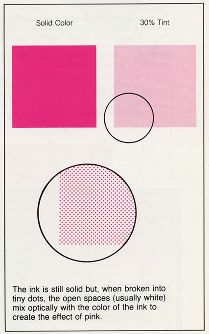
Flat color can be broken down into different values, screens or percentages of a color to create a tint (the appearance of a lighter version) of that color.
50% of black creates a gray
32% of red creates pink
The area of flat color will contain dots of the exact same size (i.e. 50%) spaced equally from each other. This effect will give the appearance of a lightened version of a specific color.
A gradient from light to dark is still considered a flat color because all the dots in the 20% range are the same size (20%) and all the dots in the e 30% range are the same size (30%).
Pantone
Matching System:
The PANTONE MATCHING SYSTEM is the definitive international reference for selecting, specifying, matching and controlling ink colors.
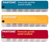
The PANTONE formula guide, a three-guide set consisting of 1,114 solid PANTONE Colors on coated, uncoated and matte stock, shows corresponding printing ink formulas for each color, and the three-book set of solid chips provides coated, uncoated and matte perforated tear-out chips that can be used for quality control.
This system allows specific colors to be reproduced accurately . Swatch books show the colors and their formulas for the printer.
Software packages, Photoshop, Illustrator, InDesign, QuarkXpress, Pagemaker, contain libraries of Pantone colors for the designer to choose from.
- Pantone coated (cv/cvc/computer video/coated)
- Pantone uncoated (cvu)
- Pantone Process (cvs)
Understanding C, U, CV, and other naming conventions in PMS colors
The PANTONE® Matching System (PMS) is the dominant spot color printing system in the United States.
Printers use a special mix of ink to achieve the color needed. Each spot color in the Pantone system is assigned a name or a number. There are over a thousand Pantone spot colors available.
Are PANTONE 3258 C, PANTONE 3258 U, and PANTONE 3258 CVU the same color?
Yes and No.
While PANTONE 3258 is the same ink formula (a shade of green), the letters that follow it represent the apparent color of that ink mix when printed on different types of paper.
The letter suffixes of U, C, and M tell us whether that particular color is how it will appear on uncoated, coated, or matte finish papers, respectively. The coating and finish of the paper affects the apparent color of the printed ink even though each uses the same formula.
Pantone swatch books — printed samples of ink - come in coated, uncoated, and matte finishes. You would use these swatch books or color guides to find the desired spot color for the type of paper used in your project.
Software programs such as Photoshop, Illustrator, InDesign
contain color palettes for various printing systems, including PANTONE
colors. You can add additional color palettes or create custom palettes
for your software.
In your software color palettes you may encounter suffixes such as CV, CVU or CVC. CV stands for "computer video" and is an electronic simulation of the Pantone color. PANTONE Reflex Blue CVU is an on-screen simulation of how PANTONE Reflex Blue will appear when printed on uncoated paper. Likewise, CVC is a simulation of the color on coated paper. Be aware that there are additional suffixes for process colors but for this discussion we'll stick with spot color.
Quick Suffix Overview:
U = uncoated paper
C = coated paper
M = matte paper
CV = computer video (electronic simulation)
CVU = computer video - uncoated
CVC = computer video - coated
Name That Color
So, which designation should you use when specifying colors? It doesn't really matter as long as you are consistent.
While PANTONE 185 CV and PANTONE 185 CVC are the same ink formula, your software may see them as two different colors, even if your monitor shows them as virtually identical.
If PANTONE 185 is the shade of red you want, use either PANTONE 185 CV or PANTONE 185 CVC but not both in the same print job.
Capitalization is also important. PANTONE 185 CV, Pantone 185 CV, and PMS 185 CV are three different colors as far as your software is concerned.
Software programs may use differing Pantone palettes. For example, Adobe InDesign 1.5 has Pantone coated (CVC) and uncoated (CVU) palettes while CorelDRAW 7 has a single Pantone CV palette. If you are importing images created in CorelDRAW into InDesign you'll need to rename your colors in CorelDRAW to match the InDesign color palettes.
When you define your own colors or create custom palettes, use a consistent naming scheme.
You can use oddball names to represent any color — such as Ruby Red Grapefruit #2 — but it is usually best to stick with a familiar naming convention: PANTONE in all caps, the name or number, then CVC or CVU as the suffix.
Remember, what you see on the screen is simply a simulation of the printed color.
To insure the most accurate color, you should use your Pantone swatch books to find the right ink colors for your project.
(adapted from aboutus.com)

One Color Printing
Cheapest type of printing. One color, black, red, yellow , PMS198, Pantone 234 etc. is applied to the printing press and all the elements in the layout are that particular color.
Remember, BLACK is considered a color!
Tints or screens of a color can be used in a one color job. Each tint, of the same color, will be printed on the same plate as the 100% color.
Paper
Choosing a color stock will give the appearance of a
second or third color.

Two Color Printing
More expensive than one color printing. Any combination of two colors is considered two color printing.
Black plus a second color is most common.
The Process colors Cyan, Magenta, Yellow MAY be used as individual spot colors BUT not usually.