Spot Color in Indesign
All graphics must be prepared and then PLACED in InDesign.
Once the graphic is placed it becomes a LINK in InDesign.
A graphic created in Adobe Illustrator and assigned
it Pantone colors, will carry
those designated color swatches along with it when placed in Indesign. The
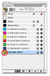
identical colors will APPEAR in the Indesign Swatch
palette.
You will NOT need to recreate the colors in Indesign.
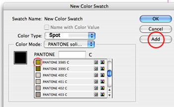
If you are not adding graphics from Illustrator but plan to use Pantone colors for graphics such as lines, boxes, and text — you will need to specify and setup the colors using the Indesign swatch palette.
Directions for choosing the Pantone colors is below.
Remember a graphic viewed on the InDesign page is a low resolution file which is a placeholder representation of the original high quality file. It is a PICT preview.
The LINK is the path to that
high resolution/quality file.
Always check the LINK palette to be sure the graphic is LINKED.
Proper linking is essential to accurate "output."
Each Pantone color (spot color) will be on it's own separation.
Also, with spot colors you may use as many tints/screens (99%-1%) of a color that you want.
These tints/screens are actually all the same ink color and will appear on the same color printing plate as the 100% solid designation of that color.
ONLY Pantone Spot colors and/or CMYK (Cyan, Magenta, Yellow and Black) are used in offset lithographic printing.
RGB is used only for the web.
Choosing Spot Colors in Indesign
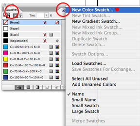
WINDOW Menu>Color>Swatches
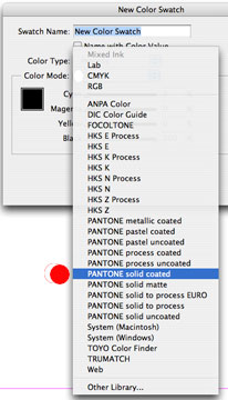
There are several Pantone options.
Read the options before you choose one.
#1

#2. Swatch Palette is open in your document.
Click on arrow in upper right corner.

#3

#4

#5
