|
tips 1. This technique requires alot of experimentation; but the process is so fun you wont mind playing. 2. Corporate logos or your own watermark can become interesting displacement maps also. |
|
| warping carving with displacement maps |
||
| Warping/Wrapping
a Displacement Map |
|||
|
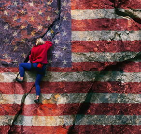
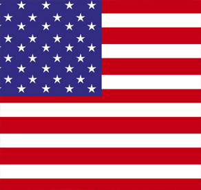
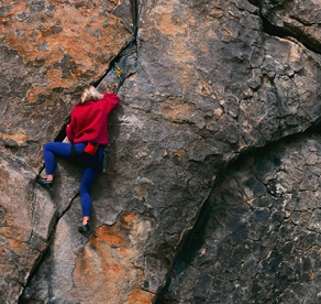
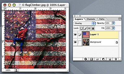
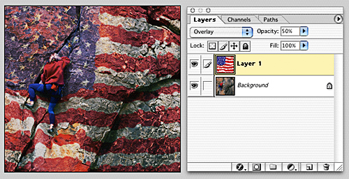
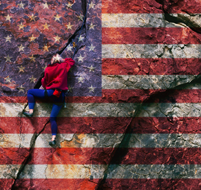
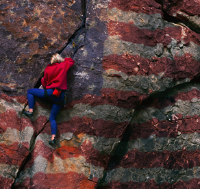
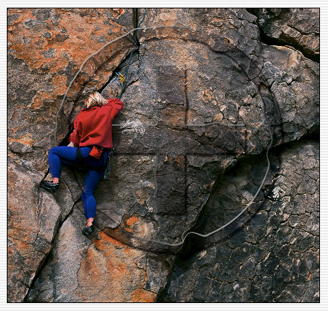
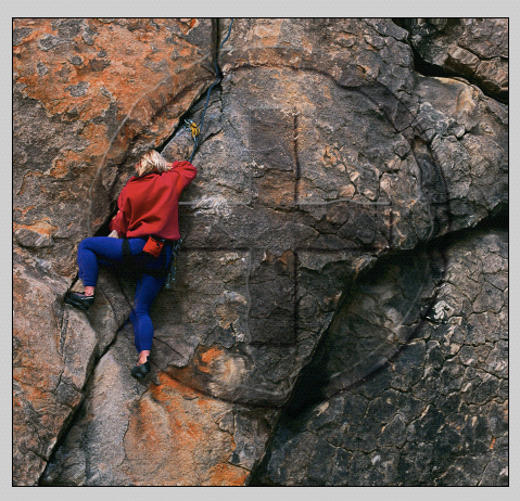
This technique warps a translucent image, or graphic, from one layer onto another layer beneath it creating the appearance of wrapping a decal-like representation of that image onto the textured surface of the layer below (the base layer). This is accomplished by using the luminance of the base layer and the Displace filter with a displacement map that's made from the surface image itself. By creating the map from this surface image, the filter will distort the image (or graphic) in such a way as to make the decal appear to dip into dark crevices and rise over highlighted areas. In this image the 'decal' is the american flag and the base layer is the rock climber. The two layers are combined by adjusting the blend mode and opacity of the 'decal' layer. A layer mask is used to protect portions of the surface image from the decal effect where ever necessary. The resulting effect can appear very realistic. THE DECAL (left) . . . and . . . THE BASE (right)
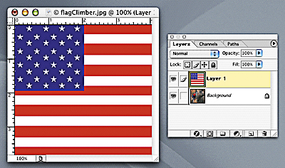
Here's the Technique: (these files are in Tutorial #1) 1. Download the following files from Tutorial #1: flag.jpg and flagClimber.jpg 2. Open the BASE FILE (the climber) and the DECAL FILE (the flag) into Photoshop. 3. Drag the flag file into the base file (remember to hold command > shift as you drag if you want this transfer to be pin registered into the new file). Note: If your decal image is smaller or larger than your base file, use Transform to resize it to fit.
4. Select Overlay as the blend mode in the decal (flag) layer and reduce the opacity of this layer to a desired percentage (50% is good for this image). [Note: the flag remains very linear and does not realistically look as if it is conforming to the dimensions of the rock, we will fix this soon by creating a displacement map. Also, portions of the flag cover the climber himself which we will fix at the very end with a layer mask.]
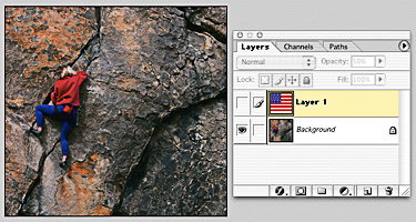
5. The next step is creating a greyscale Displacement Map. Displacement maps work by shifting the pixels of the surface in one direction where the displacement map is light and in the opposite direction where the displacement map is dark. We use greyscale in making displacement maps in order to see the lights and darks more readily. This helps us predict where the dips and rises will occur. 6. Start by clicking on the EYE icon on the flag layer to turn it's visibility off. You are left with the base image visible. It will look like this again:
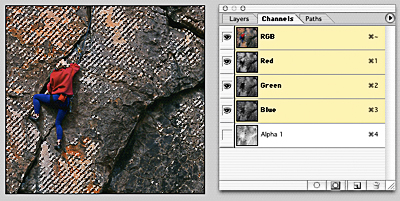
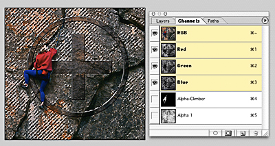
7. Next, open the Channels palette and command/click on the composite RGB channel at the top of the palette. This makes a selection based on the luminosity (lights and darks) of the visible image.
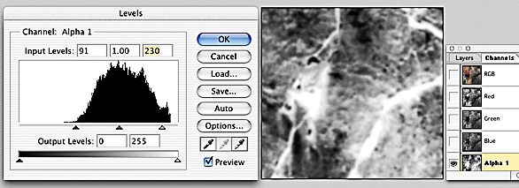
Note: I've chosen to INVERT the Alpha channel below to create a negative, but this is optional. A positive B&W Alpha channel will produce an equally effective displacement map, albeit slightly different. Try it both ways and see for yourself. 8. Now, turn this selection into a greyscale image by clicking on the "Save Selection As Channel" icon at the base of the window (the square icon with a hole in it). And then, deselect the marching ants(command/D) and click on this new Alpha 1 channel. This is the (inverted) grayscale image.
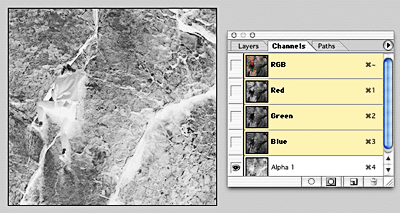
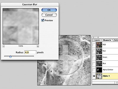
To make this greyscale image work as a displacement map you'll have to blur and increase contrast in order to exaggerate lights and darks within this image. 9. Select Filter > Blur Gaussian Blur and select 2 pixels for starters (the higher the Radius, the less sharp and chiseled the edge will look). 10. Then, select Image > Adjust > Levels and use the Input Levels sliders (the left, black-point slider) AND/OR lighten the highlights using the right, white-point slider. [Note: you can also play with adjusting the midtones as well with the middle slider.]
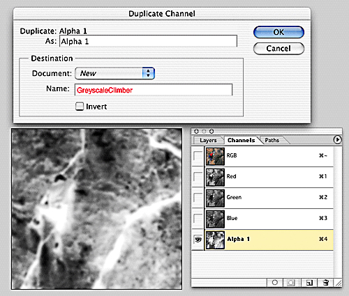
NOW WE CAN MAKE THE NEW GREYSCALE FILE 11. Choose Duplicate Channel from the Channel's pop up window selecting "NEW" under "DOCUMENT" and then type in a name for this new file (something logical like GreyscaleClimber); now click "OK". This creates your new greyscale file!
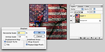
12. Now, return to the Layers Window of the original file with both flag and climber layers and reselect the decal layer (flag). Apply your new Displacement Map to this layer ( Filter > Distort > Displace ).
In the first window, change the Vertical Scale to -10 (see below) and keep the Horizontal Scale at 10 (the default setting); then click "OK". A new window will open asking you to "choose a displacement map", select your GreyscaleClimber.psd file and click on "OPEN". [Note: the flag now undulates; ... but perhaps a bit too much.]
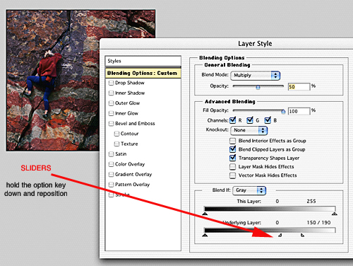
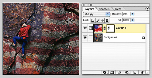
13. Experiment with Blend Options and adjust the Underlying Layer slider in the highlights (hold down the option key to split the highlight sliders and reposition them at different values). Try 150/190 as illustrated below and then try different blend modes. I'm using MULTIPLY here and the effect begins to appear more realistic.
14. Now all that's left is to remove the flag image that remains on top of the climber. With the flag layer selected, click on the "Add Layer Mask" icon at the bottom of the window (square icon with a hole). Enlarge your view to the point where the climber fills your window (command/spacebar/click with the magnifier on the climber's back).
FINAL EFFECT: before
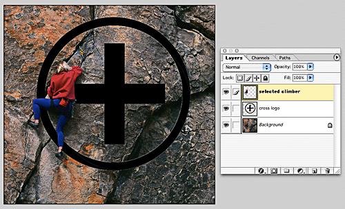
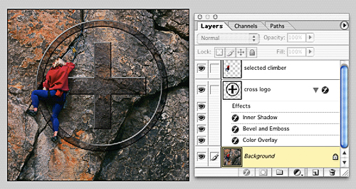
Carving a Logo with a Displacement Map • New elements: Cross Logo & Climber Layer
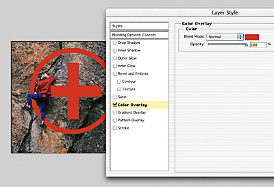
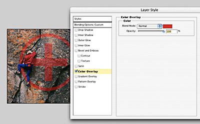
In this example we will carve a logo into the granite rock face. 1. Create your graphic or logo as a black object against a transparent background. TIP: With graphics like logos you can sometimes accomplish a 'carved-into-the-surface' illusion without creating a displacement map by simply using COLOR LAYER (see below) and change the color to match the surface texture with which it is intended to blend. Then adjust the opacity of the graphic layer until it appears more realistic. I'd also try adding a DROP SHADOW (in Blending Options) and if this does the trick you can skip the DISPLACEMENT MAP suggestion below. 2. Select the "cross logo" layer and then add a Layer Style from the bottom of the Layers window; select Color Layer (below left). Blend to Multiply.
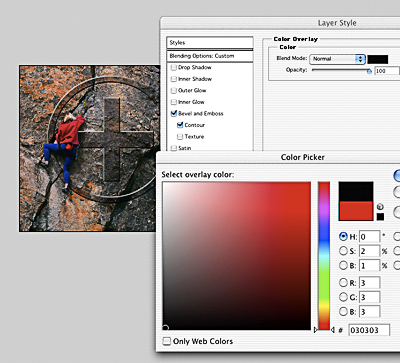
3. Experiment with Bevel and Emboss and change the color to black.
4. Now it's time to create another displacement map as we did earlier in this module. First command / click on the RGB channel. This makes a selection again based on the luminosity (lights and darks) of the visible image.
5. Now, turn this selection into a greyscale image by clicking on the "Save Selection As Channel" icon at the base of the window (the square icon with a hole in it). And then, deselect the marching ants(command/D) and click on this new Alpha 1 channel. This is the grayscale image.
And again, to make this greyscale image work as a displacement map we'll have to blur and increase contrast to exaggerate lights and darks within this image. 6. Select Filter > Blur Gaussian Blur and select 2 pixels for starters (the higher the Radius, the less sharp and chiseled the edge will look). Then, select Image > Adjust > Levels and use the Input Levels sliders to lighten the highlights and darken the shadows to taste (see #10 above as a reference). 7. Before applying the displacement map, go back to the "cross" layer in the Layers Window.
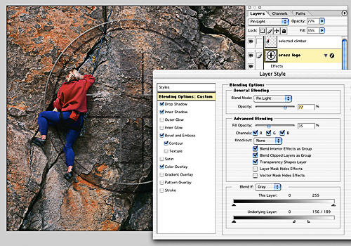
Experiment one last time with some more Blending Options (see below). This screen shot illustrates the addition of a Drop Shadow, an Inner Shadow, blending to Pin Light at 77% opacity and selecting a limited range of highlight values in the Underlying Layer to 156/189.
8. When satisfied, apply the Displacement Map as we did before (see #12 above). 9. You'll notice the same issues regarding 'unrealistic' wrapping into the contours of the rock which will need further adjustments, especially on graphics.
10. The Liquify Filter (Filter > Liquify) as well as a little rubber stamping provides the final touches for our logo. FINAL EFFECT: [ back to top ] LOWELL © 2003 |
|||