The Timeline and the Stage structures
It is important to organize the Timeline in independent layers.
You should use:
- An ACTIONS layer, for the frame actions.
- A LABELS layer, for the frame-labels.
- At least 1 layer to organize the buttons,
- A content layer. For visual clarity, you should set empty keyframes between the content keyframes (press F7 to set an empty keyframe after you select the frame).
Don't forget to name the buttons on Stage.
Frame-labels should be either all with the first letter in capital or all in lowercase.
This way you will commit less errors with the code.
In extreme cases of clumsiness, copy the name from the frame-label box (in the Properties panel) to the code.
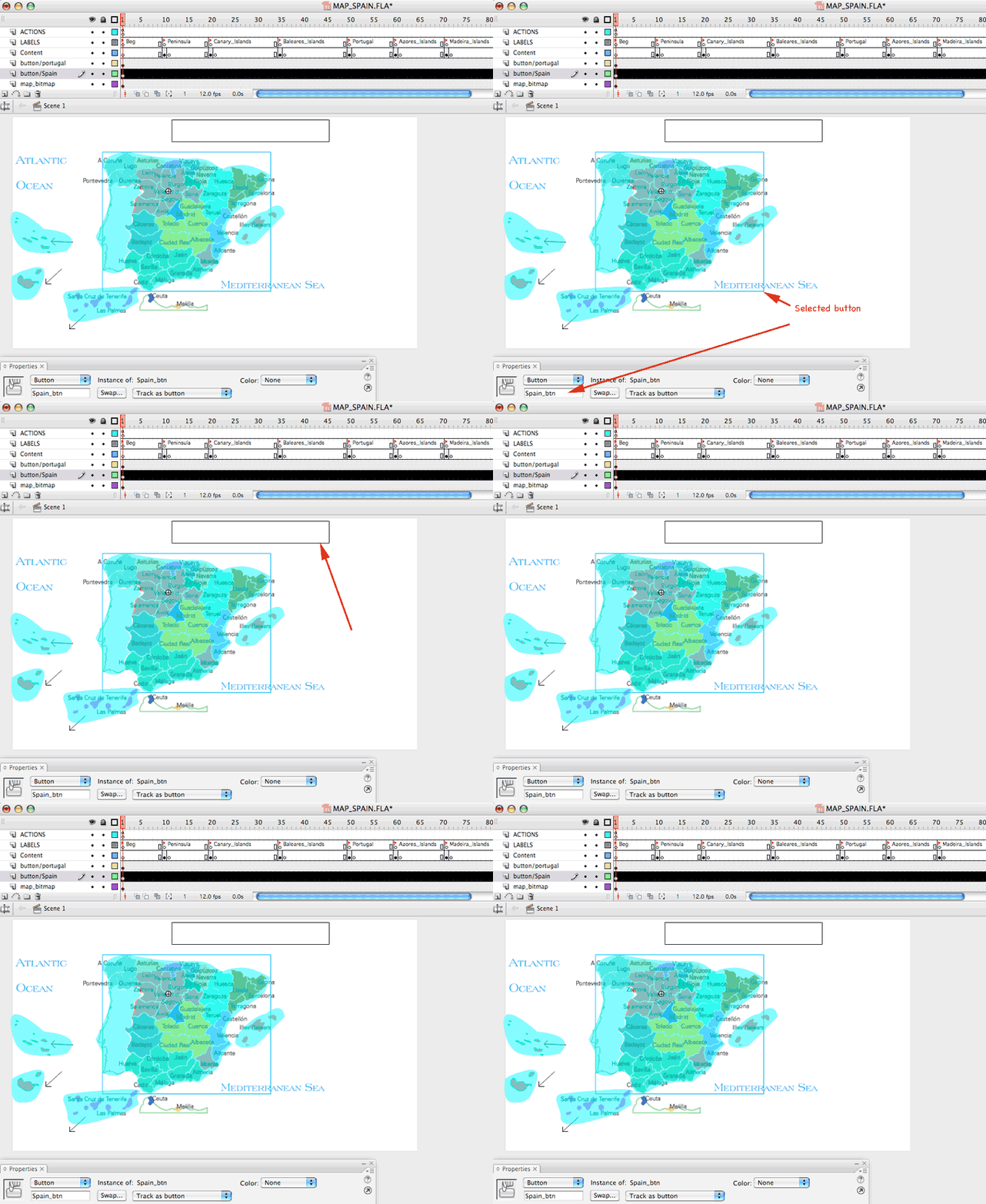
You can draw a rectangle on an extra layer in the Main Timeline, to have a clear visual reference of the Stage area dedicated to rollover content.
Double click each button and make sure that the rollover content on the rollover-State inside each button matches this rectangle on Stage.
You can delete the layer at the end or make it a "Guide layer".
Guide layers become invisible when you export to swf.
Notice that transparent buttons look like semitransparent-turquoise shapes in the authoring environment (in the fla file).
The shape corresponds to the hit-area, since button doesn't have any artwork on the UP state.
Export the file to swf to see the button working and remember that it will become INVISIBLE in the swf file.

Challenges in this assignment.
This is the first time that you design a complex interactive in Flash and there will be some design-challenges.
Remember that we want to design a graphic interface that uses interactive tools to complement its content.
This means that some information is already there BEFORE the user ask for more.
This first graphic information and the navigational system has to be ALWAYS PRESENT through the project. This means we are going to experience a CONSTANT interface.
This is your first challenge: How to create a constant graphic interface (with image and text) that leaves space for more content to come.
You need to place some content on rollover of each one of the buttons, to get a taste of what each buttons is going to bring you content-wise, and to spot the delimitation of the button itself, since the buttons are invisible before you rollover them.
In the sample file I am showing you how to use a layer on the main timeline as a graphic registration device to place content inside each one of the buttons. You can use this system if the rollover information is always going to be located on the same area of the Stage.
There is always some information that will have to show up on top of the graphic interface. Your job is to design it in a visually appealing manner. (see underneath Rollover content inside the buttons)
When we click on a button, we will get the rest of the information: small/medium photographs, short slideshows, text, graphics or whatever works for your theme.
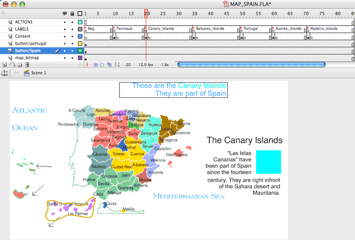
The "answer content" is placed on the Timeline underneath a framelabel (see underneath Content Location).
Notice that on Stage, when you rollover on a second item, after you have clicked on the first one, you will see the rollover information with the first content STILL ON STAGE.
This requires very good design to not make the stage absolutely overcrowded. Rollover content and "answer content" cannot be located then on the same area on the Stage.
Finally, if all your "answer content" is placed on the same location on Stage, you should make sure that text or images are alligned to the same guides.
Depending on the design, you might want the "answer content" always on the same location or around the map, close to the button.
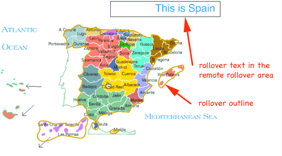
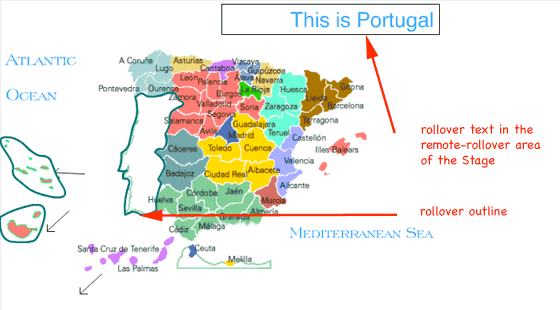
Rollover content inside the buttons. Remote rollover construction.
Notice the location of the rollover text, always on the same area of the Stage (we call it "a remote rollover" because of the visual effect being similar to an "html remote rollover").
The black box that you see around the rollover text is a layer on the main timeline. It can be turned off when you finish building all the buttons.
In a packed interface, this consistent location of information helps the user spot the location of information, without having to find it in the alredy busy map.
 |
 |
Content Location with a Constant Interface
 |
You can place the content inside a movieclip, (in my sample file you see the big title on the left saying "Canary Islands", |