|
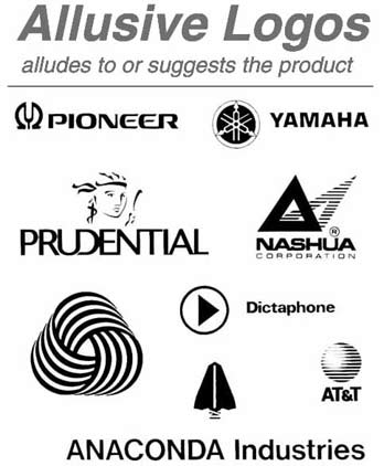
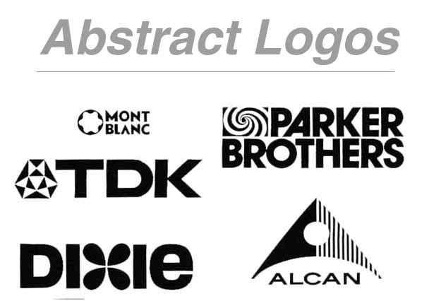
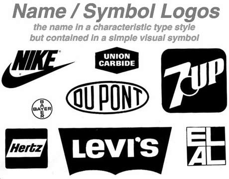
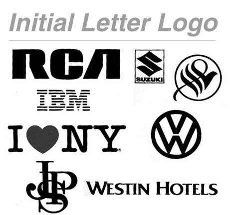
A logo, is the graphic element of a trademark or brand, which is set in a special typeface and/or font, or arranged in a particular, but legible, way. The shape, color, typeface, etc. should be distinctly different from others in a similar market. A well designed logo: * is functional and can be used in many different contexts while retaining its integrity * should remain effective reproduced small or large * can work in "full-color", but also in two color presentation (black and white), spot color, or halftone. * may be able to maintain its integrity printed on various fabrics or materials (where the shape of the product may distort the logo) * abides by basic design principles of space, color, form, consistency, and clarity * represents the brand/company appropriately When designing a logo, practices to encourage are: * avoid gradients (colors that transition from dark to light/light to dark) as a distinguishing feature * produce alternatives for different contexts (business card, posters, bill boards etc.) * design using vector graphics, so the logo can be resized without loss of fidelity (Adobe Illustrator is one of the main programs for this type of design work; open source programs like Inkscape are emerging as excellent free alternatives) * be aware of design or copyright infringements * include guidelines on the position on a page and white space around the logo for consistent application across a variety of media (a.k.a. brand standard manual) * do not use the face of a (living) person * avoid photography or complex imagery as it reduces the instant recognition a logo demands * avoid culturally sensitive imagery, such as
religious icons or national flags, unless the brand is commited to being
associated with any and all connotations such imagery may evoke |
|
 |
 |
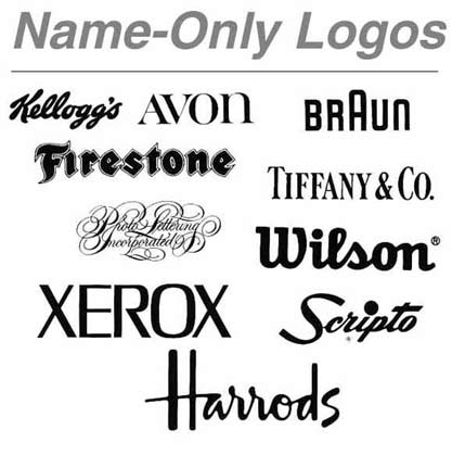 |
|
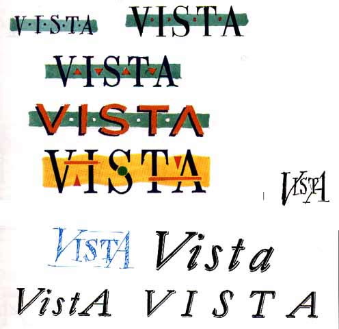 |
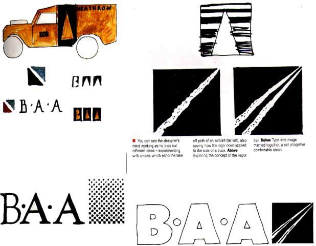 |

