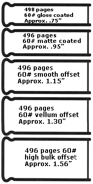
Publication Design: Format Follows Function Size and Color A book twice as thick might give the impression of having lots to read. This feature might draw the type of reader who would be inclined to pick up a publication full of literary content, such as Reader's Digest, but it could likely alienate design students who are typically visual learners, as well as others wanting information in a "quick read." A format half this size would require showing the visual examples in this book at a smaller scale, a factor that would probably inhibit a full understanding of the design principles that are presented and explored because it would be harder to view the details in these examples. This same book features four-color printing-crucial to full-color reproduction and an understanding of how color works. Printing a book in four colors is typically more complicated and expensive than printing one or two colors. A text-heavy book such as a novel would not warrant the additional expense involved in four-color printing. However, it is a necessary expense for this book in which full-color reproduction of visuals plays an important role in supporting content. Imagine how differently this book would function if the presentation of visual material was confined to just one or two colors! In addition to its vertical and horizontal dimensions, a publication also has volume and thick ness. A publication's thickness or bulk is obviously related to the number of pages it contains. A book with 16 pages will appear to have less bulk than one that contains 60 pages. A publication that appears to have many pages sends a message to prospective readers that it contains lots of information. On the other hand, one that appears thin will send the opposite message. When considering the format of any publication, it is important to determine whether a publication's audience will respond favorably to the idea of being presented with lots of information or if they would be more responsive to a publication that contains a small amount of information. Paper Other times, it is important to send a message that a publication is packed with content. In these instances, publication designers create the illusion of more pages than a publication actually contains by selecting a paper with a high basis weight to add bulk. Understanding how a paper's basis weight can affect the bulk and weight of a publication is an important aspect of publication design. It is so important that designers typically make a bulking dummy or request one from a paper merchant before they begin the design process in order to see and experience how a publication will look and feel with the dimensions, number of pages, and the paper they have chosen. The texture or surface characteristics of a paper and the perception of quality a paper projects are also important factors in publication design. When you compare the inexpensive paper used for printing newspaper to the premium coated paper used for a fashion magazine, there is an obvious difference in the way these papers look and feel. There is also an appreciable difference in their ability to reproduce printed type and imagery. Newsprint paper tends to absorb ink and makes images and type appear fuzzier when compared to the crisp reproduction capabilities of a premium printing paper. Printing papers come in a wide range of colors, surface textures, and basis weights. Papers with subdued patterns, fiber inclusions, and varying degrees of translucency can also add textural richness and aesthetic appeal to a publication's design. Any designer wanting to get involved in publication design should have a basic understanding of the different categories and varieties of paper and how they perform on press. Paper can play an important role in defining a publication's personality and achieving its communication goal, and can be used in many creative ways to support a concept.
Alternative Formats Children's books frequently take advantage of unusual materials and formats to create visual surprises. Pop-up images, books that mimic toys, and other aspects that encourage touching or manipulation are often more likely to engage children than conventional books by inviting interactivity.
Points of entry are visual clues. They help readers by calling their attention to items of interest as they randomly thumb through a publication's pages. In addition to drawing the read er's attention to an item on a page or spread, they can also serve in a broader context by helping a reader navigate through a publication. In this book, for instance, the imagery and bold typography that are incorporated into the design of each chapter's opening pages serve as points of entry. When considering points of entry and what readers see first, it is important to note that items positioned on right-hand pages and closest to the edge of a page are more likely to be noticed first. Magazines are aware of this visibility factor and typically place fractional ads (those smaller than a full page) on the outside edge of a page, rather than close to the gutter. Many magazines also charge a higher rate for ads placed on a right-hand page. Establishing Rhythm and Balance To sum it all up, a publication's design begins with
determining: |