|
Type dos and donts - use no more than 2 different fonts in any given layout - best to use one family with it's many -never use 2 different serif type face together - never use 2 different san serif typefaces together What's wrong with this body copy to the right? |
 |
|
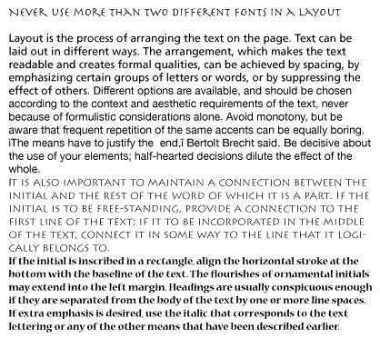
• If your headline typeface is ornate or stylized keep your bodycopy simple. • Vary styles within layout for interest and prioritizing. • NEVER use the underline option in the software. • Use USE RULE BELOW OR ABOVE option in format box of the software. • Never run rule through desenders. • Never use bold to emphasize within a paragraph, this can create a checkerboard pattern. • To emphasize use italic, small caps or larger point size. The example to the right you will notice that ITALICS and ALL CAPS are used to draw attention to the information. |
 |
|
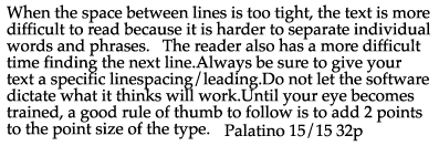
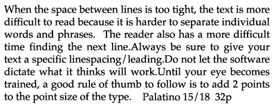
• Always set a definate number for linespacing. this will prevent gaps between lines of copy. the software reads the largest point size on a line and adds 20% for that line spacing. If you use a larger point size to emphasize that line spacing will be more than the rest of the paragraph. Never let the software make your decisions! • Rule of thumb for linespacing/leading: Notice gaps in linespacing in example to right. Line spacing was determined by the software. Column width is also too wide. |
 |
|
Linespacing / leading Until your eye becomes trained, a good rule of thumb to follow is to add 2 points to the point size of the type. Decrease line spacing if: • line length /column width rule of thumb: • if your eyes tell you it needs it |
 |
|
If the type size is 12 points, the leading/line spacing would be 14 points. Often just one point of leading will increase the readability of your text. Increase linespacing if: • the font is sans serif and the x-height is very large • the type is being reversed out of a background or solid color • if your eyes tell you it needs it |
 |
|
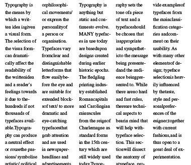
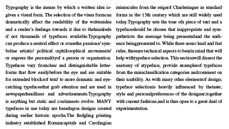
• adjust column width according to type and it's size |
 |
|
Example to right, columns set just right for font and size and alignment. |
 |
|
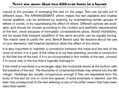
Never center more than 3 lines of text. Example to the right shows first layout with the information centered. Bad design decision. What else is wrong with this layout? The layout to the extreme right is a good redesign of the ad. |
 |
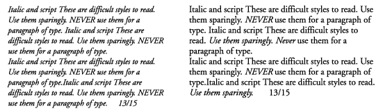
| Use script faces sparingly and never for a large amount of copy. | 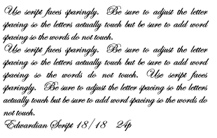 |
|
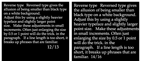
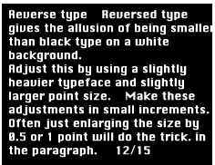
Reverse type Make these adjustments in small increments. Often just enlarging the size by 0.5 or 1 point will do the trick. |
 |
|
Adjust this by using a slightly heavier typeface and slightly larger point size. When reversing text, make it a bit larger and bolder and don’t use a “light” typeface with fancy swashes . |
 |
|
Italic and script Use italic type only to draw attention to a word or phrase in a paragraph. Use italic and extra light for accents.
|
|