logo

Composition is
the arranging of graphic elements (text, images, space) within a specific format; landscape (horizontal) or portrait (vertical). The the design principles - such as alignment, balance, contrast, focal point/emphasis, unity contribute to the visual impact of the design composition or layout.

Composition is used in fine art work such as paintings and drawings as well as in graphic design pieces. We will be focusing on using composition in:
advertising:
.......magazine ads
.......web banner ads
.......outdoor advertising

Compositonal Shapes in Art and Design

Things to remember as you design:
Poorly designed ads

-do get attention
-BUT they don't usually sell a product or company/brand

Poor organization creates chaos:
- too many focal points
- no integration of text and graphics (unity)
- missing information

When designing Small Ads for print or web be aware that
- they need to standout to be noticed (strong contrast)
- their placement on page is important
- how strong is the ad when surrounded by other ads or images

Technical issues to remember when designing ads.Depending on the format you will be designing for, the resolution of the images will differ. Always talk to the printer to find out what resolution they need.
300-350ppi is usually used for quality color magazines
150ppi is usually used for newspapers
72ppi is ALWAYS used for the web

Always purchase the 300-350ppi image from the stock photo company which you will then resize and lower the resolution for the other formats.

This ad has good contrast but terrible text and makes it difficult to read.

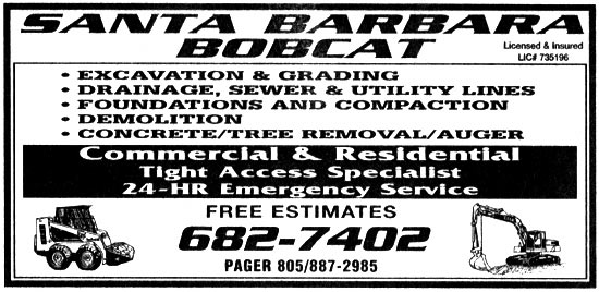
Classified section of the newspaper.
– These types of ads are usually on a page with "gray" areas and need to be bold with high contrast
– keep copy short for quick read
- use white (negative) space and borders to help ad stand out and separated from other ads

ad1

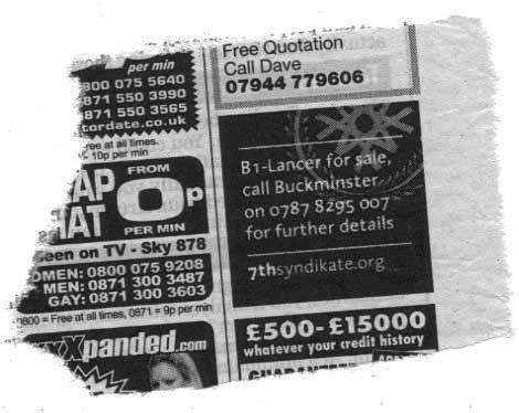
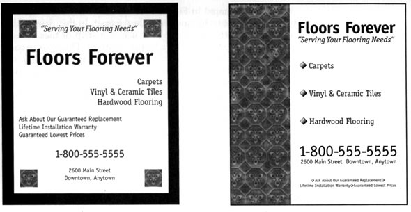
The first ad is poorly designed and uses too many different alignments. The second ad is a rework of the first and is simple and better organized.

Print is not dead contrary to what some might say. People still buy newspapers and magazines. Ads are the things that help pay to keep this print media alive. Companies still want to advertise in print but they also need to advertise their company/product on the web using banner ads. Newspaper, magazine, banner ads and outdoor advertising all need to be designed using the same design elements and principles, keeping in mind the different format each one requires.

The following things need to be considered when designing ads:
 Grids
- help to keep information organized yet they can be flexible

Borders/rules - isolate your ad and helps it to stand out

White space - - allows it to stand out when surrounded by other ads and gives ad breathing room

Headlines - help prioritize information and draw attention

Screens - use a variety to add "color" to a black and white ad

Type - use a variety of point sizes and weights to create interest
- use san serif fonts for web, small print and reversed type

Logos and Contact info - logos should be prominent but not over powering and contact info should be easily visible

Checklist
- borders/ rules
- white space
- hierarchy of information using size, weight, color
- fonts need to be appropriate for content and format
- headline prominent but not distracting
- products, prices are clearly connected
- all correct contact and pricing info included in ad
- logo prominent
- consistent elements, fonts, color when creating a series of ads

Interesting and simple layout. Good use of contrast and interesting white space.

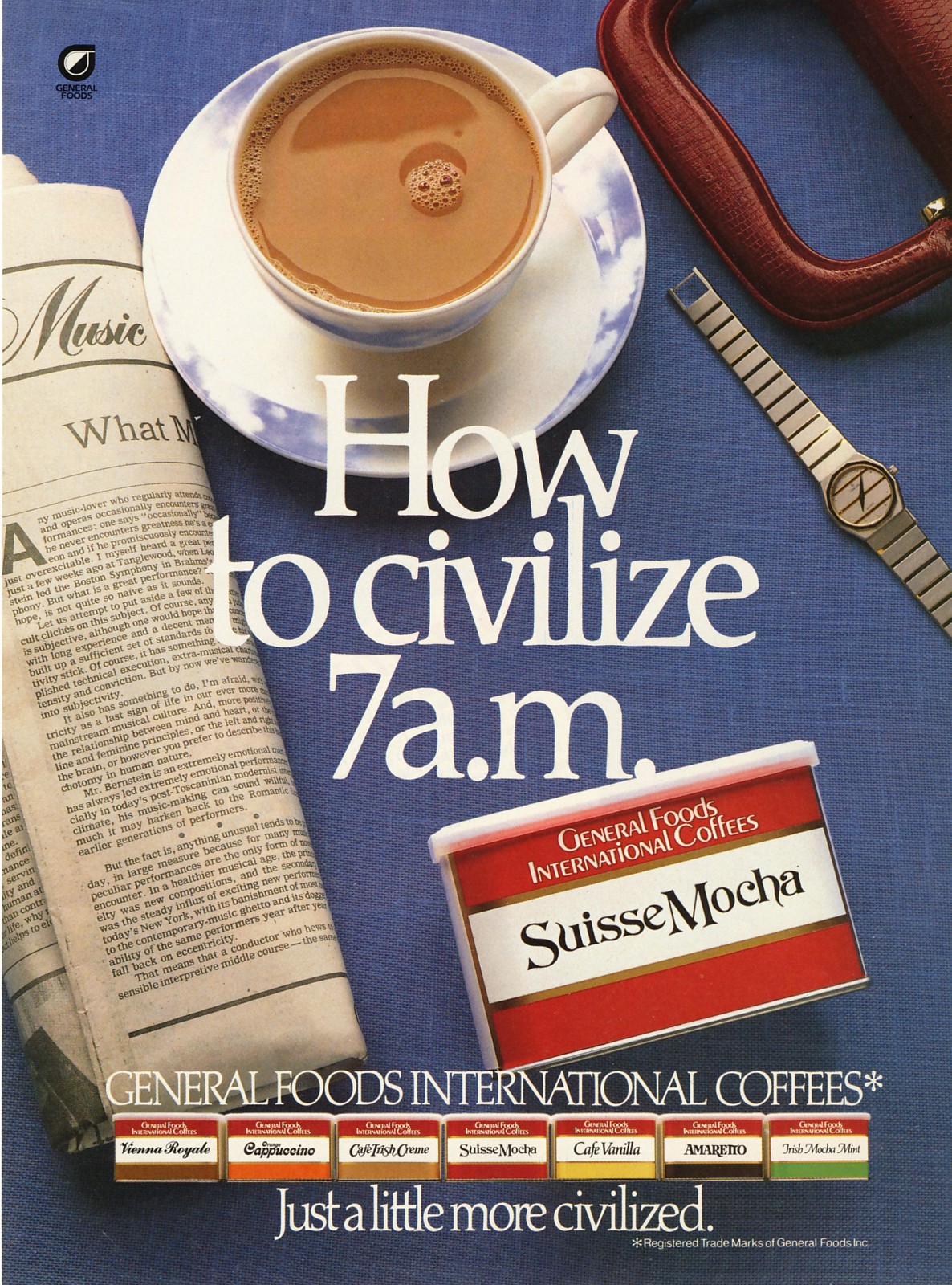
Full page magazine ads
- are more expensive
- must be well designed (can use effects i. e. bleeds)
- must choose appropriate publication for product or company

mag ad

Using grids in ads helps organize information.

ad

A web banner or banner ad is a form of advertising on the World Wide Web. This form of online advertising entails embedding an advertisement into a web page. It is intended to attract traffic to a website by linking to the website of the advertiser.

Banner Ad samples 2

Banner design tips
An effective banner design can make the difference between an
unsuccessful and successful banner ad campaign.
At Grantastic Designs, we have found that the following banner
design tips can increase CTRs (click through ratios) and resulting sales.
We hope these tips help you.

Banner Design Dos
Use animation.
A quick-to-download animation can greatly increase a banner's CTR.
Animation must be used very carefully since the purpose of the animation
is to attract visitors, not to irritate them.

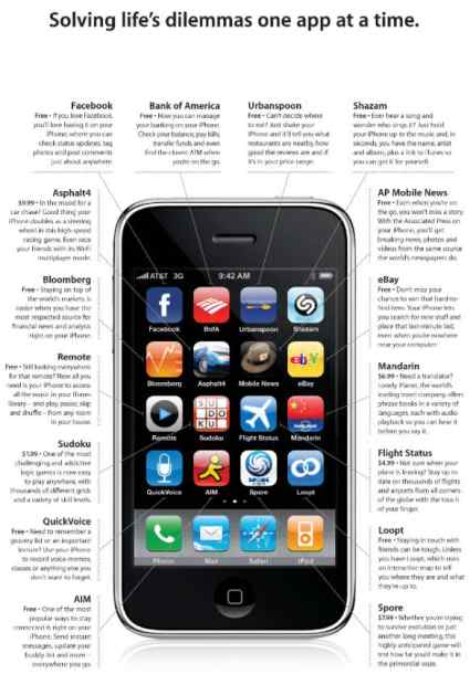
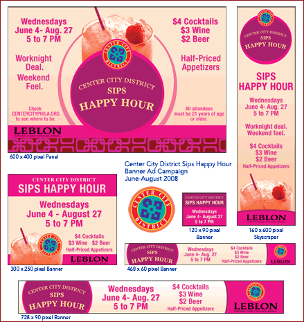
Different size banner ads.

banner

For animated banners, these general guidelines apply:
◦ The animation should be subtle enough to attract attention but should not be so ostentatious as to interfere or clash with the design of the web page you are advertising on.
◦ An animation that loops endlessly tends to irritate visitors.
Have the animation loop 7-10 times, leaving the main message on the last animation frame.
◦ Conversely, some visitors will stop a web page from loading before the banner animation has loaded, leaving only the first frame. Thus, it might be a good idea to have your message come across in your first frame if you know that the web page you are advertising on has a long download time.

1. Feature a call to action.
Placing a "Click here" or "Submit" graphic image on your banner can significantly improve your CTR.

2. Use bright colors.
Blue, yellow, and green banners have a higher CTR than black-and-white banners. Use the color red sparingly.

3. Use the word "Free" in your banner when appropriate.
Depending on what's offered, the word "free" can increase CTRs.
For example, offering a free software demo gets
a good response. Offering free money arouses suspicion since people will want to know what the catch is.

4. Give a benefit for clicking on your banner.
For example, "Do you want more traffic?" or, "Need help with taxes?" The answer to the question will be on your web site.

5. Keep the message short.
Simple banners have higher CTRs than unfocused, wordy banners.

6. Link the banner to a specific page.
When people click on the banner, they want to go directly to the web page that has the information they want. Your visitors do not want to go to your home page and have to hunt for the information.

7. Refresh or change your banners frequently.
Studies have shown that CTRs drop significantly after 2 weeks. The CTR usually increases when a new banner appears.
To find the most effective banner design for your business, you must go through a period of testing. Testing means that you run a banner over a period of time and measure the results (i.e. CTRs and resulting sales). Then you change one thing about the banner design, such as a color or a font change, and run that banner over a period of time and measure the results. The banner designs that result in the most sales should be the types of banners you use for your banner campaigns.
http://www.grantasticdesigns.com/bannertips.html -used with permission.