
Design: Page Layout
DESIGN:
To create order out of varying elements.
Design consists of both elements and principles.
"All design work seems to have three common traits: there is a message to the work, the tone of that message, and the format that the work takes. Successful design has all three elements working in co-dependence to achieve a whole greater than the sum of the individual parts." - Frank Chimero
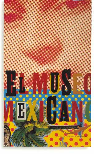
Graphic design is everywhere, touching everything we do, everything we see, everything we buy: we see it on billboards and in Bibles, on taxi receipts and on websites, on birth certificates and on gift certificates, on the folded circulars inside jars of aspirin and on the thick pages of children's chubby board books.
Graphic design is the boldly directional arrows on street signs and the blurred, frenetic typography on the title sequence to E.R. It is the bright green logo for the New York Jets and the monochromatic front page of the Wall Street Journal. It is hang-tags in clothing stores, postage stamps and food packaging, fascist propaganda posters and brainless junk mail.
Graphic design is complex combinations of words and pictures, numbers and charts, photographs and illustrations that, in order to succeed, demands the clear thinking of a particularly thoughtful individual who can orchestrate these elements so they all add up to something distinctive, or useful, or playful, or surprising, or subversive or somehow memorable.
Graphic design is a popular art and a practical art, an applied art and an ancient art. Simply put, it is the art of visualizing ideas.”
DESIGN ELEMENTS:
The visual building blocks that communicate creative ideas.
- Line
- Shape
- Texture
- Color
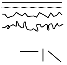
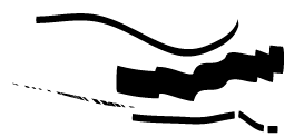
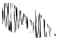
LINE: A mark created when a tool is dragged across a surface.
A moving dot or point. It is an elementary form of graphic communication used to express forms, shapes and letters.
Lines are one of the basic elements of design. Alone or in combination with other lines or shapes they can aid in the readability, appearance, and message of a design. Use lines to:
• organize
•
texturize
• guide the eye
•
provide movement
•
make a statement
•
convey universal meanings
Attributes of a line:
the way a line moves from beginning point to end point
- straight, curvy, angluar
Direction
lines relationship to the page
horizontal lines
- feeling of stability
vertical lines
- sense of strength
diagonal lines
- energy or movement
Quality
how the line is drawn
- bold
- jagged
- smooth
- thin
ˆ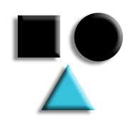
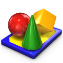
SHAPE:
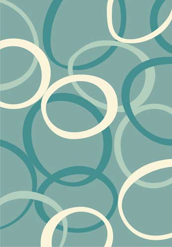
A shape is an enclosed object. Shapes can be created by line, or by color and value changes which define their edges. The three basic shape types are Geometric (Circles, Squares, Triangles etc.), Natural (leaves, trees, people etc.) and abstract (icons, stylizations and graphic representations). Use carefully to create a visually pleasing design and eye-catching design. Examine their role in design including the psychology of shapes in logo design. Alone or in combination with other shapes or lines they can convey universal meanings as well as guide the eye or organize information.
Shape: Linear
The predominant use of lines to describe an area that stands out from the space next to it because of a defined boundary of line, value, color, or texture.
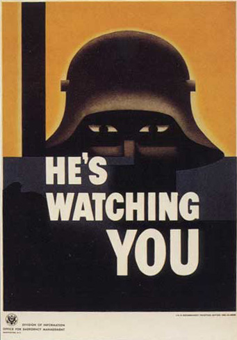
Shape: Color
An area of color not surrounded by a line but is clear and distinct and has a hard edge.
Volume and Mass
In graphic design, volumes are empty space defined by lines, and points. To give the perception of mass, the space is filled with color or texture to mimic the effect of light and shadow. Since we live in a 3-dimensional world when we add volumetric qualities to our 2-dimensional format we add a sense of realism to a design.
Mass is one of the basic elements of design. Mass equals size. Each piece you create has a physical mass. A design has mass or visual weight of graphic and text elements. Additionally, each element within the design (graphics, photos, lines, text blocks) have their own mass relative to the whole piece.
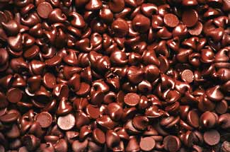
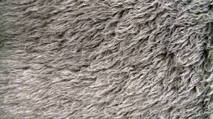
TEXTURE: The surface characteristic of a material often involving the illusion of tactile properties. Texture relates to the surface of an object. Using texture in graphic design adds depth and visual interest. This can be applied graphically in the form of pattern or through the choice of printable surface (paper stock, embossing).
Tactile quality of a surface is texture. Most textures create a pattern, but patterns don't always have a texture.
Visual Texture
- illusionary, give the impression of real textures
- created with line, value, color
- grouping lines together , crisscrossing lines
- patterns can create the appearance of texture
COLOR: The character of a surface caused by the response to the wavelength of light reflected from that surface.
Color is used to generate emotions, define importance, create visual interest and unify branding. Powerful and highly provocative design element. Color is difficult to learn for some individuals and easier for others. We all perceive colors differently.
Color is difficult to control, especially when work has to be reproduced in print or viewed on a monitor.
Primary colors are red, yellow and blue. These colors cannot be mixed to be recreated but other colors can be mixed from them.
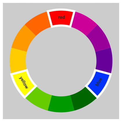
Three Categories of Color- Hue:
Hue is somewhat synonymous to what we usually refer to as "colors". Red, green, blue, yellow, and orange are a few examples of different hues. The different hues have different wavelengths in the spectrum.
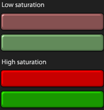
- Saturation:
The intensity, purity or strength of a color.
The brightness or dullness of a color. Saturation can also be called a color's intensity. It is a measurement of how different from pure gray the color is. Saturation is not really a matter of light and dark, but rather how pale or strong the color is. The saturation of a color is not constant, but it varies depending on the surroundings and what light the color is seen in.
Chroma and intensity are synonyms for saturation.
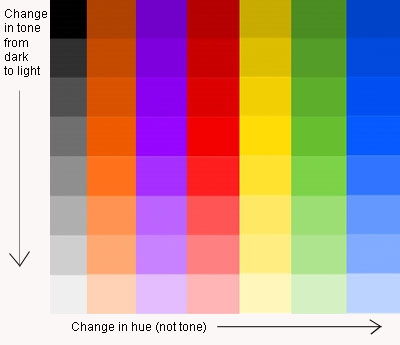
- Value:The range of lightness or darkness of a color.
Shade (making color darker), tone(neutralizing color), and tint(making color lighter) are aspects of color. The brighter a color is, the higher its value and the more light it emits. For instance, a vivid yellow is brighter than dark blue, therefore its value is higher than that of the blue. A good way to see the difference in the values of colors is to look at the corresponding greyscale version.
Value deals with contrast (relative to the lightness and darkness) and the amount of detail seen in an image. Value can be used for emphasis. Variations in value are used to create a focal point for the design of a picture. A light figure on a dark background will be immediately recognized as the center of attention, similarly for a dark figure on a mostly white background. Gradations of value are also used to create the illusion of depth. Areas of light and dark can give a three-dimensional impression, such as when shading areas of a person's face.