![]()
GDP 113 - Typography Exercise: Legibility and Readability Study
For this assignment, you will set paragraphs of text using the text provided in Moodle. Follow the directions then write your observations (#10).
Grading: 100 Points
All parts of assignment completed correctly: 40 points
Written observations are complete and well thought out: 60 points
Objectives:
To become aware of the effects of point size, leading/ line spacing and typeface selection in text composition.
ASSIGNMENT: Select two or three different print publications and study the text used for the articles. Note the differences in size, line spacing, column width and font used. Consider who the audience is for in each publication and ask yourself why these specific choices were made.
Text to be used (copy and paste into Indesign text box):
Typography is the means by which a written idea is given a visual form. The selection of the visual form can dramatically affect the readability of the written idea and a reader's feelings towards it due to the hundreds, if not thousands of typefaces available. Typography can produce a neutral effect of rouse the passions, symbolize artistic, political or philosophical movements, or express the personality of a person or organization.
1. Open a new 8.5" x11" document with .5" margins in Indesign and PLACE the text file you downloaded from the assignment page in Moodle.
2. Set the RULERS to PICAS (in InDesign preferences instead of inches.
3. Make a text box 21 picas wide and copy and paste the text into the box. Open the bottom of the text window so all the text is visible.
4. Duplicate (copy and paste) the text to the right of the original box. Next select the 2 boxes and duplicate them 1 time pasting the row below the other (see example on right). You will have TWO columns and 2 rows.
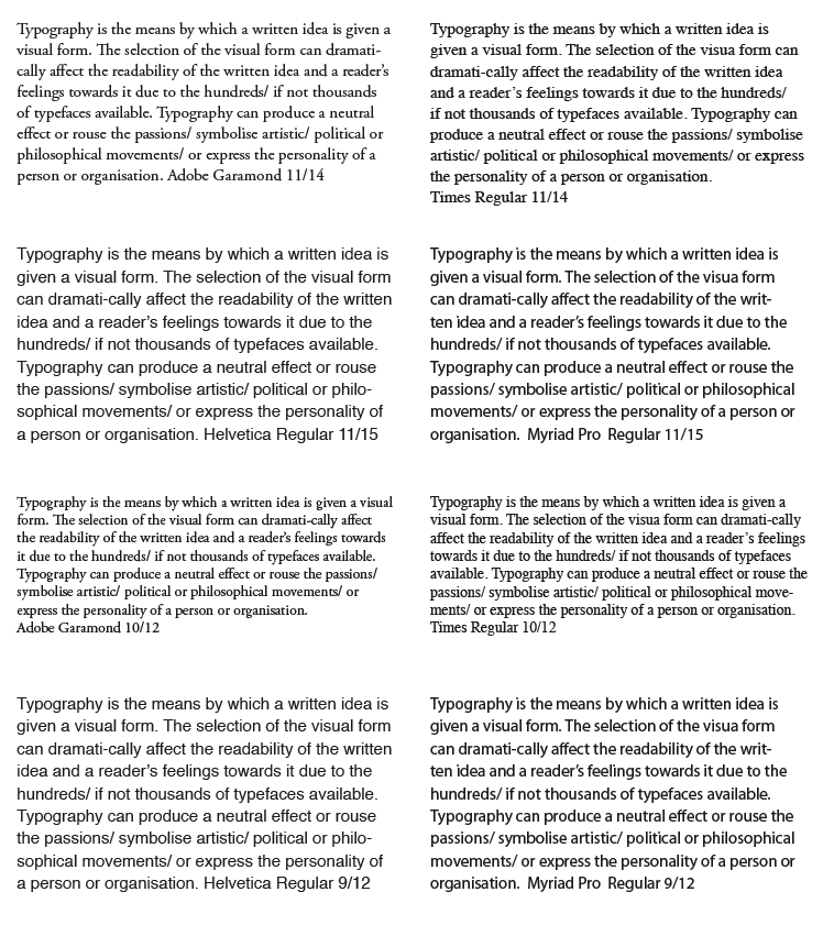
5. Row #1- Box 1 and 2 (left to right): choose a DIFFERENT serif font for each box and set the text for both boxes 11/13. Type name of the font and the size (11/13) on the last line.
• Point size is the first number in
the fraction 11/13.
• Leading/line spacing is the second number in 11/13.
6. Row#2 - Box 3 and 4 (left to right), choose a DIFFERENT san serif font for each box and set the text for both boxes 11/13. Type name of the font and the point size (11/13) on the last line of each. NOTE: At this point you will have 4 boxes, each with a different font, 2 serif and 2 sans serif, all 11/13.
7. Select rows 1 and 2, copy and paste below the other rows for a total of 4 rows and 8 boxes.
8. Rows 3 and 4 - Boxes 5, 6, 7, 8:
Keep the font and poont size the same but decrease the line spacing/leading by ONE point (to 12). Change the information on the last line to reflect the correct leading.
9. Duplicate the page. Select the page in the PAGE dialog box (Go to window>pages if it is not open). Select the black arrow at the top of the dialog box and select "Duplicate Spread".
10. Page#2 -Starting with ROW 1, keep the fonts the same but make the following changes:
ROW 1: Change the sizing to 11/14.
ROW 2: Change the sizing to 11/15
ROW 3: Change the sizing to 10/12
ROW 4: Change the sizing to 9/12
11. You will have a total of 16 boxes on the two pages. Write the following observations on page THREE:
• What effect does varying the typeface have on legibility?
• What effect do the changes on line spacing/ leading have on legibility?
• Which typeface in which point size/leading combination is most readable?
• Which is the worst and why?
12. Export Indesign file as ONE PDF (smallest file size) and upload to Moodle and submit.
Note that in the example below rows 1 and 3 are serif fonts and rows 2 and 4 are san serif.
Page 2 should have 8 boxes
with rows 1 and 3 are serif fonts and rows 2 and 4 are san serif.