
GDP113 - TYPOGRAPHY TELLS A STORY Pt.1
Using type as text, texture and voice
OBJECTIVES:
• Understand timing and sequence in visual storytelling.
• Explore fonts and styles to create meaning beyond the content of the words
• Use expressive and interesting arrangements to help the reader flow through the text and emphasize the important parts of the lyrics.
• Using a horizontal orientation, create a well unified design.
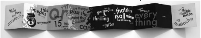
Example:
Grading and Evaluation
Followed the directions of the assignment |
15 points |
Concept is sound, creative and memorable |
15 points |
Design utilizes the design principles and communicates well. |
30 points |
Excellent use of fonts, sizing and arrangement. Text flows and reads easily. |
40 points |
Grading: |
100 |
DESCRIPTION:
This assignment will be in 2 parts due at separate times:
Part 1 -using your chosen content, design an exciting and interesting well organized and unified horizontal layout using only type. Your final piece will be 24" long by 4" high. The final printed piece will be folded into 6 - 4" panels and folded using an accordian fold. You will use text ONLY that depicts lyrics from a verse of a song, a JINGLE or POEM. Think about all of the exercises you have worked on this semester and bring those new skills into this assignment. Use font style, point size changes, weight, type arrangement, color and texture to create the visual "sound", image, emotion and meaning of the content of the words. Think about how the reader will flow through the piece as if the text were in motion. The key is to think about what sounds and pauses look like.
You may use no more than TWO fonts.
It is wise to choose font(s) that have several styles in the family.
Part 2 - You will then convert your printed piece into a kinetic (moving) design.
Details and instructions will be included in a separate assignment document.
PROCESS FOR PART 1:
• Pick a short song, lyric, jingle or poem (children's nursery rhymes may also be used) that has many expressive, descriptive and action words in it.
• Submit your selection (typed text to be used) to the instructor through Moodle "iMail" for approval.
• Create TWO (2) thumbnail ideas in pencil.
Using an 11" x 5" paper, draw two 10.5" x 2" frame (one above the other and leave a space between them). Organize the text into a sequence that will work in the horizontal format. See this link for thumbnail examples. Think about the hierarchy of information. Keep in mind the use of positive and negative space and balance. The thumbnails should reflect the position, size and weight of words. Draw carefully and neatly.
• Choose an appropriate kuler.com color theme. It must reflect the mood and energy of the content of the piece. Create a screen shot of the color strip and include it with your thumbnails in the Type Tells a Story Thumbs forum.
• Create a type experiment sheet of at least 15 different fonts in a variety of sizes and weights. Be sure to label the fonts. Export this as a PDF from Indesign and upload this to the Type Tells a Story Thumbs forum.
• Scan your thumbnails as jpegs and insert them into the Type Tells a Story Thumbs forum for input from other students and the instructor. You must also include the kuler color strip and the text from your song, lyric or poem. Use the insert icon two separate times to add both the thumbnail image and the kuler image (or create one jpg with both images).
• Once you have reviewed the feedback on your thumbnails, create the design in InDesign (use Indesign as this is where you will create the kinetic design for part 2 of the assignment). Format the text based on your design. You may alter the layout from the thumbnails as you begin placeing elements. The final document size will be 24 " x 4". Use guidelines every 4" to indicate each panel for folding purposes. (The guidelines should not to be in the final PDF). Try different sizes, blocks, colors and styles. You can do crossovers, repetition, texture, paths, layering, modification and type as background noise.
DO NOT use any images or graphic elements unless they are glyphs or type. YOU MUST ONLY USE TYPE. Work in color but be careful to consider readability. Light colors do not read well, especially when small.
• FINALIZE and PRINT OUT THE PANELS in color, full size.
If you are using an 8.5" x 11" or
an 11" x 17" printer, you will need to tile the final printed piece and then NEATLY assemble (tape) them.
Indesign> FILE>PRINT> choose SETUP> select TILE> Auto
• Fold the print enough to see the accordion fold (see the example to the right). Take a photo of the printed piece and make a jpeg of it.
• Upload the photo jpeg to the Type Tells a Story Final forum for critique.
• Upload the photo jpeg to this assignment link for grading.