
WHAT IS MOTION GRAPHICS?
Motion graphics uses images and typography to "tell a story" that moves the reader kinetically and interactively through a composition. All information is not seen at once but flows along a seamless format.
Motion, interactivity, color and sound are used to enhance the meaning and impact of the message.
Four Attributes of Motion:
1. Structure - In the lecture about storytelling you learned about the different structures used to drive the eye through the information – linear, tree or web.
2. Images - Images (including typography) should basically be clear and simple to start with. Composition and motion will complicate the viewing as the elements move, twist, turn, enlarge, reduce, merge, and transit to enliven and enlighten the message.
3. Timing - Moving from one graphic element to the next must be timed in order to create consistency and impact for the reader. Planning how long and how fast the design will move through the composition is essential
for producing an effective and readable whole.
Length of time: Most commercials are timed for 30, 60 or 90 seconds. For songs, animations and jingles, the script should be read aloud to determine how long it would take to be viewed.
Speed/Pace: Remember, each action should last AT LEAST 3 SECONDS before moving on in order for the reader to grasp the meaning. There should also be NO MORE THAN 3 words per second to allow
for clear hearing, viewing and understanding
4. Sound - There are three kinds of sound that can be incorporated into motion. Each one must be calculated separately for the best timing and effect.
- Narrative or dialog
- Sound effects
- Background sound/music
THE LANGUAGE OF KENETIC MOTION
Variety of shots or viewpoints: Where is the "camera"? Which angle or viewpoint best defines and helps describe the scene to the viewer?
CLOSE-UP SHOT: A close range of distance between the camera and the subject.
HIGH CAMERA ANGLE: A camera angle which looks down on its subject making it look small, weak or unimportant.
LEVEL CAMERA ANGLE: A camera angle which is even with the subject; it may be used as a neutral shot.
LONG SHOT: A long range of distance between the camera and the subject, often providing a broader range of the setting.
LOW CAMERA ANGLE: A camera angle which looks up at its subject; it makes the subject seem important and powerful.
PAN: A steady, sweeping movement from one point in a scene to another.
POV (point of view shot): A shot which is understood to be seen from the point of view of a character within the scene.
REACTION SHOT- 1. – A shot of someone looking off screen.
2. – A reaction shot can also be a shot of someone in a conversation where they are not given a line of dialogue but are just listening to the
other person speak.
------------------------------
Transitions: How does one scene move to another scene? Like pages in an
interactive book or website, how do you move the reader seamlessly
from one viewpoint to another.
• DISSOLVE: A transition between two shots, where one shot fades away and simultaneously another shot fades in.
• FADE: A transition from a shot to black where the image gradually becomes darker is a Fade Out; or from black where the image gradually becomes brighter is a Fade In.
• JUMP CUT: A rapid, jerky transition from one frame to the next, either disrupting the flow of time or movement within a scene or making an abrupt transition from one scene to another.
• SPLIT: One scene splits to the next to transit
• TILT: Using a camera on a tripod, the camera moves up or down to follow the action.
• WIPE/PUSH: A transition between two shots, where one shot wipes away the previous one.
• ZOOM: Use of the camera lens to move closely towards the subject.
-----------------------------------
Interactive Configurations: Interactivity includes these basic functions that can add action and impact to a static element, picture, type or object.
• BUTTONS: making objects appear or disappear on a page. Choose
different "behaviors" (Appearance or Actions) for buttons to go to somewhere else or to open something or change to something else (rollover).
• TRANSITIONS: actions between pages or cells (see above)
• MULTI STATE OBJECTS: slideshows / layering / timed appearance -
Align objects on top of each other and have them appear in sequence.
• ANIMATION: animating an object one decides on: action/direction, timing/ duration and speed.
• LINKING MEDIA: video / audio
--------------------------------------
MEDIA is the MESSAGE: the type of media you use affects the impact of the message.
• WEB - HTML, Flash
• KINETIC - Video, After Effects
• INTERACTIVE GRAPHICS - CS5 InDesign / Photoshop / Illustrator - saved in PDF or SWF
BASIC RULES FOR DESIGNING FOR A SCREEN
When designing for the screen, people tend to underestimate the importance of type. You would be wrong to think that only print designers have to kern, adjust, weight and organize type meticulously.
That's exactly what separates semi-pros from high-standard professionals.
Let's talk about minuteness for a bit.
It is strictly a lie that motion designers don't have to spend hours on adjustment and alignment on type.
It is strictly a lie that motion designers don't have to kern, weight and organize type.
Obviously, we can't bring typography to perfection for every single frame, but the important key frames should show a sense of aesthetics when it comes to typography. We'll share with you the DO'S and DONT'S of typography used in animation.
-------------------------------------------
DO'S and DONT'S of Typography in Animation
Do:
Use sans serif fonts when the type you are displaying is not easily legible due to terms of timing or composition.
Serif fonts are harder to read in motion and become a plight rather than the originally intended information bearer.
Always keep in mind that you are designing for the screen. In opposition to printed work, the user can easily resize your screen design, and you surely do not want to lose your serifs due to the user's high screen resolution.
Using sans serif typefaces retains the readability even at smaller font sizes.
Limit yourself to two different typefaces per piece of art. More than that will destroy the feeling of a clear concept and make you look like an amateur. This tip is generally held as a basic guideline for typography in any media, whether its print design or web design typography.
Do Not:
Use faux italic or faux bold. Those are the buttons for bold and italic in Photoshop and any other Adobe product. They will try to simulate the type style of the font but never succeed entirely as it can't elicit what intention of the font's creator was. And yes, in most cases, faux italic and faux bold are noticeable. Instead, look for the typeface's italic or bold style. In the example below, you can see the difference between the real versus the faux bold style.
Do Not stretch fonts disproportionally. The thick strokes will get way out of proportion fast, so will the curvatures. Squeezing type could even put your job in jeopardy. Choose a font that fits your design!
Interactive page transitions dialog box for InDesign CS5.5 and CS6
![]()
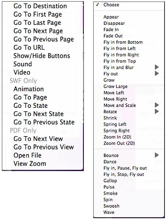
Buttons (left) and animation (right) dialog boxes showing the choices in Interactive CS5 InDesign
Tips and tricks for saving time while creating a kinetic type video:
Kinetic typography
By Linda Rabaino, 2010
The technical name for "moving text"—is an animation technique mixing motion and
text. This text is presented over time in a manner intended to convey or evoke a particular idea or emotion. It is often studied in Communication Design and Interaction Design courses. Some commonly seen examples of this technique include movie title sequences and credits, web page animation and other entertainment media.
1. Before you get started, fully flush out the exact copy you want to use. It's a pain to go back and change even one word, especially if you're going to narrate.
2. Keep the text simple. Short sentences. Think about which words and phrases are important from the start so you can later highlight them with a different color or motion.
3. Watch a few tutorials to get a feel for how it will all come together in the end. There are kinetic type tutorials all over the web. I recommend this thorough, step-by-step video tutorial as a starting point.
4. Record the narration after you're absolutely sure of the text you want to use. After you have a good working version, mix in your audio loop. Then match the text animation to the narration and the music.
Review:
TELLING A STORY IN TYPE using motion
Although the examples below were created using After Effects, a highend animation software, they will give you ideas that you can translate into your assignment using Indesign for the motion part of this assignment.
From link above:
Cee Lo Green video (contains offensive language but great type)
Starbucks – If you vote
Live Outloud! (simple kenetic)
Social Life with Friends (kenetic poem)Kanye West Concious (video)
Type Animation (video)