 |
|
|
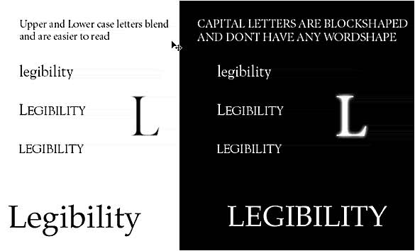
Art of Legibility Research has found that the typefaces people have grown up with are more comfortable and easier to read. In our culture and in our era, san serif letterforms are more easily recognizable when there is a short amount of text to read. Can you read the example at the right? Probably not. The brain relies more on the differences in the top half of the letterforms than the bottom. It is probably easier for you to read the second example where the top half of the letterforms are visible. |
|
|
Legibility depends on the characteristics of the letterform design to make them easily recognizable; size of the counters, x-height, character shapes, stroke contrast, serifs or lack of serifs and weight. When a short amount of text can be easily recognizable Legibility depends on the ability to instantly recognize letterforms. Legibility is how easily shapes of letters can be distinguished. |
|
|
|
|
 |
|
|
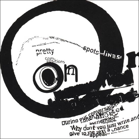
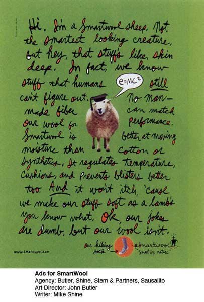
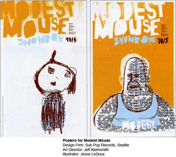
Not all type designs are meant to be legible. Some layouts use type in a very creative and offbeat way. The design to the right and the two below are examples of type used to create a mood or feeling. The need for the information to be immediately recognizeable is not as important.
|
 |
 |
 |