Design is design is design.
Design princples are Guidelines or rules that work with
elements of design to accomplish creative objectives.
Generally, all the principles of design apply to any piece you may create. How you apply those principles determines how effective your design is in conveying the desired message and how attractive it appears. There is seldom only one correct way to apply each principle.
Arranging each element on a page, be it a photo, graphic or type, the designer must be thinking about the basic principles of design that will organization the information in a visually creative and attractive way. Below are the Principles of design.
- Alignment
- Balance
- Contrast
- Emphasis
- Unity
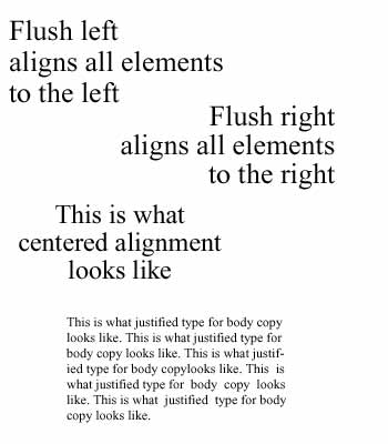
ALIGNMENT:
The visual connection between words, graphics, images and rules on a page when their edges line up with each other.
Rule of Thumb:
Use only one alignment in a layout.
Example:
- Flush/align left, flush/align right, centered, justified
- lining up the top of a photo with the top of a headline.
In the example below, the first design is unbalanced because of the different alignments used.
It is best to use one alignment in a layout.
the middle design has one alignment, align right, but the design is heavy on the right.
In the third design the balance is equalized by adding the jagged bar to the left side.
This bar is an element found in the graphic and by repeating it a feeling of unity is created.

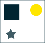
UNITY:
Order achieved by the relationship of forms to one another and the space around them.
The example to the left is not unified. The elements have no connection to each other.
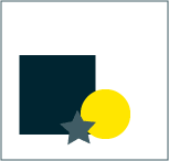
Unity by proximity: spacial relationship of one element to another.
Elements can touch, overlap, line up with each other, as in the example to the left, to create a sense of unity.
BALANCE:
Order achieved by the relationship of forms to one another and the space around them.
Balance is an equal distribution of weight.
A design that is balanced holds together, looks unified and feels harmonious.
Unbalanced design feels uncomfortable.
Balance involves the following visual factors:
- weight
- position
- arrangement
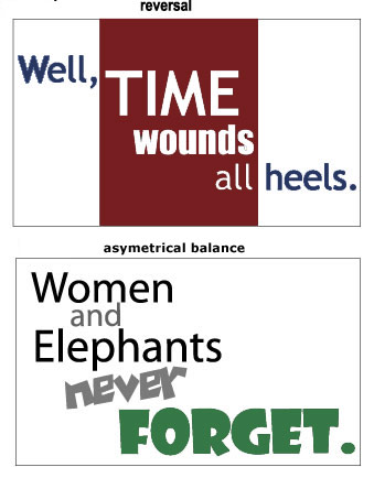
Asymmetrical Balance
A layout which places elements in unequal and opposing positions within a given space.
The example to the left is a well balanced asymetrical design with an informal and creative feel.

Symmetrical Balance
A centered layout which is achieved by repeating shapes in the same position on either side of a central axis.
The example to the left is a well balanced symetrical design with a formal or more business feel.
CONTRAST:
The elements on a page should look distinctly different from each other.
It stresses the visual difference between words, phrases and graphics.
Color, size, negative space, weight of text and reversals create contrast.
EMPHASIS:
The most important elements on the page should be the most prominent.
The second most important element should be the second most important, etc.
Placing elements in the optical center of a pageemphasizes them.
Optical center of a page is top one third of page.
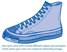
DESIGNING WITH SPOT COLORS:
Designing with one flat color:
Although you might only have 1 color to work with,
you can make the item or layout more interesting by
using several different values or percentages of that same color.
Tints of a color: use any number of tints from 10% to 9o%
Each tint or value of a color is printed on the same plate as
the 100% color.
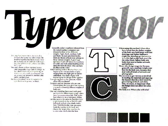
When designing with type, the value (light and dark) of a page will change depending on the font, point size, line spacing and negative or white space you have chosen.
This example (squint your eyes) shows the value changes when different fonts are used. In this case, the letterforms create a different amount of white space between and around each letter which alters the value of the page.
The example to the left is a two color design with
a large area of color,
and areas of white space to create interest.
Using Reverse type is another creative way to create contrast and interest in a layout when you are limited to the number of colors.
Reverse type: type is the color of the paper, the background shape is the color of the ink
Some other ways to create an interesting one or two color layout:
• Use colored or special textured paper to make it more interesting
• Use one of the colors for special emphasis or impact
• Use one color as background and assign the other color for the elements, keeping the paper a "third" color
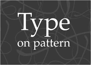
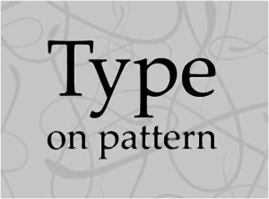
Background Patterns (or other images such as photographs)
When designing with type, think about the background the type is sitting on.
The example to the right shows how the words can get lost when the background is a pattern and there is no variation in value (light to dark areas) between the type and pattern.
Hurts the eyes...don't ya think?

Changing the value of the background to a lighter value than the type allows the pattern to coexist with the type.
The type is now visible.
Reversing the type on a pattern background is also a technique to make the type readable.