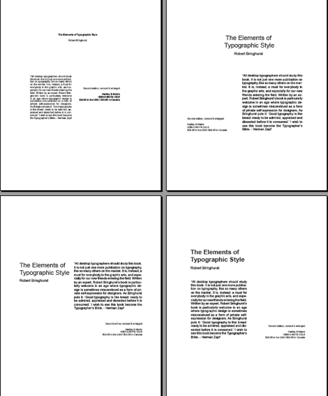

| Bottom left and right layout
works best. Alignments are good and clustering of groups creates a good sense
of unity. |
|
| Adding line spacing to the
paragraph in each of the layouts would also improve the “feel” of the design. |
|
| The top left and right
layouts have too many alignments being
used which creates a sense of awkwardness. Lowering the elements on
the page would also help anchor the elements to the page. |
|