|
|
|
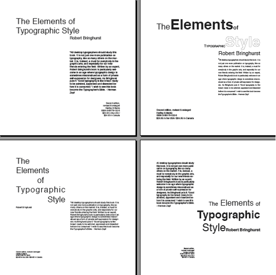
The to right layout uses the
space well and is the most interesting. The grouping of the title is
good…..couple of suggestions to improve the grouping…would be to enlarge
typography so it relates more to the other large words and drop the top line
down closer to the word STYLE. Size of author is good and fists well with
column width.
|
|
Bottom right is a good
start. Tucking the column of text in tighter to the head (next to THE) and
bringing up the bottom group closer to STYLe and tucking it in would really
improve the layout. Adding line spacing to the column and small blcock of
text would also improve layout.
|
|
|
|
The other two layouts have a
good start and will work once the elements are grouped in a more cohesive
manner.
|