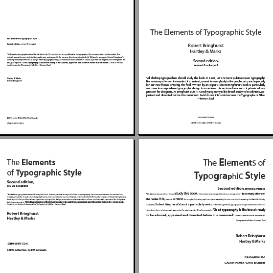

| The two bottom layouts are
most interesting. This is where you were allowed to use more size and weight
change. A word of caution…..when making some letters bolder thanothers a
checker board effect can result and distract from the messsag of the word(s).
Using different colors in this way is also difficult to use
successfully…until you have more experience. |
|
| At full size, the bottom
left layout paragraph does work well with the different point sizes and
weights. Making the column width narrower would add to the layout. …nice job! |