|
|
|
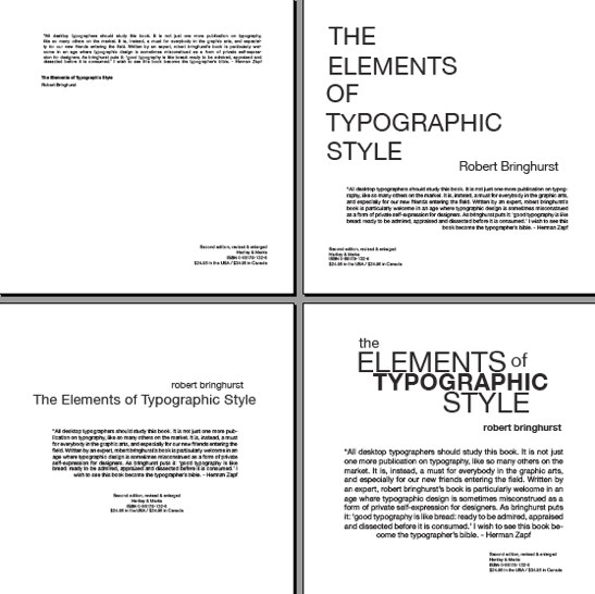
The top left layout has too
much space between the top grouping (which works) and the bottom
group……closeness works here!
|
|
Bottom left works well as a
unit. The placing of the author at the top is a good idea and works. The
amount of space between the groupings is good. I’d suggest not using centered
layout for last group.
|
|
|
|
The top and bottom right are
nice experiments that are beginning to work. Grouping of the title and
tucking in the smaller words (the and of) creates a nice overall shape and is
easy to read. The bottom right works best.
|
|
Nice job!
|