|
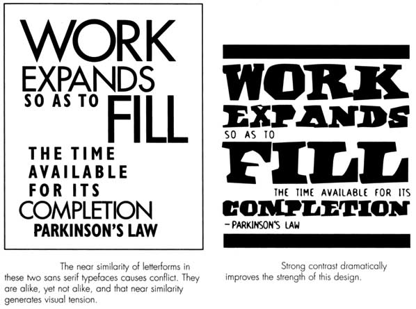
Type Contrasts - creates visual interest When typefaces on a page are really different they don't compete or conflict. |
|
Good contrast Be bold when focusing on contrast Ways to create contrast Example |
|
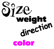
Size Big and small A simple concept. BUT be sure to make a statement. 12 point type and 16 point type aren't different enough in size. 65 point and 72 point don't work either. Make the contrast OBVIOUS. |
|
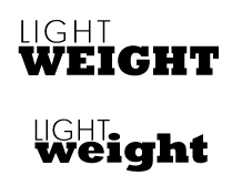
Weight Contrast heavy headlines, medium weight subheads with body copy. Avoid using bold type in body copy. Avoid using bold to emphasis words on a page. Weight contrast also involves the strategic use of type and white space. |
|
 |
  |
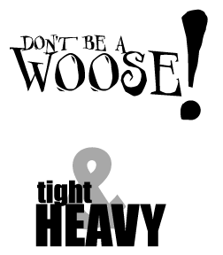
Using only ONE Font in a layout is important. Example to extreme right uses two differrent san serif fonts. This example shows good contrast when using two different fonts. But be careful, this is a difficult thing for a new designer to pull off. The first layout uses one font that creates contast and interest. |
|
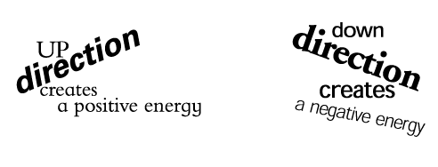
DIRECTION AVOID placing words on a slant. ONLY do it if you can justify in words why . |
|
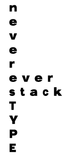
NEVER stack letters to create a vertical word. It takes experience to choose the correct font, weight, size and letterspacing to make it a successful design. Always type on the horizontal and then rotate the entire word to create a vertical arrangement. |
|
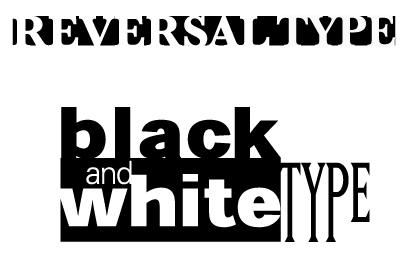
REVERSAL Creates alot of contrast especially in newspaper ads where your ad is surrounded by gray blocks of copy. A great way to draw attention! |
|
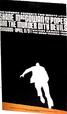
COLOR When budget allows use contrasting colors to attract readers attention. Adding the gold shape at the bottom along with the reveresed type and figure creates energy and excitement. - Contrast the headline color with the body color.
- if budget doesn't allow for color use heavy black type with gray type or reversal type on a dark background or blocks of gray in the layout.
|
|