![]()
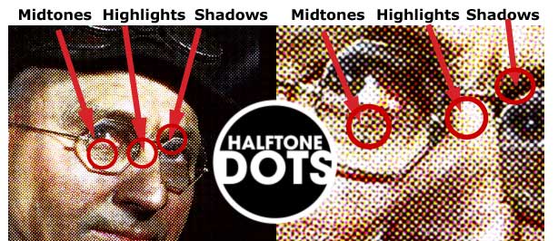
As we begin to talk about full process color (CMYK), it is important to remember that a full color continuous tone photograph needs to be broken down into a halftone dot pattern in order for it to be printed on an offset press.
The image to the left shows that the dots are of varying sizes to create highlights, midtones and shadows.
Four Color Printing and Pantone Process Colors:
The four colors used to recreate photographic images in the printing process are Cyan, Magenta, Yellow, Black or CMYK.
So far we have been using Pantone colors as SOLID/Spot colors with line art images.These Pantone SOLID/Spot colors represent a separate printing plate for each of the colors used.
Now that we are beginning to use full color(Cyan, magenta, Yellow, Black), photographic images for printing, it is important to understand the difference between Pantone SOLID colors and Pantone PROCESS colors.
When you hear the word PANTONE you should automatically think of SPOT/Solid or FLAT color. When you hear the word PROCESS you
should automatically think of FOUR colors;
CYAN,
MAGENTA, YELLOW and BLACK or CMYK. These four colors are used to create the full color spectrum when offset printing.
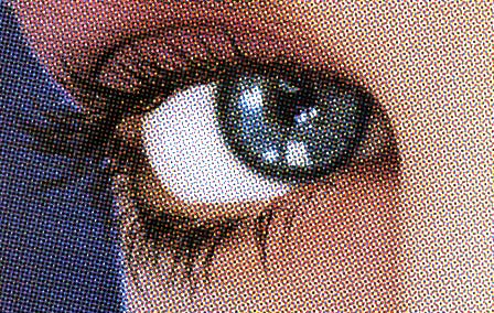
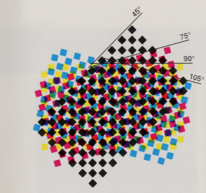
The "Rosette" image below shows an enlarged view of the halftone screen that reproduces process color images in offset printing.
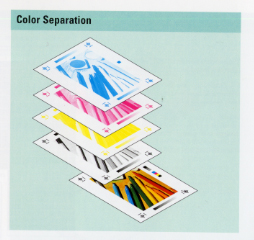
Color Separations
We already know that EACH different color will need it's own film negative and/or printing plate in order for it to print properly.
A two color job (spot color) will have only two printing plates and a four color job will have four plates.
What if you have a full color photograph which will be printed in a full color brochure, and you would like to add a solid color frame and solid color type to the photo?
Stroking the frame using a Pantone SOLID color would add an extra printing plate and you would now have the four process colors and one spot color which would result in a 5 color printing job...more money.
To get the same look and keep the print job to JUST the four Process colors you must use the PANTONE PROCESS Colors.
PANTONE PROCESS COLORS look like the solid colors but they are actually created using different percentages of cyan, magenta, yellow and black.
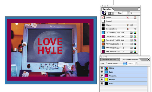
In the illustration to the left, you can see that the photo has two different "solid" color frames and a solid color for the type, LOVE HATE.
In the SWATCH palette, you can see the three different PANTONE PROCESS colors; Pantone DS(Desktop Color) 56-1, Pantone DS(Desktop Color) 227-1, Pantone DS(Desktop Color) 144-1.
Notice that after each name there is a gray square. This gray square indicates that the color will separate as a Process color(CMYK).
In the Separations Preview palette (Window>OutpuPreview>Separations)
there will only be the four process color plates visible.
If a Pantone plate is visible in Separations Preview palette, then you have chosen a Pantone SOLID color instead of a Pantone Process color.
#1.
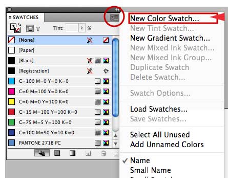
You access the PANTONE PROCESS COLOR PALETTE the same way you access the Pantone Solid color palette.
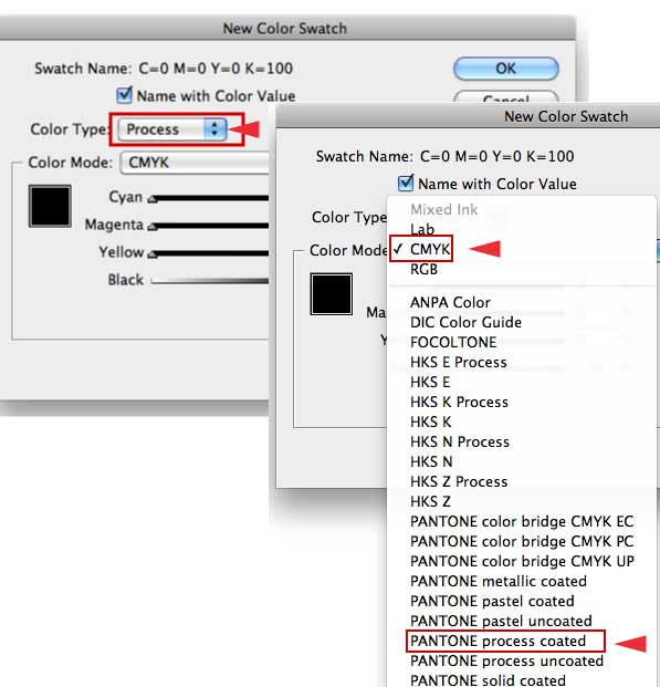
InDesign: Swatch Palette>Black arrow at top right of palette>New Color Swatch>Color Mode:Pantone Process.
#2.
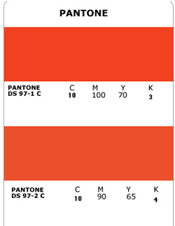
The example to the left is a sample of what the Pantone Process color strip looks like.
Notice it gives the CYMK (CMYK is the same thing) percentages which will create this color.
REMEMBER that the colors you view on your monitor will not print as you see them. That is why it is important to use the Pantone color strips.
It is important to remember that if you try and create your own color using the CMYK slider in the Color Palette, you will not know if that color will print the same as you are viewing it on your monitor.
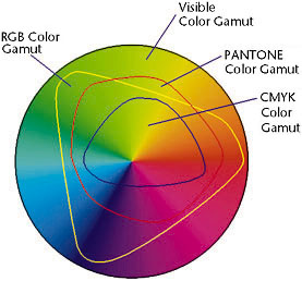
Another important thing to remember is that the CMYK color gamut is the smallest color gamut.
And only the colors in the Pantone Process color strip will print accurately.
The phrase "out of gamut" refers to a range of colors that cannot be reproduced within the CMYK color space used for commercial printing.
Graphics software is designed to work with images in the RGB color space throughout the editing process.
The RGB color space has a much wider range of discernible colors than CMYK.
When you print an image it must be reproduced with inks and these inks cannot reproduce the same range of colors that we can see with our eyes.
Because the gamut of color that can be reproduced with ink is much smaller than what we can see, any color that cannot be reproduced with ink is referred to as "out of gamut."
In graphics software, you often will see an out of gamut warning when you select colors that will shift when an image is converted from the RGB color space used in the editing process, to the CMYK space used for commercial printing.
This warning will be an exclamation point (!) next to the color.
From Sue Chastain,
about.com