 |
"The Wealth of Nations and the well-being of individuals now depend on having artists in the room". | |
|
Daniel H. Pink, "A whole new mind, moving from the information age to the conceptual age" |
|
|
||
|
"Design in its simplest form, is the activity of creating solutions" | |
|
Frank Nouvo, Industrial designer | |
When Designing a site, you need to take care of several aspects:
- From a structural point of view you need to first DEFINE the content of the site.
You need to do this BEFORE you focus on the look and feel.
It will help creating a Site-map: an accounting of bits and pieces that make out the site. For more on site maps, HERE.
You need to define the scope of the project: the number of sections your site will have, the number of html pages for each section. This is really defined by your content, that will dictate the media content of your pages (ex: text and pics, or text and video, text -pics and flash...).
You need to envision how the main navigation is going to work (functionality and location on the page) and if you are going to need a secondary navigation (if you have several items/subsections inside a given section).
This the most work-intensive and problematic part of putting up a website and without this step, building a good navigation is almost impossible.
After defining the architecture of your site you will structure the content of each of your pages.
This means collecting all the media, specially pictures, and coordinating it with the text content, that will usually need major editorial design to adapt it to highly interactive screen format. Long text is discouraged: summarizing and transferring concepts into graphs and images is fundamental. People scan text on the web, they seldomly read as a first resource. CLICK
Once the content is defined, page by page, and a good informational organization is defined, the web page production begins. WHEN CREATING AN HTML SITE, the structure of the page will be created through XHTML tags inside your page.
As you see, there is a lot to solve before you begin working with html in a web site.
- From a visual point of view you need to create a CONSISTENT "look and feel" for the whole site.
A website is a high profile extension of a business and in many cases their most popular display for branding.
Selecting a color palette, type, graphics and design elements define an intuitive mood that frames the experience and conditions business. It dictates direct information for your right brain and will help or discourage the site use.
We will talk more about visual issues down the page.
WHEN CREATING AN HTML SITE, the look and feel is created with CSS (Cascade Style Sheet).
Cascade style sheets can be created for an individual page (in the head of the html) or more professionally, as an external file that applies to the whole site.
CSS will define font families, sizes and colors. Aligning of elements, positioning and even rollover look for your links.
|
|
|
|
|
||||||||
CREATING THE LOOK AND FEEL OF A WEBSITE,
There are some fundamental ideas that will help you approach the creation of your Layout:
Define your working space.
This is the area of the browser window in which you are planning to place content: the dimensions and general proportion of your pages in Photoshop.
1
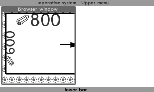
Keep screen resolution in mind. This important decision depends on who your targeted audience is and what type of computer/monitor resolution they tend to have. When working for computer screens, your page's main content should be resolved in an area in between |
 |
2
Remember that web page design is relative. You don't know how big the browser window of a user is going to be.
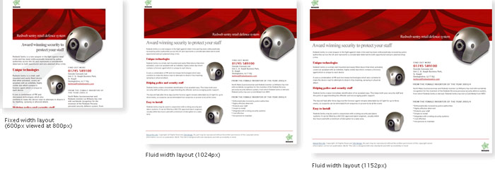
More on Elastic, Fluid or Fixed options for a layout HERE Click HERE for layout examples (this is a page with links to multiple successful web layouts, including blogs) |
 |
3
Content distribution within the page. Everybody can see what is placed on the upper-left corner of your page. |
 |
|
 |
|
 |
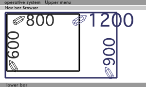
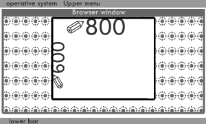
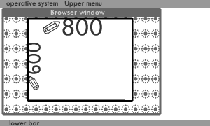
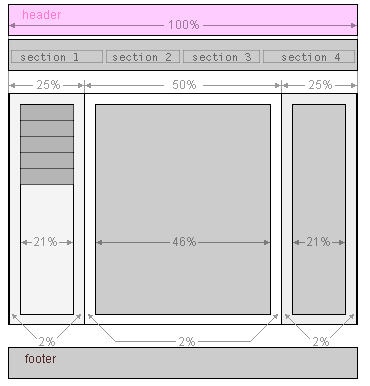
| In this graph I am using a fixed layout that is centered against an html/CSS background color, image or pattern. Notice the difference with the example above (in white, gray and red) where the negative space and text block changes as you increase/decrease the width of the browser window (called a Fluid layout). |
|||||
Don't count with the scroller bar to view your main content. Scrolling down a window takes the user's time. |
|
||||
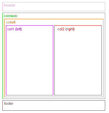
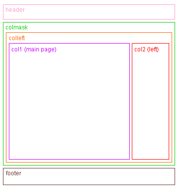
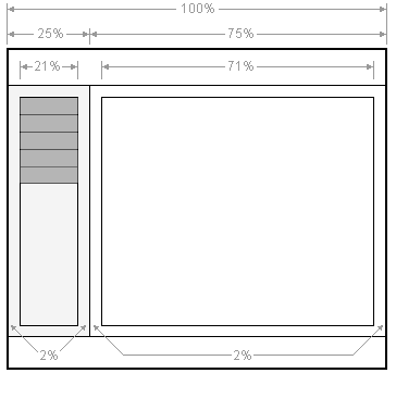
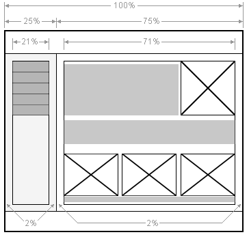
Design your template page-layout. This is the distribution of content across the page that defines the composition and negative space in your page. In the graphs you see the boxes (defined by DIV tags in CSS)named according to standard CSS conventions.
|
 |
|
 |
|
| COMPOSTION ISSUES |
Think were are you going to place your main navigation. A Horizontal line or bar across the top of the page is the most popular choice.
Plan a location for a sub navigation if any of your sections are going to have more than one page. |
 |
|
 |
|
Reserve an area for pictures and an area for text. Text blocks define areas of interest that need to be incorporated as part of the composition. Notice that in a traditional book page you will only have one color background and one or max two columns of text. |
|
 |
|
Align your images.
One of the most common newbie layout mistakes is to slap images into a page without any thought to layout.
Use guides in Photoshop to understand the internal visual structure of your page when designing. It will make a world difference when you have to slice the content out to export it to match the html/CSS structure. Click HERE
ClickHERE for a number of graphic examples.
Balance the graphics and text on a page.
It's easy to get carried away with lots of images and animations, but they can make a page very hard to read.
When you're considering your layout, remember that images are a major part of the design, not just afterthoughts: carry content through them.
Think of blocks of text as images when envisioning the composition of the page and find a good balance between both.
Think about text width.
This is often called the "scan length", and refers to how many words are displayed on one line.
Most people can comfortably read about 7 to 11 words on a line.
Longer than that, the text will be hard to read, shorter than that and it's disjointed and distracting.
When designing your layouts make sure that the major text area displays the text in a readable width.
Centering text is inadvisable. Centering is very difficult to do well and it's often hard to read.
Avoid phrases in all capitals. Capitalization of the first letter can help reading, a phrase in all capitals is way harder to read than all lowercase because of the straighter negative space of all capitals and all letters having the same height.
Avoid "rectangle-itis" in your page design.
An obsessive use of guides makes you envision the whole page as a grid of boxes.
you need some organic elements, that alter the shape of your negative space and give some variation to the structure of blocks.
Blocks are psychologically constrictive and they need to be counterbalanced with some other elements (curves, free form shapes).
Here are some ways to break up the monotony of rectangle-itis (I am paraphrasing Lynda Weiman all along):
- Make graphics with round edges or
- Use irregularly shaped graphics as an alternative shape.
- Use graphics to break the lines,
- Use background images to break the lines,
- Don't cram everything tightly,
- Vary shapes and weights,
- In frame sites, use one background
- Think outside the box.
Use color to define spaces.
There are only so many words that a human can take (and those are even fewer on a web page). excessive Information can be overwhelming and requires a strong effort for assimilation:
Color helps your intuitive perception, inducing clear understanding with no extra effort (and even some enjoyment).
Guide the user through a site with color hierarchy:
establish a few color Keys that will become your intuitive guide for the site; we call that the color-palette for your site.
Those few colors will become your communication code, you can use them to distinguish heading info from text blocks,
to help alleviate a very long text with small-not interfering design elements, or to code main sections of the Navigation.