"Typography" From Greek: typos "form" and graphein "to write"
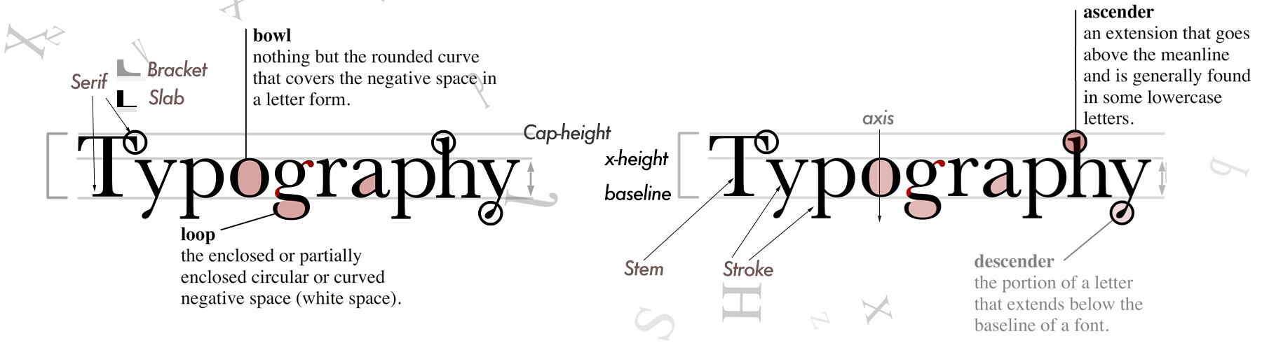
Serif
A typeface that incorporates small details on the ends of many strokes called "serifs".
They are generally used in newspapers, magazines and books because this type of design tends to read better in long bodies of text.
Common Serif typefaces: Times, Garamond, Caslon, Times New Roman, Bodoni.
Serif@fontsquirrel,
Elegant Serif fonts @webdesignledger
Garamond @ typewolf , Garamond Premier @ Adobe fonts
Galiard ITC @ Adobe fonts
Linotype Didot @ Adobe fonts
Novecento Slab @ Adobe Fonts
Sans serif
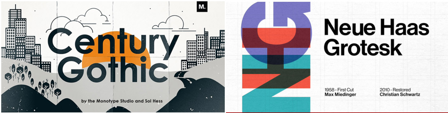
Also referred as "Gothic" do not include those details at the end of the strokes and tend to have a more geometric construction.
They have been commonly used for tittles and headlines. They have become a popular choice for body text on digital devices, since they create a simpler negative space around them that works well in the highly contrast light-through environment of a reading screen.
Common scenarios typefaces: Arial, Helvetica, Futura, Frutiger, Gil Sans or Univers.
Sanserif@ fontsquirrel
Avenir font @ typewolf
Futura font @typeworlf
Brown (geometric Sanserif similar to Aperture) @ typewolf
Century Gothic @ adobe fonts
Extreme design for "Sneakers Max" @ PositiveType
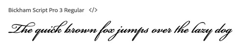
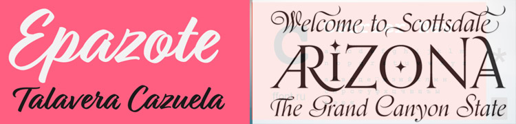
Script
Reflect handwriting, with letters that appear joined. In today's digital world,Script fonts are only used sporadically, when a personal, private or emotional feeling needs to be added to the text.
Are commonly classified into the following categories: Blackletter, Casual or Formal.
Examples of Script typefaces: SnellRoundhand, Caflish Script, brush Script and Blacktur.
Script fonts@1001fonts
Bickhan Spript @ Adobe fonts
See how LIGATURES look in Orpheus @ Adobe Fonts
"Learning curve", lovely callygraphy font @ Adobe Fonts
"Relation", Handwritten vintage signage
See also cursive. MORE
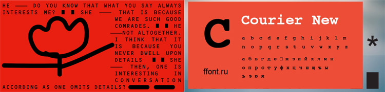
Mono space
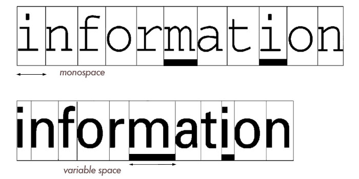
A monospaced font, also called a fixed-pitch, fixed-width, or non-proportional font, is a font whose letters and characters each occupy the same amount of horizontal space. They are still popular because the strong visual imprint that typewriters still have in our culture.
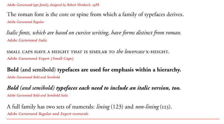
TypefaceIs collection of letters, numbers, symbols and punctuation marks designed with stylistic unity, such as Futura or Gil Sans. FontHistorically a font referred to any size or style variant of a handset typeface, such as 12-point Garamond. With digital publishing, scalable type made the specific size less pertinent and was omitted in the description of a font. In desktop publishing, a font is a digital file that holds the characters and formatting of a typeface. In today's world of digital media, the terms "typeface" and "font" have become interchangeable" in common speech. |
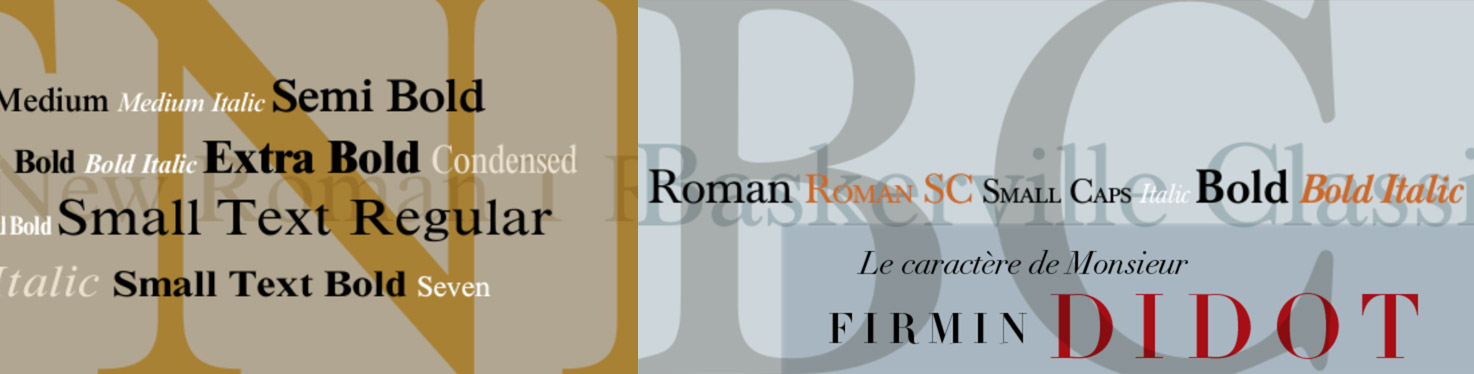
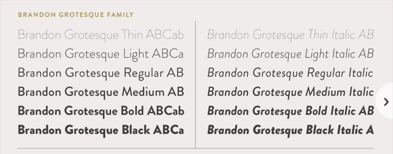
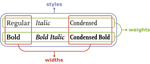
Type familyIs a collection of the many versions of a single typeface with different weights and widths, without change in letterform design. The most common varieties in a family are: Roman, Italic, light, Boldface, Condensed and Extended. A Roman font is the basic, unaltered design of a typeface. |
To create Uniformity and Harmony in a publication or website, many designers will restrict themselves to the use of 2 typefaces(often one serif and one sans serif), utilizing the different type families to create a typographic hierarchy. |
|
 |
Abbreviations: Rm | Roman Th | Thin Ex, X | Extra Comp | Compressed
|